Technical artist and game developer with a background in medicine. KPU Advanced Game Development — Dean's Honour Roll, GPA 4.17. Based in Richmond, BC — open to contract and full-time opportunities.
I'm Caio Vallim Monazzi. I worked as a General Practitioner in Brazil for five years before making a deliberate move into game development in 2023.
My focus is real-time rendering, custom Unity editor tooling, and systems architecture in C# and HLSL. I build things from scratch and document them properly.
KPU Advanced Game Development diploma - completed 2025. Open Work Permit. Available now.
1.2🔗
Links
All active profiles and contact points for Caio Vallim Monazzi.
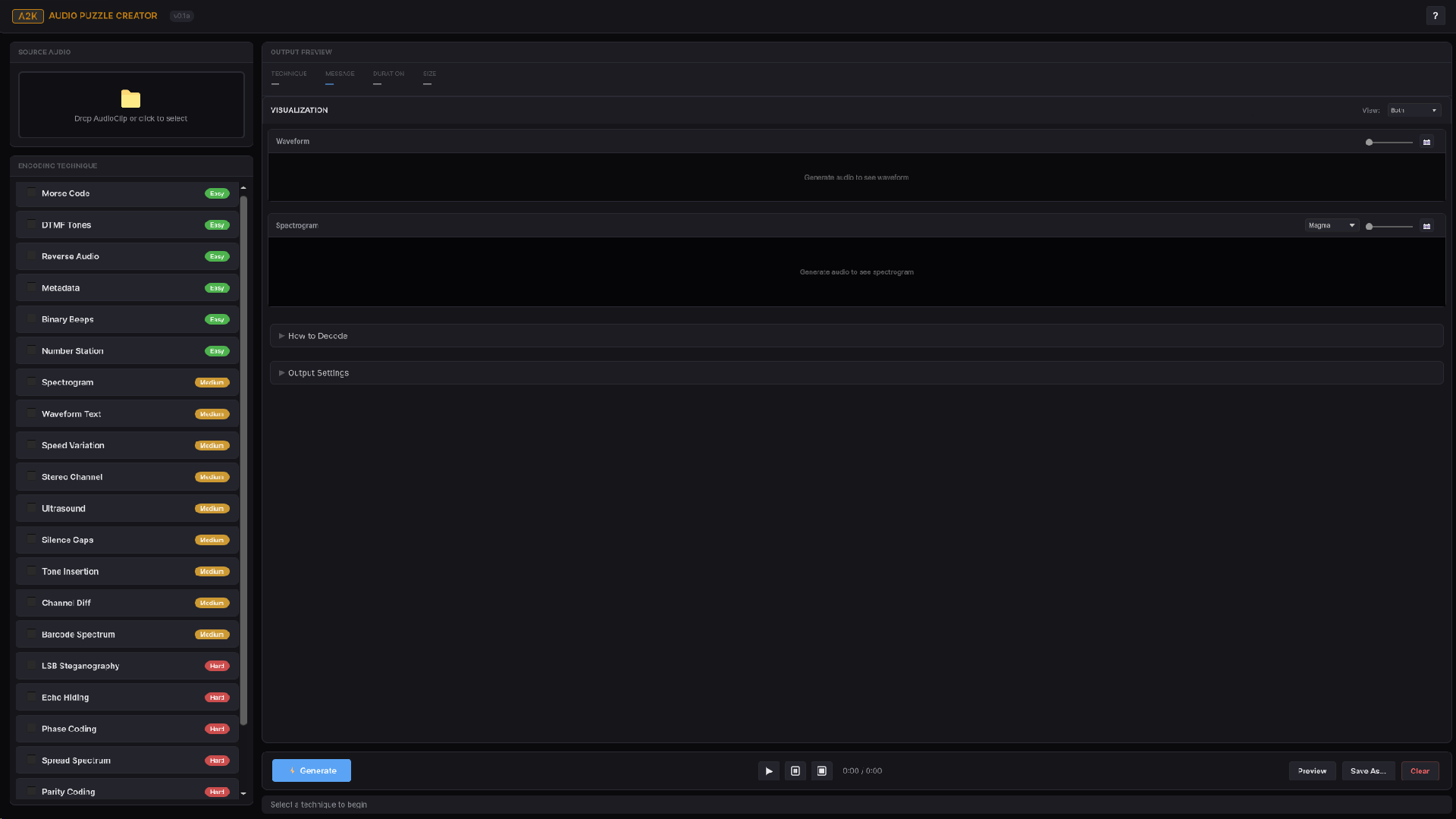
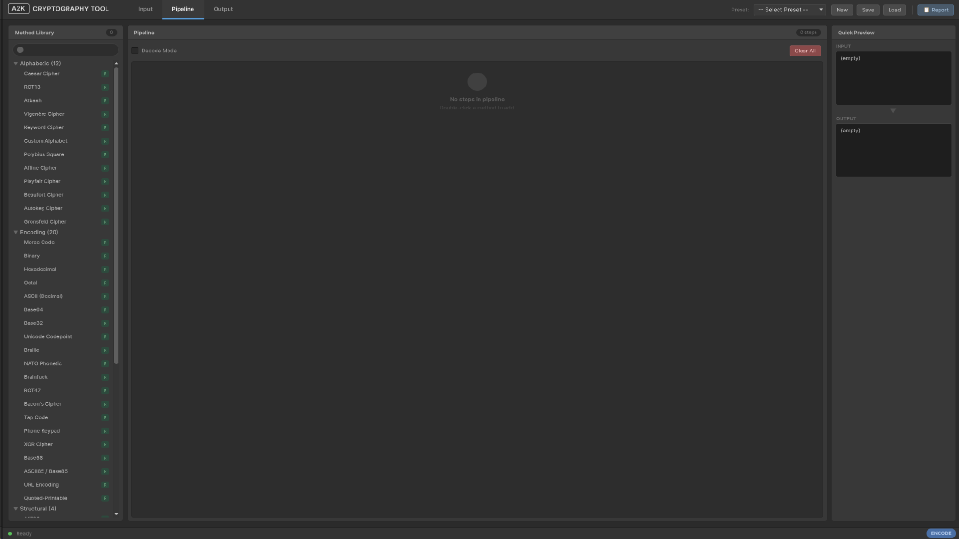
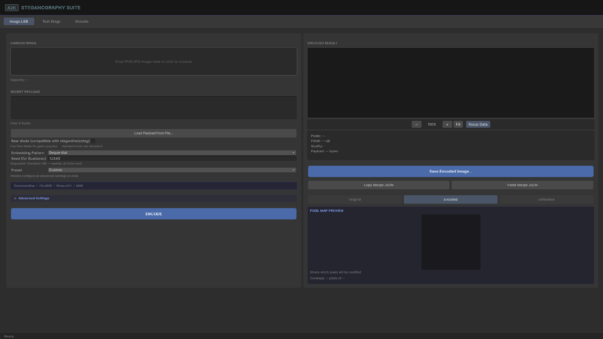
7 demo lanes showcasing all A2K systems. 16 puzzle types, 13 weapons, 31 custom editor tools, 47+ modular systems, 5 minigames — all code, art, models, audio, and voice work authored independently. Includes 3 prior games refactored into isolated namespaced assemblies, each integrated as self-contained scenes with no cross-project dependencies. Each booth demonstrates systems live with video explanations, script viewers, and interactive displays. Core systems complete and fully playable; some booths are a work in progress.
Set in a decaying Amazon mansion, custom modelled in Blender. Puzzle-based multi-floor progression, inventory, consumables. Shipped on Built-in RP, then released alpha HDRP.
19 custom shaders including volumetric fog, glow, water surface, fire, and GPU-instanced brick. Timed colour-matching puzzle with countdown and reward states, 4 additional puzzles, multi-floor elevator system, cinematic pipeline, runtime mesh destruction with debris, and a procedurally animated character with line-renderer hair, animated eyes, and AimIK.
Seven floors mapped to Dante's Inferno, each with distinct puzzle logic. NPC dialogue system with inventory-driven state changes, pooled footprints, stamina system, flashlight battery management, full UI.
🧩 Physical — Unity · Physics-based platformer
Solo-built.
Fully procedural character generated at runtime from primitives with complete skeleton hierarchy, custom box mesh generation, and trail renderers on all four limbs. Weight-reactive platform types, buoyancy physics, fluid hazard zones, full weather and seasons system with per-terrain particles, wind and lightning, breakable tiles, enemy AI, and hierarchical player state machine. Shipped as an embedded minigame in Try to See Sharp and A2K Interactive Showroom.
Dynamic split-screen with distance-based camera merge and split, pressure plate cooperative mechanics requiring simultaneous activation, procedural map generator, bomb explosion system, enemy AI.
🐍 Snake — Unity · Arcade remake
Solo-built.
Classic Snake rebuilt from scratch with procedural Perlin noise terrain, multiple themed terrain types, dynamic level dimensions that shrink per level, and distinct spawners for food, coins, and power-ups. Special item toggles between walled and wrap-around modes. Full JSON save/load with persistent progression and arcade coin economy. Shipped as an embedded minigame in Try to See Sharp and A2K Interactive Showroom.
Sole programmer on a 4-person team. With Tris Nguyen, cmonazzi.
Berzerk-inspired top-down shooter with 8-directional controls and aim assist, bullet pooling with muzzle flash and camera shake, zombie AI with line-of-sight detection, timed wave spawning, XP system, key/door system, and persistent state across scene transitions.
Sole programmer on a 3-person team. With Chrolla, Kairooe, cmonazzi.
Full character controller with 9 movement states, melee and ranged combat, enemy AI with detection and turret variant, persistent save/load, and potion system.
Down Under — Unity · Atari-constraint 2D platformer
Sole programmer on a 3-person team. With Kairooe, cmonazzi.
Full platformer physics, water mechanics with sink and swim behaviour, two enemy AI classes, environmental hazards, coin collection, and power-up system.
Back to Tub — Unity · One-button-constraint 2D platformer
With Khashayar Sahebkar, cmonazzi, lorenLin.
Prototyped a camera-based procedural level generation system and designed the core block behaviour concepts (slime, ice, lava tiles). Built 3 levels. Managed version control via Unity Cloud Plastic SCM.
First-person open-world survival. Lakeside island, fog-covered meadows, floating islands, underground cave system. Core loop: food, water, health, purpose. Built before formal training using asset integration and scene composition as primary tools.
1.4.1
Extra Videos
Video_A2KInteractiveShowroom
Video_A2K_CCTV
Video_A2K_PrefabPlacer
Video_A2K_CutsceneEditor
Video_A2K_IconCreator
Video_A2K_PerformanceMonitor
Video_A2K_PaletteEditor
Video_A2K_GunWeapon
2💻
A2K Preview Window
A2K Preview Window is a multi-format asset inspector built as a dockable Unity EditorWindow. It syncs automatically with the Project window selection and dispatches to one of 21 specialised preview modules based on asset type. Open via Tools → A2K Preview Window or Ctrl+Shift+P. Minimum window size: 500×350px. A 🔓/🔒 lock button freezes the current asset independently of Project window selection.
[A2K Preview Window — live showroom →](https://www.cmzdev.com/a2k-project/a2k-preview-window)
A dockable asset inspector built as a custom Unity EditorWindow. Syncs automatically with the Project window selection and dispatches to one of 21 specialised preview modules based on asset type. Each module provides its own toolbar, settings panel, and info panel, no Unity default inspector components are used.
Open via Tools → A2K Preview Window or Ctrl+Shift+P. Minimum window size: 500×350px.
Architecture
On OnEnable, 21 modules are instantiated in priority order. On each selection change, the list is evaluated until a module returns true from CanHandle(Object obj). The first match is used. If no module matches, FallbackModule handles the asset using Unity's built-in Editor preview.
The toolbar, settings panel, and info panel are built with UIToolkit (UXML + USS). The preview area uses IMGUIContainer, required because all 3D modules depend on PreviewRenderUtility, which only operates in IMGUI. Settings persist via EditorPrefs key A2K_Preview_v15 as JSON.
Two base classes: PreviewModule for 2D modules, and PreviewModule3D for anything requiring an orbital camera, PreviewRenderUtility, grid, bounds, and lighting.
Modules
Module
Handles
MonoScript
.cs — syntax highlighting, structure browser, text scale
Global 3D Controls is the shared orbital camera, lighting, and viewport overlay system inherited by all PreviewModule3D modules. Settings are configured once in the settings panel and apply identically across Material, Shader, Mesh, Prefab, Particle, AnimationClip 3D view, and Terrain 3D view.
Global 3D Controls
Shared camera and viewport system inherited by all PreviewModule3D modules: Material, Shader, Mesh, Prefab, Particle, AnimationClip (3D view), and Terrain (3D view). Settings configured here apply identically across all listed modules.
Camera FOV is fixed at 30°. Near clip: 0.001. Far clip: 1000. Left-drag orbits with pitch clamped to ±89°. Scroll wheel zooms at 0.05 per tick, range 0.1–20. Middle-drag or Alt+drag pans. Drag sensitivity: 0.5. Pan sensitivity: 0.003.
All settings persist across sessions via EditorPrefs key A2K_Preview_v15, serialised as JSON.
Settings Panel
Setting
Default
Background colour
RGB(0.18, 0.18, 0.20)
Grid
On
Grid scale
1.0
Grid density
10 cells
Grid colour
RGBA(0.5, 0.5, 0.5, 0.5)
Major line interval
Every 5 cells
Bounds
Off
Bounds colour
RGBA(1.0, 1.0, 0.0, 0.8)
Light
On
Light angle
135°
Light pitch
30°
Light intensity
1.0
Light colour
White
Ambient colour
RGB(0.25, 0.25, 0.30)
Auto-rotate
Off
Rotation speed
30°/s
Wireframe
Off
Image 1 A2K Preview Window — idle state. No asset selected. The toolbar shows the lock button (🔓), refresh, and recenter controls. The preview area displays the empty state placeholder. Status bar reads Ready with Select an asset to preview on the right.
Image 2 Settings panel open with no asset loaded. The Asset Info section shows Name and Type as empty dashes. The View section exposes the background colour picker and the Show Stats toggle.
Image 3 Background colour picker in action. The RGBA value (0.132, 0.132, 0.160, 1.000) — hex #222229 — is the default preview background. Changes apply immediately to the preview area.
2.2
MonoScript Module
MonoScript Module is a C# source viewer with full syntax highlighting and a parallel structure browser. Renders the script with token-level colour coding, an inline search bar, and a member panel that lists and sorts every field, property, method, event, type, constant, and constructor parsed from the file.
MonoScript Module
C# source viewer with full syntax highlighting, an inline search bar, and a parallel structure browser panel. Handles every .cs file in the project. Files over 2000 lines are truncated and the final line is replaced with // ... truncated ...
The viewer renders the script with colour-coded tokens. The inline search bar highlights all matches in the file and steps through them one by one. The structure browser parses the file at load time and lists every declared member independently of the current scroll position.
Status bar shows Script | {ClassName}, or Script | {lineCount} lines if the class name cannot be parsed.
Syntax Highlighting
Colour coding applied per token category on file load:
Token
Colour
Keywords
RGB(0.34, 0.61, 0.84)
Types
RGB(0.45, 0.88, 0.88)
Strings
RGB(0.84, 0.62, 0.46)
Numbers
RGB(0.71, 0.85, 0.66)
Comments
RGB(0.41, 0.53, 0.35)
Preprocessor directives
RGB(0.61, 0.43, 0.70)
Attributes
RGB(0.31, 0.78, 0.78)
Search highlight
RGBA(0.9, 0.7, 0.2, 0.5)
Current search match
RGBA(0.9, 0.5, 0.1, 0.7)
Structure Browser
Toggle with the 📋 toolbar button. Parses the file at load time and lists every field, property, method, event, nested type, constant, and constructor found in the script. Clicking a member scrolls the viewer to its declaration line. Members are colour-coded by type:
Member Type
Colour
Field
RGB(0.55, 0.78, 0.95)
Property
RGB(0.95, 0.78, 0.55)
Method
RGB(0.78, 0.95, 0.58)
Event
RGB(0.95, 0.68, 0.95)
Nested Type
RGB(0.45, 0.88, 0.88)
Constant
RGB(0.78, 0.58, 0.95)
Constructor
RGB(0.88, 0.88, 0.58)
Access modifier badges appear next to each member name:
Badge
Colour
public
green
private
grey
protected
yellow
internal
blue
Additional modifier badges:
Badge
Colour
readonly
blue-grey
async
amber
abstract
orange
override
green
virtual
teal
static
grey
Sort modes control the order of members in the panel:
Button
Sort
#
By line number
A
Alphabetically
◆
By access level
Text Scale
Controls the font size of the script viewer. Range 50% to 200% in steps of 10%. Default is 100%. Persisted per project via EditorPrefs key A2K_MonoScript_TextScale. Styles are fully rebuilt when the value changes.
Toolbar
Button
Action
📋
Toggle structure browser panel
📝
Open in external editor
📍
Ping in Project window
-
Decrease text scale
1:1
Reset text scale to 100%
+
Increase text scale
Info Panel
Displayed below the toolbar. Shows metadata parsed from the file:
Field
Notes
Class
Class name
Namespace
Namespace if declared
Inherits
Shown only if base type is not object
Implements
Up to 3 interfaces, truncated with ... if more
Lines
Total line count
Size
File size on disk
Text Scale
Current zoom level
Image 4 MonoScript module — NewMonoBehaviourScript.cs. Full syntax highlighting active: keywords in blue, types in cyan, comments in muted green. Status bar reads 17 lines | 309 B | 2 members | 105 %. Text scale is at 105%, zoom applied via Ctrl++.
Image 5 MonoScript module with the info panel open and the + zoom button tooltip visible (Increase text size — Ctrl++). The info panel displays Name, Type, Class, Inherits (MonoBehaviour), Lines, Size, and Text Scale. The View section is visible below the Module section.
Image 6 MonoScript inline search — query Start, showing 1 of 2 matches. Both occurrences are highlighted in the source. The info panel remains visible alongside the search results, showing all parsed metadata including class name, inheritance, and file size.
Image 7 Text scale controls overview. Tooltips identify all three zoom actions: Decrease text size (Ctrl+−), Reset text size (Ctrl+0), and Increase text size (Ctrl++). The composite shows the window at three different scales side by side, with the search bar demonstrating live result filtering — one search returning 1 of 1, another returning No results.
2.3
TextAsset Module
TextAsset Module is a syntax-highlighted text viewer for plain-text asset types Unity imports as TextAsset. Applies format-specific parsing for JSON, XML, YAML, CSV, and shader source files. Everything else renders as plain highlighted text.
TextAsset Module
Syntax - highlighted text viewer for plain-text asset files. Format-specific parsing is applied for JSON, XML, YAML, CSV, and shader source formats. The format label shown in the status bar is the file extension in uppercase with the leading . stripped (e.g., JSON, HLSL).
All files must also satisfy obj is TextAsset - Unity must have imported them as text assets. Binary files with these extensions will not match.
Info Panel
Format / Lines / Size
Image 1 TextAsset module — asset selected in the Project window before the preview loads. Unity's file icon and asset name are displayed in the preview area. Status bar reads Ready.
Image 2 Composite showing toolbar controls and search behaviour. Top: tooltips for Go to Top (Ctrl+Home), Go to Bottom (Ctrl+End), and Open in Default Editor. Middle: search query search returning 1 of 1 match with the term highlighted in amber. Bottom: single-character query . returning 1 of 14 matches, highlighting every instance across the file.
Image 3 TextAsset module — plain .txt file open. No syntax highlighting applied. Status bar reads 6 lines | 243 chars | utf-8.
Image 4 Open in Default Editor toolbar button tooltip. Opens the file in the system's associated application. Status bar shows 3 lines — scroll position differs from the full view.
Image 5 Go to Top (Ctrl+Home) toolbar button tooltip. Jumps the scroll position to line 1 instantly.
Image 6 Go to Bottom (Ctrl+End) toolbar button tooltip. Jumps the scroll position to the last line of the file.
Image 7 Settings panel open alongside the text view. Asset Info displays Name, Type (TextAsset), Lines (6), Characters (243), Size (243 B), Encoding (utf-8), and Format (TXT). The Module and View sections are collapsed below.
2.4
Texture Module
Texture Module Wraps Unity's built-in TextureInspector preview with a channel selector toolbar. Channel switching is applied via reflection on the internal m_PreviewMode field before each render, giving isolated RGBA, R, G, B, and A views on top of Unity's standard preview output.
Texture Module
Delegates rendering entirely to Unity's built-in TextureInspector via reflection on the internal m_PreviewMode field. This field is set before each render call to switch between channel views. All texture types pass through this path, the module does not render the texture directly.
Handled types:obj is Texture && obj is not Sprite -Sprites are excluded and routed to Fallback.
Status bar:Texture | { width}×{ height}
Channel Toolbar
Button
Channel
Keyboard
RGBA
Combined
1
R
Red only
2
G
Green only
3
B
Blue only
4
A
Alpha only
5
Channel selection is persisted via EditorPrefs key A2K_Texture_Channel.
Info Panel
Size , Type , Format , Compression , Memory (read via ShaderUtil.GetStorageMemorySizeLong reflection, falls back to Profiler.GetRuntimeMemorySizeLong) , Color Space , Filter , Wrap , Mipmaps (only shown if count > 1) , Aniso (only shown if level > 0) , Alpha , Readable
Image 2 R channel isolated - keyboard shortcut 2. Tooltip R (2) confirms the active channel. Format and memory remain displayed in the status overlay.
Image 3 G channel isolated — keyboard shortcut 3.
Image 4 B channel isolated - keyboard shortcut 4. Tooltip B (4) visible.
Image 5 A channel isolated with the info panel open. The alpha channel reads solid white, confirming full opacity with no transparency data. Asset Info displays: Size 512 × 512, Type Default, Format DXT1, Compression DX7/BC, Memory 128.0 KB, Color Space sRGB, Filter Bilinear, Wrap Repeat, Alpha FromInput.
Image 6 Normal map — RGBA view. The characteristic blue-purple tone (RGB ≈ 0.5, 0.5, 1.0) confirms a tangent-space normal map at rest orientation. Format BC5, colour space Linear, 512×512, 341.4 KB. The channel selector shows RG3A — BC5 stores only the R and G channels, with B reconstructed at runtime.
2.5
Material Module
Three-view material inspector built on PreviewModule3D. Renders the material on one of six preview meshes including a procedurally generated torus, with a full properties list and a texture grid view alongside the 3D preview. Also handles direct Shader asset selection by instantiating a temporary material from the shader.
Material Module
Full 3D preview with two additional inspection views, a preview mesh selector, and per-asset property breakdown. When a Shader asset is selected, a temporary Material is instantiated from it and passed to this module.
Status bar shows the shader name, truncated to 30 characters with ... if longer.
View Modes
Button
Mode
Keyboard
🎨
3D Preview
1
📋
Properties list
2
🖼
Textures grid
3
Preview Meshes
Icon
Mesh
●
Sphere
■
Cube
▬
Plane
◎
Cylinder
□
Quad
◯
Torus
Press M to cycle meshes in sequence. Mesh selection is persisted via EditorPrefs key A2K_Material_MeshIndex.
Toolbar
Button
Action
View mode buttons
Switch between 3D Preview, Properties, and Textures
Mesh selector
Cycle or select preview mesh
☰
Toggle legend
↻
Toggle auto-rotate
⊞
Toggle grid
□
Toggle bounds
◫
Toggle wireframe
☀
Toggle light gizmo
Keyboard Shortcuts
Key
Action
1 / 2 / 3
Switch view modes
M
Cycle preview mesh
W
Toggle wireframe
R
Toggle auto-rotate
G
Toggle grid
B
Toggle bounds
L
Toggle legend
F
Frame object
Info Panel
Field
Notes
Material name
Asset name
Shader name
Assigned shader
Render Queue
Render queue value
Passes
Number of shader passes
Properties total
Total property count
Floats
Float property count
Colors
Color property count
Vectors
Vector property count
Textures
Texture property count
Keywords
Active keyword count
Selected property
Name, Display Name, Type, and (for textures) Size and Format
Image 02 Toolbar tooltips composite. Properties (2) identifies the properties list view button. Toggle Legend (L) and Auto Rotate (R) label the legend and rotation controls. The 3D preview (🎨) button is active.
Image 03 - Cube mesh.
Image 04 Sphere mesh, tooltip Sphere (M to cycle) confirming the M shortcut cycles through all preview meshes.
Image 05 - Plane mesh - top-down projection showing the albedo tiling and roughness variation across a flat surface. Tooltip Plane (M to cycle) visible.
Image 06 - Cylinder mesh, tooltip Cylinder (M to cycle).
Image 07 - Quad mesh, tooltip Quad (M to cycle).
Image 08 - Torus mesh ,tooltip Torus (M to cycle).
Previews both legacy Unity Font assets and TMP_FontAsset (TextMeshPro) without a hard assembly dependency, TMP detection is by type name. Shows an editable sample text block at ten configurable sizes and an optional character map grid.
Font Module
Previews Font assets and TMP_FontAsset (TextMeshPro) without a hard assembly dependency, TMP detection is by type name string comparison. Shows an editable sample text block and an optional character map grid.
Default sample text:The quick brown fox jumps over the lazy dog.
Scroll wheel also cycles through these sizes while the preview is focused.
Toolbar
Button
Action
Size dropdown
Select preview font size
㊀
Toggle character map grid
↺
Reset sample text to default
Info Panel
Font name , Type (TextMeshPro or Legacy) , Characters , Dynamic (shown for Legacy Font assets only)
Image 1 Font module — two font assets hovered in the Project window before selection. Left: a legacy Unity Font asset displaying the standard Aa glyph preview. Right: a TMP_FontAsset displaying the TextMeshPro F icon. Status bar reads Ready.
Image 2 Toolbar controls with tooltips active. Show Character Map toggles the glyph grid below the preview. Reset Sample Text restores the default pangram. Size dropdown is set to 32. Character map is open, showing the full glyph set. Status bar: VT323-Regular | 65535 characters.
Image 3 Font module with the info panel open. Preview at size 32 showing the pangram, full uppercase, lowercase, and numerals. Asset Info: Name VT323-Regular, Type Font, Font VT323-Regular, Type Legacy, Characters 65535, Dynamic Yes. The View section exposes Background colour and Show Stats toggle.
Image 4 VT323-Regular SDF — the TextMeshPro signed distance field variant of the same font. Rendered output is visibly smoother than the legacy version. Status bar reads VT323-Regular SDF | 107 characters, reflecting the reduced glyph count in the SDF atlas. The − zoom button is active in the toolbar.
Image 5 Preview at the minimum size of 12. All character rows — pangram, uppercase, lowercase, numerals, and special characters — are fully visible at small scale. Status bar: VT323-Regular | 65535 characters.
Image 6 Size 24 with the character map open simultaneously below the preview. The preview shows the complete character set including special characters. The character map grid displays the full glyph inventory, scrollable independently of the preview area. Status bar: VT323-Regular | 65535 characters.
2.7
AnimationClip Module
Three-panel animation viewer with a GL-rendered curve graph, a dopesheet timeline, and a 3D model preview. All three modes share a transport bar along the bottom, and the curve and dopesheet views include a collapsible property panel listing every animated property grouped by category.
AnimationClip Module
Three - panel animation viewer: a GL-rendered curve graph, a dopesheet timeline, and a 3D model preview. All three modes share a transport bar along the bottom edge.
Status bar:Current frame number, active view mode name, and selected keyframe count (e.g., Frame 24 | Curves | 3 sel).
View Modes
Button
Mode
Keyboard
📈
Curves - interactive GL curve graph with zoom, pan, and tangent handles
1
◆
Dopesheet - timeline with keyframe diamonds and hierarchical property groups
2
🎬
3D Preview - drag a GameObject with an Animator onto the viewport to bind a model
3
Toolbar
📈◆🎬 view mode buttons , ▶/❚❚ play/pause , ■ stop (resets to frame 0) , 🔁 loop , 📋 properties panel , ⚡ show events , ◇ show tangents , ⊡ fit view to content
Auto-rotate (↻) and Grid (⊞) buttons appear only when the 3D Preview mode is active.
Keyboard Shortcuts
Key
Action
Space
Play / Pause
■ Stop
Reset to start
Home
Jump to start
End
Jump to end
← / →
Step one frame backward / forward
1 / 2 / 3
Switch view modes
F
Fit view to content
A / Ctrl+A
Select all keyframes
Escape
Deselect all
T
Toggle tangent display
Info Panel
Duration (F3 seconds) , Frame Rate (fps) , Total Frames , Looping , Legacy , Wrap Mode , Total Curves , Total Keyframes , Curve count per category (sorted by count descending) , Events count (if any) , Root Motion (if present) , Humanoid (if applicable)
2.8
AnimatorController Module
State graph viewer for AnimatorController and AnimatorOverrideController assets. Renders all states, sub-state machines, Entry, Exit, and Any State nodes at their exact Unity-stored positions with anti-aliased Handles-based transition arrows. Sub-state machines navigate into their own view on double-click with a breadcrumb bar to return. Supports multiple layers, a scrollable parameters panel, and zoom/pan.
AnimatorController Module
State graph viewer for AnimatorController and AnimatorOverrideController assets. Renders all states, sub-state machines, and special nodes (Entry, Exit, Any State) at their exact Unity-stored positions. Transition arrows are drawn via Handles.DrawLine, fully anti-aliased at any angle and zoom level.
Status bar:{stateCount} states | {transitionCount} transitions, appended with sub-machine count when present. Layer name is shown in the status property when the controller has more than one layer.
Node Types
Node
Colour
Notes
State
RGB(0.32, 0.32, 0.38) grey
Regular state
Default State
RGB(0.28, 0.58, 0.32) green
Marked with ▶ badge
Blend Tree state
RGB(0.48, 0.36, 0.62) purple
Marked with ◈ badge
Sub-State Machine
RGB(0.28, 0.42, 0.60) blue
Marked with ► and SM badge
Entry
RGB(0.20, 0.55, 0.28) dark green
Exit
RGB(0.55, 0.22, 0.22) dark red
Any State
RGB(0.22, 0.46, 0.58) dark teal
Selected
RGB(0.35, 0.52, 0.78) blue
Any node type when selected
Node dimensions: regular states 140×48px · special nodes (Entry/Exit/Any State) 96×36px · sub-state machines 150×48px. All dimensions scale with zoom.
Transitions
Type
Colour
Source
Entry → Default State (implicit)
Green
sm.defaultState — always present
Entry → state or sub-machine (explicit)
Green
sm.entryTransitions
Any State → state or sub-machine
Teal
sm.anyStateTransitions
State → state
Grey
AnimatorState.transitions
State → sub-machine
Grey
AnimatorState.transitions with destinationStateMachine
State → Exit
Red
AnimatorState.transitions with isExit = true
Selected-node transitions are highlighted in RGB(0.65, 0.75, 1.0) blue and drawn on a second pass above all other edges.
Sub-State Machine Navigation
Double-clicking a sub-machine node navigates into it, showing its own states, Entry, Exit, and Any State nodes at their correct positions. A breadcrumb bar appears above the graph showing the full path (Base Layer ▶ SubMachineName) with a ◀ back button. Switching layers or selecting a new asset resets to the root view.
Layer Tabs
Shown when the controller has more than one layer. Clicking a tab switches layers and resets the navigation stack to that layer's root state machine.
Toolbar
Button
Action
📋
Toggle parameters panel
−
Zoom out (min 0.3×, step 0.15)
⊙
Fit all nodes into view (F)
+
Zoom in (max 2.5×, step 0.15)
📝
Open in Unity's Animator window
Navigation Controls
Input
Action
Scroll
Zoom in / out
MMB drag or RMB drag
Pan
F / Home
Fit view
Escape
Deselect node
Click
Select / deselect node
Double-click state
Ping motion asset in Project window
Double-click sub-machine
Navigate into sub-machine
Info Panel
Layers - Parameters - States - Transitions - Sub-Machines (if any) - Currently Viewing (when inside a sub-machine)
When a node is selected: State name - Speed - Motion or BlendTree name - Transition count - Role (Default State if applicable), or for sub-machines: name and enter hint, or for special nodes: node type and role description.
Parameters Panel
Scrollable list of all controller parameters. Each row shows a colour-coded type badge (F Float - I Int - B Bool - T Trigger) and the default value.
2.9
Audio Module
Waveform viewer with transport controls and click-to-seek. Renders the waveform from the clip's sample data, plays back via AudioUtil reflection, and displays duration, sample rate, channel count, and load type in the info panel.
Audio Module
Waveform viewer with transport controls and click-to-seek. Waveform is rendered from the clip's sample data. Playback uses Unity's internal AudioUtil via reflection on three methods: PlayPreviewClip, StopAllPreviewClips, and IsPreviewClipPlaying.
Status bar:Audio | {position} / {duration} while playing, e.g., Audio | 0:14 / 1:02.
Toolbar
Button
Action
▶ / ❚❚
Play / Pause
■
Stop and return to start
🔁
Toggle loop
Click anywhere on the waveform bar to seek to that position.
Info Panel
Duration - Samples - Channels (displayed as Mono, Stereo, or {n}ch) - Frequency (Hz) - Load Type
2.10
Video Module
VideoPlayer rendering into a managed RenderTexture inside the editor without entering Play mode. Provides play/pause, stop and reset, loop toggle, and single-frame step buttons in both directions.
Video Module
VideoPlayer rendering into a managed RenderTexture. Playback runs inside the editor without entering Play mode. Frame stepping pauses the player and moves one frame forward or backward.
Particle system preview with three view modes — a live 3D viewport, a systems list, and a curves visualisation — plus a full transport bar with play, pause, stop, restart, variable speed control, and frame step.
Particles Module
Particle system preview with transport controls, speed control, and three view modes. Handles GameObject assets that have a ParticleSystem component.
Status bar:▶ {particleCount}/{maxParticles} | {time:.1f}s while playing, ❚❚ replaces ▶ when paused.
Systems - Particles (current / max) - Duration - Time - Speed - Loop - State (Playing / Paused) - Main / SubEmitters / Trails / Bursts counts
When a system is selected: Name - Particles (current / max) - Rate (per second) - Lifetime
2.12
Prefab Module
Prefab Module 3D viewport with a collapsible hierarchy panel and component inspector. Clicking any node in the hierarchy shows its component list. Handles prefab assets only — scene objects are not matched
Prefab Module
3D viewport with a collapsible hierarchy panel and a component inspector. Handles GameObject assets that are prefab assets, scene objects are not matched.
Status bar:Prefab | {objectCount} obj | {componentCount} comp | Centered or Original.
Hierarchy Panel
Indent width: 16px per level. Row height: 20px. Panel width: 220px. Clicking a node shows its component list in the info panel.
Toolbar
Button
Action
⊙
Toggle centering at origin (C)
⊡
Frame object and reset rotation (F)
📁
Toggle hierarchy panel (H)
📋
Toggle component panel
▼
Expand all hierarchy nodes
▶
Collapse all hierarchy nodes
↻
Auto-rotate
⊞
Grid
□
Bounds
◫
Wireframe
📝
Open prefab in editor
Info Panel
Type - Objects - Components - Vertices - Triangles - Materials - Size (bounds dimensions) - Position (Centered or Original) - Offset (world offset from origin) - Nested Prefabs (shown only if count > 0)
2.13
Mesh Module
Mesh Module 3D preview for Mesh assets, GameObject references, and imported model files in six formats. Includes centering toggle, normals overlay, and detailed mesh statistics including vertex count, triangle count, submeshes, UV channels, and bone count.
Mesh Module
3D preview for Mesh assets, GameObject references, and imported model files. Includes a normals visualisation overlay and centering toggle.
ScriptableObject Module Reflection-based field viewer for any ScriptableObject not in a Unity internal namespace. Exposes a public ISORenderer interface that lets any tool register a custom preview renderer for a specific ScriptableObject type, replacing the default field display entirely.
ScriptableObject Module
Reflection-based field viewer for any ScriptableObject that is not a Unity internal type. Unity internal types (namespaces starting with UnityEngine or UnityEditor) are excluded and routed to Fallback.
Status bar:SO | {TypeName}
Custom Renderers
Implement ISORenderer and register via ScriptableObjectModule.RegisterRenderer() to replace the default field display for a specific type:
Type · Path · Fields (count of public, non-[NonSerialized] instance fields) · Renderer (shown only if a custom ISORenderer is registered for this type)
2.15
Terrain Module
Terrain Module Five-mode terrain visualiser: a 3D mesh preview, a heightmap, a splatmap, a slope analysis view, and a normals display. Handles TerrainData, TerrainLayer, Terrain components, and GameObjects containing a Terrain component, with a hover overlay showing height and slope at the cursor position.
Terrain Module
Five-mode terrain visualiser with an interactive 3D mesh, three analysis views, and a hover overlay. Handles TerrainData, TerrainLayer, Terrain components, and GameObject assets that contain a Terrain component.
Procedural mesh at 128-sample resolution with full orbital camera, wireframe, and grid
Heightmap
2
256px texture — gradient from low (deep blue) through mid greens and browns to peak (white)
Splatmap
3
Per-layer colour-coded coverage map — up to 9 distinct layer colours
Slope
4
Gradient visualisation of terrain slope angle
Normals
5
World-space normal display
Height Gradient Colours
Point
Colour
Low
RGB(0.05, 0.15, 0.35) — deep blue
Mid 1
RGB(0.15, 0.45, 0.20) — green
Mid 2
RGB(0.55, 0.55, 0.25) — yellow-green
Mid 3
RGB(0.55, 0.40, 0.25) — brown
High
RGB(0.95, 0.95, 0.95) — near white
Hover overlay (2D views): position · height · slope · dominant paint layer at cursor. Coverage percentage per layer is shown in the colour legend.
TerrainLayer preview shows diffuse texture, normal map, mask texture, specular value, and diffuse remap min/max (read via reflection).
URP compatible — auto-detects the active render pipeline at setup and creates materials accordingly.
Keyboard Shortcuts
Key
Action
1–5
Switch view modes
Tab
Cycle view modes
F
Reset / frame view
W
Toggle wireframe (3D mode only)
G
Toggle grid (3D mode only)
L
Toggle legend
Scroll
Zoom
Left drag
Rotate (3D) / Pan (2D)
Middle drag
Pan
2.16
AudioMixer Module
AudioMixer Module Three-view mixer inspector for AudioMixer and AudioMixerGroup assets. Renders the group hierarchy as a GL tree, fader strips with volume meters, and an exposed parameters list. When a group is selected directly, the parent mixer is resolved via reflection.
AudioMixer Module
Three-view mixer inspector for AudioMixer and AudioMixerGroup assets. When an AudioMixerGroup is selected, the parent AudioMixer is resolved via reflection on the audioMixer property.
Status bar (mixer selected):{groupCount} groups | {exposedParamCount} params
Status bar (group selected):Group: {groupName}
View Modes
Button
Mode
Keyboard
🌳
Hierarchy — GL-rendered tree with connection lines between groups
1
🎚
Faders — vertical strips with volume meters per group
2
📊
Parameters — exposed parameter list with value bars
3
Toolbar
Button
Action
🌳 / 🎚 / 📊
Switch view modes
☰
Toggle legend (L)
⊡
Reset view (F)
📝
Open in Unity's Audio Mixer window
Keyboard Shortcuts
Key
Action
1 / 2 / 3
Switch view modes
Tab
Cycle view modes
F
Reset view
L
Toggle legend
Scroll
Zoom
Drag
Pan
Info Panel
Mixer name · Groups · Max Depth · Exposed parameters · Snapshots · Effects
When a group is selected: Name · Depth · Volume (dB) · Effects list
2.17
SpriteAtlas Module
SpriteAtlas Module Three-view atlas inspector — a packed texture preview via Unity's built-in system, a 64px thumbnail grid, and a detailed sprite list. Sprite entries can be sorted by name, size, or area, and selection shows per-sprite pivot, PPU, and texture metadata.
SpriteAtlas Module
Three-view atlas inspector. The Atlas view uses Unity's built-in packed texture preview. The Grid and List views are drawn by the module directly from sprite metadata.
Status bar:Atlas | {spriteCount} Sprites | {maxTextureSize}px — Atlas [Variant] | ... when the atlas is a variant.
View Modes
Button
Mode
Keyboard
▣
Atlas — packed texture via Unity built-in preview
1
⊞
Grid — 64px thumbnails with 8px spacing
2
≡
List — detailed entry rows
3
Toolbar
Button
Action
▣ / ⊞ / ≡
Switch view modes
⇅
Cycle sort mode: Name → Size → Area (S)
☰
Toggle legend (L)
⊡
Reset view (F)
🔍
Ping selected sprite in Project window (Enter)
Keyboard Shortcuts
1 / 2 / 3 switch modes · Tab cycles modes · S cycles sort · L legend · F reset · Esc deselect
Info Panel
Atlas name · Type (Variant, shown only for variant atlases) · Sprites · Max Size · Padding · Rotation · Tight Pack · Texture size / Format / Filter / Wrap Mode / Mip count
When a sprite is selected: Name · Size · PPU · Pivot
2.18
Timeline Module
Timeline Module Three-view Timeline inspector using reflection throughout for com.unity.timeline compatibility. Shows a visual lane view with coloured clip segments and a scrubable playhead, a flat track list, and a detailed clip list. Includes direct launch into Unity's Timeline window.
Timeline Module
Three-view timeline inspector for PlayableAsset assets where the type name contains "Timeline". All TimelineAsset access is via reflection for version compatibility — requires the com.unity.timeline package.
Status bar:{trackCount} tracks | {duration:.1f}s
View Modes
Button
Mode
Keyboard
🎬
Timeline — visual lane view with coloured clips, time ruler, and interactive playhead
1
📋
Tracks — flat track list with type icons and mute indicators
When a clip is selected: Name · Track · Start (seconds, F3) · Duration (seconds, F3)
Track type counts are shown grouped by type.
2.19
Shader Module
Shader Module Four-view shader inspector handling standard shaders, compute shaders, and RayTracing shaders. Standard shaders get a full 3D preview on the same six-mesh selector as the Material module, plus properties, passes, and keyword views. Compile errors, variant count, pipeline detection, and pass hierarchy are all extracted via ShaderUtil reflection.
Shader Module
Four-view shader inspector handling standard shaders, compute shaders, and RayTracing shaders. When a standard Shader is selected in the Properties, Passes, or Keywords views, the 3D preview uses the same mesh selector and orbital camera as the Material module.
Status bar (Shader):✓ [Pipeline] {propCount} Props | {passCount} Passes — ⚠ replaces ✓ when the shader has errors.
Status bar (ComputeShader):Compute | {kernelCount} Kernels
Status bar (RayTracingShader):⚡ RayTracing | {stageCount} Stages
Pipeline Detection
Pipeline is determined by shader name patterns, asset path, and keyword names: URP (contains universal, urp, lightweight, or path contains universalrp) · HDRP (contains hdrp, high definition) · Built-in (starts with hidden/, standard, mobile/, particles/, skybox/, sprites/, ui/, unlit/) · Custom (fallback)
View Modes (Shader only)
Button
Mode
Keyboard
🎨
3D Preview — full orbital preview using a temporary material
1
📋
Properties — full property list with colour-coded types
2
📦
Passes — subshader and pass hierarchy with render states
3
🔑
Keywords — global and local keyword listing
4
Reflection Calls
ShaderUtil.GetShaderMessages — error and warning messages
ShaderUtil.GetVariantCount — total variant count (shown as {n}M+ when > 1,000,000)
ShaderUtil.GetSubshaderCount — subshader count
ShaderUtil.GetPassCount — pass count per subshader
Toolbar
For Shader: 🎨📋📦🔑 view mode buttons · mesh selector (same six meshes as Material) · ☰ legend · ↻ auto-rotate · ⊞ grid · ◫ wireframe · 📝 open in editor
For ComputeShader and RayTracingShader: ☰ legend · 📝 open in editor (no mesh selector, no 3D controls)
When a property is selected: Name · Type · Range (for Range properties)
Info Panel (ComputeShader): Shader name · Kernels count · Kernel name list
Info Panel (RayTracingShader): Shader name · Type: DXR Shader
2.20
SVG Module
SVG Module GL-based vector preview for .svg files and A2K VectorArtTool's .vectorart and .vproj formats, with no external packages required. Includes a source view with syntax highlighting, pan and zoom, and three background modes — checkerboard, dark, and light.
SVG Module
Vector preview for .svg files and A2K VectorArtTool documents (.vectorart, .vproj). VectorArt files are loaded via reflection against VectorArtTool's SerializedDocument format — no hard assembly dependency. SVG rendering is done via GL — no external packages required.
Status bar:SVG | {width}×{height} | {pathCount} paths — or VectorArt | ... for VectorArt files.
View Modes
Button
Mode
Keyboard
🖼
Preview — GL-rendered from parsed path data with bezier curve support
1
📄
Source — XML or JSON source with syntax highlighting
2
Toolbar
Button
Action
🖼 / 📄
Switch view modes
◐
Cycle background: Checkerboard → Dark → Light (B)
⊡
Frame / fit to view (F)
🔗
Open in external editor (E)
📝
Select asset in Project window
Keyboard Shortcuts
Key
Action
1 / 2
Switch view modes
Tab
Cycle view modes
F
Fit to view
B
Cycle background mode
E
Open in external editor
+ / −
Zoom in / out
Ctrl+Scroll
Zoom
Drag
Pan
Info Panel
File name · Type (SVG or VectorArt) · Width · Height · Paths · Layers (VectorArt only) · Groups · Gradients (SVG only) · Lines (source line count) · Size (file size) · Zoom · Background mode
2.21
Folder Module
Folder Module Project folder browser with a hierarchical tree view, a flat sortable list, and a stats chart breaking down content by asset type. Navigation, expand/collapse, path copy, and Finder/Explorer reveal are all keyboard-accessible.
Folder Module
Folder browser with three view modes and a type breakdown chart. Handles any asset path that passes AssetDatabase.IsValidFolder.
Status bar:{fileCount} files • {folderCount} folders • {totalSize} — appends the active filter type in parentheses when a type filter is active.
View Modes
Button
Mode
Keyboard
🌲
Tree — hierarchical nodes with expandable folders
1
☰
List — flat view with sortable columns
2
📊
Stats — visual chart breakdown by asset type
3
Toolbar
Button
Action
🌲 / ☰ / 📊
Switch view modes
↻
Refresh folder (R)
⊞
Expand / collapse all (F)
📂
Reveal in Explorer / Finder
📋
Copy folder path
Keyboard Shortcuts
Key
Action
1 / 2 / 3
Switch view modes
F
Expand / collapse all
R
Refresh
Ctrl+C
Copy selected asset path
Enter
Open selected asset
↑ / ↓
Navigate list
← / →
Collapse / expand selected node
Info Panel
Path · Files · Folders · Total Size
When an asset is selected: Name · Type (category) · Size
2.22
Fallback Module
Fallback Module Catch-all for any asset type not claimed by the other 20 modules. Uses Editor.CreateEditor to render Unity's built-in preview when available. When no preview exists, shows the type name, base type, file extension, size, and last modified date with open, ping, and reveal toolbar buttons.
Fallback Module
Catch-all for any asset type not claimed by the 20 modules above. Uses Editor.CreateEditor to render Unity's built-in preview when the asset has one. When no built-in preview is available, the type name and file metadata are displayed directly.
Status bar: The asset type name.
Toolbar
Button
Action
Notes
📝
Open asset
Always shown
🔍
Ping in Project window
Always shown
📂
Reveal in Finder / Explorer
Shown only when asset path is not empty
Info Panel
Type · Base type (shown when the base type is not Object) · Format (file extension) · Size · Modified (formatted as yyyy-MM-dd HH:mm)
Lightweight custom gizmos and overlays that visualize and debug your scene, with batched GPU draw calls so the viewport stays fast even with a lot on screen.
Highlights
Custom gizmos · Scene overlays · Batched draw calls
Brush-based prefab scattering and painting — randomized, jittered-grid, ring and spiral patterns with surface alignment — plus the classic single-click Prefab Placer.
Around thirty modeling operators, move / rotate / scale gizmos, per-element selection and faithful normals on a kernel-tested core. ProBuilder-class editing, without leaving the Scene View.
**[outdated] for the updated version : [Open the live showroom →](https://cmzdev.com/a2k-sprite-maker) **
Key Design Goals
Editor-only , zero runtime footprint; the entire tool lives behind #if UNITY_EDITOR.
ScriptableObject project , all sprite data is stored in a SpriteProject asset, enabling standard Unity version control and undo integration.
Layer-frame architecture , layers are project-global definitions; each frame stores pixel data keyed by layer ID. Every frame always holds data for all project layers.
Full undo integration , all mutations go through Undo.RecordObject on the project asset, integrating with Unity's Edit menu (Ctrl+Z, Ctrl+Shift+Z).
Service container pattern , subsystems are resolved through a ServiceContainer for dependency injection and testability.
Comprehensive test coverage , 26 editor test files covering data models, controllers, tools, export, and integration scenarios.
Access
Open via Tools/A2K/Sprite Maker or the keyboard shortcut Ctrl+Shift+M (configurable in settings).
System Limits
Limit
Value
Canvas width / height
1 - 4096 px
Default canvas size
32 × 32 px
Zoom range
0.25× - 64×
Brush size
1 - 64 px diameter
Palette colors
max 256
Palette ramps
max 64
Undo steps
max 100
Atlas max size
64 - 8192 px
Atlas default size
512 px
Atlas default padding
2 px
Atlas max padding
32 px
Atlas default extrusion
1 px
Atlas max extrusion
16 px
Default pixels per unit
16
Default frame rate
12 fps
Auto-save interval
30 seconds
Content-aware fill generations
max 20
5.2.3
Architecture
Architecture
The window is implemented as a partial class split across eight files for maintainability.
Shows previous and next frames tinted red and blue respectively. Opacity and frame count configurable.
Symmetry guides
Project constraints
Visual axis lines for active symmetry mode
Symmetry Modes
Symmetry is a project-level constraint. When active, all drawing tools mirror strokes across the configured axes automatically.
Mode
Description
None
No mirroring
Horizontal
Left-right mirror across vertical center axis
Vertical
Top-bottom mirror across horizontal center axis
Both
4-way mirror (horizontal + vertical)
Radial4
4-way radial symmetry
Radial8
8-way radial symmetry
Onion Skin
Previous frames are tinted red; future frames are tinted blue. Opacity decreases by 25% per frame from the current position. Configurable settings: enabled toggle, frame count (how many frames before/after to show), opacity value. Stored in EditorPrefs via SpriteMakerSettings.
Canvas Resize
Canvas resize uses an AnchorPoint to determine where existing pixels are positioned in the new bounds.
Anchor
Position
TopLeft
Pixels anchored to top-left corner
TopCenter
Pixels anchored to top center
TopRight
Pixels anchored to top-right corner
MiddleLeft
Pixels anchored to middle-left
Center
Pixels centered in new bounds
MiddleRight
Pixels anchored to middle-right
BottomLeft
Pixels anchored to bottom-left corner
BottomCenter
Pixels anchored to bottom center
BottomRight
Pixels anchored to bottom-right corner
5.2.6
Tools
Tools
The ToolManager registers all tools at construction and routes input events to the active tool through a shared ToolContext.
Selects contiguous region by color similarity. Shift adds, Ctrl subtracts.
Move
V
Moves the current selection or entire layer contents.
Brush Settings
All drawing tools share a single BrushSettings instance through ToolContext.
Property
Range
Default
Description
Size
1 – 64 px
1
Brush diameter in pixels
Circular
bool
true
Circular tip when true; square tip when false
Opacity
0 – 100
100
Paint opacity percentage
Hardness
0 – 100
100
Edge falloff — 100 = hard edge, lower values produce smooth quadratic falloff
Brush size is adjusted with [ (decrease) and ] (increase), or - and =.
Hardness falloff: pixels within the hard core radius receive full opacity. Pixels in the soft region receive quadratic falloff: opacity × max(0, 1 - t²) where t is the normalized distance from the hard core edge to the brush boundary.
Shape Fill Modes
Applies to Rectangle and Ellipse tools. Toggle with F while a shape tool is active.
Mode
Description
Stroke
Outline only, no fill
Fill
Solid fill, no outline
Both
Solid fill with outline
Clone Stamp
The Clone Stamp tool operates in three sub-modes selected via keyboard shortcuts.
Mode
Key
Description
SpotHeal
J
Auto-fills from nearest neighbor pixels. No source point required.
Heal
H
Blends source pixels with destination texture. Alt+Click to set source point.
Clone
stamp icon
Copies pixels exactly from source. Alt+Click to set source point.
Aligned mode: when enabled, the offset between source and destination is preserved as you paint. When disabled, painting always samples from the original source point.
Property
Default
Description
BrushSize
3
Stamp brush diameter
CircularBrush
true
Circular vs square brush shape
AlignedMode
true
Maintain source-destination offset
Opacity
100
Paint opacity
Hardness
100
Edge falloff
Content-Aware Fill
Content-Aware Fill fills a selection by sampling the surrounding pixel edges. Up to 20 independent generations can be produced from a single selection; cycle through them to find the best result.
Requires an active selection.
Collects edge pixel colors from the selection boundary.
Generates up to 20 variants from different random seeds.
Each generation is stored; navigate with cycle controls without redrawing.
Accessible from the right-click context menu when a selection is active.
Selection Operations
When a selection is active the following operations are available.
Operation
Shortcut
Description
Select All
Ctrl+A
Selects the entire canvas
Deselect
Ctrl+D / Escape
Clears the current selection
Invert Selection
Ctrl+Shift+I
Inverts the selected region
Copy
Ctrl+C
Copies selection to system clipboard
Cut
Ctrl+X
Cuts selection to system clipboard
Paste
Ctrl+V
Pastes from system clipboard onto canvas
Flip Horizontal
H
Flips selection horizontally
Flip Vertical
Shift+H
Flips selection vertically
Rotate CCW
,
Rotates selection 90° counter-clockwise
Rotate CW
.
Rotates selection 90° clockwise
Free Transform
T
Activates free transform on selection
Delete
Delete / Backspace
Clears selected pixels to transparent
Nudge
↑ ↓ ← →
Moves selection 1 pixel per keypress
Selection mode modifiers: hold Shift while using Selection or Magic Wand to add to the current selection. Hold Ctrl to subtract.
5.2.7
Layers
Layers
Layers are project-global. Every frame in the project holds pixel data for every layer. Adding or removing a layer updates all frames simultaneously.
Layer Operations
Operation
Description
Add layer
Creates a new Normal blend mode pixel layer above the active layer
Duplicate layer
Clones the layer definition and all its pixel data across all frames
Delete layer
Removes the layer definition and all associated pixel data from all frames
Rename layer
F2 key or double-click the layer name
Reorder
Drag layer cards in the layer panel
Toggle visibility
Eye icon on the layer card
Toggle lock
Lock icon on the layer card
Set opacity
Opacity slider on the layer card
Set blend mode
Blend mode dropdown on the layer card
Layer Compositing
Frames are composited top-to-bottom through the layer stack. Each layer applies its BlendMode at its Opacity over the accumulated result below it. Invisible layers are skipped. The composite result is what is displayed on the canvas and what is rendered to the export texture.
5.2.8
Timeline and Animation
Timeline and Animations
Animations
A project can contain multiple named animations. Each animation references an ordered list of frame IDs. The active animation determines which frames appear in the timeline.
Operation
Description
Add animation
Creates a new animation with a default name
Rename animation
Double-click the animation name
Delete animation
Removes the animation; does not delete frames referenced exclusively by it
Set frame rate
Per-animation frame rate (0.1 – 120 fps)
Set loop mode
Once, Loop, or PingPong
Frame Operations
Operation
Shortcut
Description
Add frame
—
Appends a blank frame to the active animation
Duplicate frame
—
Copies pixel data and inserts after the selected frame
Delete frame
Delete
Removes selected frame(s) from the animation and project
Navigate previous
[
Move to previous frame
Navigate next
]
Move to next frame
Play / Pause
Space
Toggles animation preview playback
Rename frame
—
Edit frame name in the inspector panel
Set duration
—
Per-frame duration override in seconds
Multi-Frame Selection
Hold Shift or Ctrl in the timeline to select multiple frames. Delete and duplicate apply to the entire selection.
5.2.9
Palette
Palette
The palette stores up to 256 Color32 entries. Index 0 is always transparent and cannot be removed or made opaque — this invariant is enforced on every setter.
Palette Operations
Operation
Description
Add color
Adds the current foreground color to the palette
Remove color
Removes a color by index (index 0 cannot be removed)
Set color
Replaces a color at index (index 0 always forces alpha to 0)
Lock palette
When locked, add/set/remove operations are rejected
Click color
Sets the foreground drawing color
Right-click color
Sets the background drawing color
Swap colors
X key — swaps foreground and background colors
Palette Ramps
Palettes support up to 64 named PaletteRamp entries. Ramps group palette indices into ordered tonal sequences for structured color workflows. Each ramp stores a name and an ordered list of palette color indices.
Indexed Color Mode
Layers with UseIndexedColor enabled constrain drawing to the project palette. Drawing with a color not in the palette finds the nearest palette entry instead of writing an arbitrary color.
5.2.10
Export System
Export System
The export system is driven by an ExportProfile and orchestrated by ExportPipeline. Pre-export validation runs through ExportValidator before any file is written.
Export Modes
Mode
Description
SingleAtlas
Packs all frames into one texture atlas
PerAnimation
Produces one sprite sheet per animation
Both
Produces both a single atlas and per-animation sheets
IndividualSprites
Exports each frame as a separate image file
Export Content
Option
Description
AllAnimations
Exports every animation in the project
SelectedAnimations
Exports only the animations specified in SelectedAnimationIds
AllFrames
Exports all frames without animation grouping
Output Formats
Format
Extension
Notes
PNG
.png
Default. Lossless, supports alpha.
TGA
.tga
Lossless, supports alpha.
EXR
.exr
HDR floating point format.
Atlas Layout Modes
Mode
Description
RowPerAnimation
Each animation occupies its own row
Horizontal
All frames in a single horizontal strip
Vertical
All frames in a single vertical strip
GridByColumns
Fixed column count, rows calculated automatically
GridByRows
Fixed row count, columns calculated automatically
Packed
Optimal bin packing using a row-based algorithm
Size Policies
Policy
Description
Auto
Minimum atlas size that fits all sprites
Fixed
Exact width and height; auto-expands with a warning if too small
FixedWidth
Width locked; height calculated automatically
FixedHeight
Height locked; width calculated automatically
Packing Sort Modes
Mode
Description
None
No sorting; frames packed in input order
ByArea
Largest area first
ByMaxSide
Largest side length first
ByWidth
Widest frames first
ByHeight
Tallest frames first
ByAnimation
Sorted by animation name then frame index
Atlas Settings
Setting
Range
Default
Description
MaxAtlasSize
64 – 8192
4096
Maximum atlas dimension in pixels
Padding
0 – 32
2
Transparent gap between sprites in pixels
Extrusion
0 – 16
1
Edge pixel duplication to prevent bleeding
PowerOfTwo
bool
true
Forces atlas dimensions to power of 2
MultipleOfFour
bool
true
Forces atlas dimensions to multiples of 4 for GPU compression
ForceSquare
bool
false
Forces equal width and height
AllowRotation
bool
false
Permits 90° rotation of sprites during packing
TrimTransparent
bool
false
Removes transparent border pixels from each sprite before packing
GroupByAnimation
bool
true
Keeps animation frames contiguous in the output
Individual Sprite Settings
Applies when ExportMode is IndividualSprites.
Setting
Default
Description
IndividualTrimTransparent
true
Removes transparent border pixels
IndividualPadToPowerOfTwo
true
Pads output to power of 2 dimensions
IndividualMultipleOfFour
false
Pads output to multiples of 4
IndividualCenterSprite
—
Centers the sprite within the output bounds
IndividualForceSquare
—
Forces equal width and height
IndividualMinSize
32
Minimum output dimension (1 – 8192)
IndividualMaxSize
—
Maximum output dimension
IndividualOverflowMode
ScaleDown
Behavior when a sprite exceeds the max size
Overflow modes:
Mode
Description
ScaleDown
Scales the sprite down to fit within the max size
Clamp
Crops the sprite to the max size
NoLimit
No maximum size applied
Sprite Settings
Setting
Default
Description
PixelsPerUnit
16
Pixels per Unity unit (1 – 2048)
FilterMode
Point
Texture filter mode applied on import
PivotMode
ProjectDefault
How sprite pivot points are determined
Pivot
(0.5, 0.5)
Custom pivot when PivotMode = Custom
Pivot Modes
Mode
Description
ProjectDefault
Uses the project-level pivot setting
Center
Pivot at (0.5, 0.5)
TopLeft
Pivot at (0, 1)
TopCenter
Pivot at (0.5, 1)
TopRight
Pivot at (1, 1)
MiddleLeft
Pivot at (0, 0.5)
MiddleRight
Pivot at (1, 0.5)
BottomLeft
Pivot at (0, 0)
BottomCenter
Pivot at (0.5, 0)
BottomRight
Pivot at (1, 0)
Custom
Uses the Pivot Vector2 field
Unity Asset Generation
Option
Default
Description
CreateSprites
true
Generates Sprite assets from the exported texture
CreateAnimationClips
—
Generates AnimationClip assets from animation data
CreateAnimatorController
—
Generates an AnimatorController with all clips
CreatePrefab
—
Generates a prefab with SpriteRenderer and the controller wired
FrameRate
12
Frame rate used for generated animation clips (1 – 120)
Unity Import Settings
Applied to the exported texture via TextureImporter after writing.
File names are resolved by NamingResolver using token substitution.
Scheme
Pattern
Example
AnimationFrame
{animation}_{frame:00}
Walk_03.png
ProjectAnimationFrame
{project}{animation}{frame:00}
Hero_Walk_03.png
AnimationFrame3Digit
{animation}_{frame:000}
Walk_003.png
FrameAnimation
{frame:00}_{animation}
03_Walk.png
Custom
user-defined
Any token combination
Available tokens in custom patterns: {animation}, {frame:00} (zero-padded frame number), {project}.
Metadata Export
When ExportMetadata is enabled, a JSON file is written alongside the sprite texture containing animation names, frame counts, frame rates, loop modes, and sprite rect data.
Per-Sprite Adjustments
SpriteAdjustmentCollection allows per-frame overrides in IndividualSprites mode. Each SpriteAdjustment is identified by animation name and frame index and supports:
Exclusion — exclude this specific frame from export
Bounds override — specify a custom crop rect instead of auto-detecting content bounds
Offset — apply X/Y offset when placing the sprite in the output
Pivot override — per-sprite custom pivot point
Name override — custom file name for this specific sprite
Export Window
The Export Window (ExportWindow) is a separate EditorWindow with a WYSIWYG atlas preview. Open via the Export button in the main Sprite Maker window.
Preview Panel
The preview shows a real-time render of the packed atlas at the current profile settings.
Pan with middle mouse or Alt+left drag
Zoom with scroll wheel
Toggle sprite rect overlays (shows each sprite's bounds)
Toggle animation color bands (color-coded regions per animation, 8 distinct colors cycling)
Click a sprite rect to select it and view its detail
Detail View
When a sprite is selected in the preview, a detail panel shows a zoomed view of that sprite with:
Output bounds overlay (green) — final export bounds after trim/pad operations
Interactive bounds editing for per-sprite adjustment overrides
Warning Panel
Pre-export warnings appear in a scrollable list above the export button. Warnings are non-blocking; errors prevent export.
Export Profile Persistence
The ExportProfile is serialized on the ExportWindow instance as a [SerializeField], persisting through domain reloads. The project is referenced via its asset path string.
5.2.11
Undo System
## Undo System
The `UndoSystem` wraps Unity's `Undo` API with focus-awareness and stroke grouping.
### Focus Awareness
Undo and redo only activate when the Sprite Maker window is focused. This prevents `Ctrl+Z` from triggering while other editor windows are active.
### Stroke Grouping
Drawing strokes are grouped as single undo operations regardless of how many pixels were painted. `BeginStroke(name)` opens a group; `EndStroke()` closes it. A single undo step reverses the entire stroke.
### Structural Changes
Frame additions, removals, layer operations, and animation changes are recorded as individual undo steps via `MutateProject(label, action)`.
### Integration
All mutations in `SpriteMakerWindow.Mutations.cs` call `Undo.RecordObject(_project, label)` before modifying the project, integrating fully with Unity's **Edit → Undo** / **Redo** menu items.
5.2.12
Clipboard
Clipboard
Clipboard operations use the system clipboard as the single source of truth. Internal copy writes to the system clipboard; paste reads from it. This allows copy-paste between the Sprite Maker and external applications such as Photoshop or Aseprite.
Operations
Operation
Shortcut
Behavior
Copy
Ctrl+C
Copies selection (or full canvas if no selection) to system clipboard as an image
Cut
Ctrl+X
Copies to clipboard and clears the source pixels to transparent
Paste
Ctrl+V
Reads image from system clipboard. If no project is open, creates a new project from the clipboard image. If a project is open, pastes onto the current canvas.
Paste as new project
Menu option
Explicitly creates a new project from clipboard contents regardless of current state
Windows Implementation
On Windows, ImageClipboard reads CF_DIB (24-bit) and CF_DIBV5 (32-bit with alpha) clipboard formats via P/Invoke. Writing uses CF_DIBV5 to preserve the alpha channel. Row alignment is 4-byte boundary. Maximum image dimension: 8192 px.
Import
Textures can be imported from the Project window into the Sprite Maker via drag-and-drop onto the canvas. The imported texture is placed as a new frame or onto the current canvas depending on context.
5.2.13
Settings
## Settings
Settings are stored in `EditorPrefs` with the prefix `A2KSpriteMaker_` and persist across Unity sessions.
| Setting | Key | Default | Description | |---|---|---|---| | `ShortcutEnabled` | `A2KSpriteMaker_ShortcutEnabled` | true | Enables Ctrl+Shift+M keyboard shortcut to open the window | | `AutoSaveEnabled` | `A2KSpriteMaker_AutoSave` | false | Auto-saves the project every 30 seconds | | `ShowGrid` | `A2KSpriteMaker_ShowGrid` | true | Shows pixel grid on canvas | | `ShowRulers` | `A2KSpriteMaker_ShowRulers` | true | Shows pixel coordinate rulers on canvas edges | | `LastProject` | `A2KSpriteMaker_LastProject` | — | Asset path of the last opened project, restored on window reopen | | `PreviewZoom` | `A2KSpriteMaker_PreviewZoom` | — | Persisted canvas zoom level | | `OnionSkinEnabled` | `A2KSpriteMaker_OnionSkinEnabled` | — | Onion skin overlay toggle | | `OnionFrames` | `A2KSpriteMaker_OnionFrames` | — | Number of frames to show in onion skin | | `OnionOpacity` | `A2KSpriteMaker_OnionOpacity` | — | Onion skin opacity |
5.2.14
Keyboard References
Keyboard Reference
Tools
Key
Tool
B
Pencil
E
Eraser
L
Line
R
Rectangle
O
Ellipse
G
Fill
I
Color Picker
J
Clone Stamp (Spot Heal mode)
H
Clone Stamp (Heal mode)
S
Selection
W
Magic Wand
V
Move
Canvas
Key
Action
Space
Toggle animation playback
[
Previous frame
]
Next frame
F
Fit canvas to window (no shape tool) / toggle fill mode (shape tools)
-
Zoom out
=
Zoom in
[
Decrease brush size
]
Increase brush size
Space + drag
Pan canvas
Editing
Key
Action
Ctrl+Z
Undo
Ctrl+Shift+Z · Ctrl+Y
Redo
Ctrl+S
Save project
Ctrl+C
Copy selection
Ctrl+X
Cut selection
Ctrl+V
Paste from clipboard
Ctrl+A
Select all
Ctrl+D
Deselect
Ctrl+Shift+I
Invert selection
Delete · Backspace
Delete selected pixels
H
Flip horizontal
Shift+H
Flip vertical
,
Rotate selection CCW
.
Rotate selection CW
T
Free transform
X
Swap foreground/background colors
F2
Rename active layer
Enter
Confirm rename
Escape
Cancel rename / cancel active drawing stroke
↑ ↓ ← →
Nudge selection 1 pixel
Clone Stamp
Key
Action
Alt+Click
Set clone / heal source point
5.2.15
Test Coverage
Test Coverage
The test suite lives in Tests/Editor/ and uses A2K.SpriteMaker.Tests.asmdef. All tests run in the Unity Test Runner under the Editor category.
Test File
Coverage
AnimationDataTests.cs
AnimationData frame management, ID generation, clone
AtlasPackerTests.cs
Atlas packing correctness across layout modes
CanvasEngineTests.cs
Pixel read/write, composite, resize operations
ConstantsTests.cs
Constants values and ranges
ContentAwareFillTests.cs
Fill generation, edge sampling, multi-generation cycling
Profile validation, pivot resolution, name generation
ExtendedDataTests.cs
Extended data model edge cases
IntegrationTests.cs
End-to-end project create → draw → export flow
NamingResolverTests.cs
Token substitution for all NamingScheme values
PaletteDataTests.cs
Color add/remove/set, index 0 invariant, ramps
SelectionDataTests.cs
Selection region operations, marquee math
SpriteProjectTests.cs
Project mutation, layer/frame consistency
TexturePoolTests.cs
Texture pooling, acquire/release, size matching
TextureUtilityTests.cs
Texture copy, trim, pad, format conversion
TimelineControllerTests.cs
Animation CRUD, frame reorder, playback state
ToolContextTests.cs
Tool context state, brush settings propagation
ToolManagerTests.cs
Tool registration, switching, active tool routing
UndoSystemTests.cs
Stroke grouping, focus awareness, undo/redo
ValidatorTests.cs
ProjectValidator repair logic
5.3
A2K Texture Grabber
Pull textures straight out of your scene
Capture render output and surfaces into clean, import-ready texture assets, with control over framing, resolution and format — straight from the Editor.
Compose trim strips into a single sheet, preview every variation through a procedural filter pipeline, and export game-ready trim textures with UV guidance.
Frame a prefab in a live preview, layer a 15+ effect stack Behind / With / In Front of it, add tint zones, and capture a transparent sprite PNG. IMGUI & UI Toolkit editions.
Collect textures into a single Texture2DArray asset with compression presets, validation and an estimated GPU footprint — stable references on every rebuild.
Combine meshes and their albedo / normal / height / ORM maps into a grid atlas with channel-routed ORM and UV bleed, then export atlas textures, remapped meshes and a URP material.
Route occlusion, roughness, metallic and mask maps into the R / G / B / A channels of one texture, with per-channel source selection and a live channel preview.
A full game design document editor built inside Unity — write, structure, preview, and export without leaving the engine. Documents live as ScriptableObject assets with three embedded visual editors, six export formats, and a fully customisable HTML output pipeline.
A complete game design document editor built inside Unity as a custom editor window. Documents are Unity ScriptableObject assets — a single .asset file contains everything: section hierarchy, media references, visual canvases, export settings, colour scheme, and typography. No external software. No browser. No sync issues.
Why It Exists
Standard GDD solutions are either outside the engine (Google Docs, Notion) and have no awareness of your assets, or inside the engine but limited to plain text files with no structure. The A2K GDD Editor is purpose-built for Unity — it understands Unity assets, links directly to scripts, prefabs, scenes, materials, and shaders, and exports to fully self-contained HTML with navigation, search, media, and theming — without leaving the editor.
Architecture
The editor is a single EditorWindow split across nine partial classes, each owning one responsibility:
File
Responsibility
GDDEditorWindow.cs
Core state, fields, tab routing, lifecycle
GDDEditorWindow.Toolbar.cs
Document selector, tab bar, preview toggle, ON/OFF master toggle
GDDEditorWindow.Navigation.cs
Left panel — section tree, search, context menu
GDDEditorWindow.SectionTabs.cs
Right panel — thirteen section editing tabs
GDDEditorWindow.Preview.cs
Live HTML preview rendered inline in the editor
GDDEditorWindow.Settings.cs
Document info, game info, branding, definitions, defaults
GDDEditorWindow.Export.cs
Full export pipeline for all output formats
GDDEditorWindow.Assets.cs
Asset registry — global reusable assets with tag lookup
GDDEditorWindow.Utilities.cs
Shared helpers, cached GUI styles, draw utilities
Performance decisions: The navigation panel pre-calculates a flat List from the section hierarchy. GUI styles are initialised once as static fields and reused for the entire editor session. Both choices keep GC allocation at zero during normal use — no per-frame allocations while the window is open.
Document Structure
Sections are stored as a flat serialised list with ParentId for hierarchy — not a recursive tree. Unity serialises flat arrays reliably. Hierarchy is reconstructed at runtime into a Dictionary> keyed by parent ID. The cache is invalidated explicitly on structural changes only, not on every repaint.
Embedded vector drawing canvas — rectangles, ellipses, lines, arrows, freehand paths, text, with multi-layer support
Graph Editor
A node-based flowchart editor embedded per section. Used for documenting game logic, AI state machines, quest flows, dialogue trees, and system architecture.
Node Types
Flow Control
Node
Colour
Default Ports
Start
Green — #33BF4D
Single output
End
Red — #D93F3F
Single input, no output
Branch
Cyan — #4DCCCC
One input → Path A, Path B (all execute in parallel)
Merge
Teal — #4DB3B3
Multiple inputs → single output
Sequence
Blue — #597DDA
Ordered chain of steps
Logic
Node
Colour
Default Ports
Decision
Yellow — #F2BF33
One input → Option A, Option B (user-labelable)
Condition
Orange — #F28D33
One input → Yes, No
Switch
Purple — #A666DA
One input → Case 1, Default (expandable)
Random
Pink — #E673B3
One input → 50%, 50% (weighted, expandable)
Execution
Node
Colour
Properties
Action
Blue — #597DDA
General action or step
Wait
Brown — #997040
Duration property (seconds)
Variable
Teal-Green — #4DB399
Variable name + value to set/get
Loop
Dark Blue — #406AB3
Iteration count → Loop Body, Exit
Events & States
Node
Colour
Use Case
Event
Orange — #F28033
Game event trigger
Trigger
Magenta — #D957A6
External trigger or listener
State
Teal — #40B3B3
Game state (circular)
Transition
Teal — #4D9AA6
State transition arrow
Special
Node
Colour
Use Case
Checkpoint
Gold — #E6BF33
Save point
Dialog
Blue — #668BE6
Dialogue node → Response 1, Response 2
Combat
Red-Orange — #D95740
Combat encounter
Reward
Gold-Yellow — #F2CC33
Reward or loot
Objective
Green — #4DCC66
Quest objective
SubGraph
Purple — #9966CC
Reference to another section
Note
Grey — #808080
Comment or annotation (no ports)
All node colours are the defaults from GDDNode.GetDefaultColor(). Any node accepts a custom hex colour override.
Multi-Port Nodes
Decision, Condition, Random, Switch, Branch, Loop, and Dialog nodes ship with named ports. Ports on Decision, Random, Switch, and Dialog nodes can be added or removed at runtime. Port labels are editable. Random ports carry a Weight float for probability control. Switch ports carry a Value string for routing logic.
Connection Types
Type
Visual
Use
Default
Solid white
Standard execution flow
Success
Green
Yes / success path
Failure
Red
No / failure path
Optional
Dashed grey
Optional path
Bidirectional
Blue
Two-way connection
Data
Cyan dotted
Variable or data transfer
Trigger
Orange
Event-driven connection
Tools & Shortcuts
The Graph Editor uses Unity's standard tool shortcut layout:
Key
Tool
Q
Hand — pan the canvas
W
Move — drag nodes
E
Rotate
R
Scale — proportional resize (hold Shift)
T
Rect — resize from edges using 8 handles
F
Fit to content — frame all nodes
Delete / Backspace
Delete selected node
Ctrl+D
Duplicate selected node
Escape
Deselect / cancel drag
Middle Mouse / Scroll
Pan and zoom canvas
Right-click a node opens its property panel in the sidebar.
Moodboard Editor
A visual reference board embedded per section. Used for art direction, style guides, lookdev references, and inspiration collections.
Canvas
Default canvas size is 800×600. Background colour, grid size (default 50px), grid visibility, and snap-to-grid are all configurable. Zoom and pan offset are preserved per moodboard.
Item Types
Type
Description
Image
Reference image from project assets (GUID-linked), embedded byte data, or external file path. Preserves aspect ratio by default. Supports tint colour and opacity.
Text Note
Sticky note with editable text, font size, bold toggle, and one of 8 preset background colours (cream, green, blue, red, purple, orange, grey, white).
Color Swatch
Named colour sample with hex display. Drag from the colour picker to place.
Shape
Rectangle, Rounded Rectangle, Ellipse, Triangle, Diamond, Arrow, or Line — each with configurable fill colour, stroke colour, stroke width, and fill toggle.
AssetRef
Direct reference to a Unity project asset by GUID. Displays asset type alongside the reference.
WebLink
URL reference with label, displayed as a clickable card.
Group
Container for multiple items. Groups can be coloured, titled, and collapsed.
Tags
Each item can carry multiple tags. Tags are defined per moodboard with a name and one of 9 preset colours (red, orange, yellow, green, cyan, blue, purple, pink, grey). Used to filter and organise items visually.
Layer System
Items are assigned to layers. Each layer has:
Visibility toggle — hide/show without deleting
Lock toggle — prevent selection and editing
Opacity — per-layer transparency
Preview colour — colour dot identifier in the layer list
Drag-to-reorder — change stacking order
Tools & Shortcuts
Key
Tool
Q
Hand — pan canvas
W
Move — drag items
E
Rotate
R
Scale proportionally
T
Rect — free resize
F
Fit to content
Delete / Backspace
Remove selected items
Double-click
Edit text note content
Ctrl+S
Save moodboard
Drag & Drop
Add images from Project window
Middle Mouse / Scroll
Pan and zoom
Sketch Editor
A vector drawing canvas embedded per section. Used for wireframes, UI mockups, system diagrams, and technical illustrations.
Canvas
Default canvas size is 800×600 with a light grey background (#F2F2F2). Canvas colour, grid size (default 20px), grid visibility, and snap-to-grid are configurable. Zoom and pan offset are preserved per sketch.
Element Types
Key
Type
Notes
1
Rectangle
Hold Shift for square. Configurable corner radius.
2
Ellipse
Hold Shift for circle.
3
Line
Straight line with configurable line cap (Butt / Round / Square).
4
Arrow
Line with arrowheads — configurable start and end arrow, arrow size.
5
Pencil (Path)
Freehand Bezier path. Points carry smooth/corner toggle and handle positions for curve control.
6
Text
Text label with font size, bold toggle, and anchor alignment (9 positions).
—
Image
Image element linked by GUID or file path, placed on canvas.
All elements carry: fill colour, stroke colour, stroke width, opacity, rotation, and visibility/lock flags.
Transform Tools
Key
Tool
Q
Hand — pan canvas
W
Move
E
Rotate
R
Scale proportionally
T
Rect — free resize from any edge or corner
F
Fit to content
Delete / Backspace
Delete selected elements
Ctrl+S
Save sketch
Layer System
Layers work identically to the Moodboard — each layer has name, visibility toggle, lock toggle, opacity, and preview colour. Elements live inside layers. Layer order determines drawing order. Multiple layers can coexist in a single sketch.
Colour Swatches
Each sketch carries a personal swatch palette (default: black, white, red, green, blue, yellow, cyan, magenta, mid-grey). Swatches are editable and persist with the sketch data.
Asset Registry
A global tag-based image management system. Assign a short tag to any image asset once, then reference it anywhere in the document using {{tag-name}} syntax.
Registering an Asset
Open the Assets tab
Click + Add Asset
Assign a unique tag — e.g. hero-render, logo, pipeline-diagram
Select the source — Unity project asset (by GUID), external file path, or URL
Configure alt text, caption, alignment, click action, and custom size
Using Asset Tags
              → inserts the image registered as "logo"
{{hero-render}}       → inserts the image registered as "hero-render"
{{pipeline-diagram}}  → inserts the image registered as "pipeline-diagram"
Tags resolve in section content, section summaries, Markdown, and raw HTML. Tags decouple image references from file paths — rename or replace the asset in the registry and all references update without touching section content.
Auto-Populate
Auto-Populate Registry scans all sections and registers every referenced image and audio asset it finds — header images, footer images, gallery images, audio clips — de-duplicated by file path. Runs in one click.
Game page documentation — no external file dependencies
Markdown
.md file
Wiki, README, version control
JSON
Structured .json
API integration, external tools, data pipeline
Plain Text
.txt
Maximum compatibility fallback
RTF
.rtf
Word processor import
HTML Export
The HTML exporter generates a single file with all CSS and JavaScript inlined — no external dependencies, no CDN requests. A locally-downloaded Mermaid.js file can be dragged into the document settings as a .txt asset to enable offline diagram rendering without any network access.
Page templates:
Template
Layout Style
Documentation
Left sidebar, medium content width — GitBook-style
Minimal
No sidebar, narrow centred content — Medium-style
Professional
Compact header, wide content, subtle nav — Stripe Docs-style
Magazine
Full-width hero, card sections — game press kit style
Table of contents: None / Top / Left / Right / Both — Simple / Numbered / Nested / Collapsible — configurable max depth
Itch.io Export
Produces a _itchio.html file with all images and audio embedded as base64 data URIs — no external file references of any kind. Configurable media size limits per type (image, audio, video) with 0 meaning strip entirely. Moodboards, graphs, and sketches can be stripped independently. Warns if output exceeds 50 MB. An optional CRT-style loading screen (retro scanline animation using system fonts and the document's primary colour) can be injected before the document renders.
GitHub Pages Publishing
Publishes directly to a GitHub Pages branch without leaving the editor. Reads repository configuration from the project's existing git remote — no manual URL entry required if the project is already connected to GitHub. The publisher commits the exported HTML to the configured branch (default: gh-pages), pushes, and opens the live URL on completion. Custom domains are supported.
Definitions System
All status values, priority levels, section types, highlight styles, and reference types are user-defined. Built-in defaults are a starting point — every definition can be renamed, recoloured, reordered, hidden, or deleted. User-created definitions are never overwritten by built-in updates.
Built-in section types: 69 types across 9 categories — Core/Meta, Game Design, World & Narrative, Art & Visual, Technical, Audio, Production, Special/0467, Portfolio & Documentation.
Built-in priorities: None · Critical · High · Medium · Low · Optional
Built-in highlights: None · Info · Warning · Danger · Success · Tip · Note · Important
The merge system ensures built-in type updates propagate to existing documents — new built-in types are added, existing definitions (including custom ones) are never touched.
A dockable, infinite-canvas moodboard for the Unity editor — images, notes, colour swatches, eight vector shapes, asset references, links, groups and freehand drawings — with move/rotate/scale gizmos, snapping, tagging and PNG export. Two complete front-ends (IMGUI + UI Toolkit) share one UI-agnostic Core.
An infinite-canvas moodboard built as a Unity editor tool, with two complete front-ends — IMGUI and UI Toolkit — over one shared, UI-agnostic Core. Drop images, text notes, colour swatches, vector shapes, asset references, web links, groups and freehand drawings onto a pannable, zoomable board; arrange them with move/rotate/scale/rect gizmos and snapping; tag, group and z-order them; and export the whole board to PNG.
Both editions are thin front-ends over a shared Core (A2K.Editor.Tools.MoodBoard.Core) that owns the data model, settings, geometry, persistence, undo, clipboard, commands, the item factory, a texture cache and a CPU rasterizer for PNG export — the Core has no UI dependencies.
The IMGUI edition is the original window, surgically refactored onto the Core: its immediate-mode rendering and input were left untouched, only data and services became shared. The UI Toolkit edition is a declarative rewrite — UXML owns the window chrome (toolbar, board tabs, canvas host, status bar), a single USS stylesheet owns all static styling, and C# only binds behaviour and sets inline styles for genuinely dynamic values (item transforms, pan/zoom, palette colours, runtime geometry, show/hide state). Tool, selection and visibility states flip USS classes rather than hardcoded colours. The .uxml/.uss assets are located by name (path-independent) and the window fails loud with setup instructions if they are missing.
Core
Layer
Responsibility
Models
Boards, items (8 types), tags, draw strokes — serialized field names are the on-disk contract
Settings
Single source of truth: palettes, zoom limits, snap thresholds, handle sizes, default item sizes
Live reference to a project asset, shown with its thumbnail
Web Link
Clickable URL card (double-click opens the browser)
Group
Labelled container (10 palette colours) framing its child items
Drawing
Freehand pencil/brush strokes with an eraser
Every item also carries shared properties: bounds, rotation, z-order, opacity, lock, visibility, tags and a group id.
Interaction
Five tools (Select, Pan, Pencil, Brush, Eraser) and four transform gizmos (Move, Rotate, Scale, Rect) that belong to the Select tool and appear only while it is active. Snapping aligns item edges and centres to other items and to the grid, with on-canvas guides; rotation snaps to 15°. The original keyboard map is identical in both editions: Q/P/B/X tools, W/E/R/T gizmos, G grid, S snap, Ctrl+Z / Ctrl+Shift+Z / Ctrl+Y undo–redo, Ctrl+C/X/V clipboard, Ctrl+D duplicate, Ctrl+A select all, Ctrl+G group, [/] z-order step, arrows to nudge.
Interop
Both editions read and write the same board store with identical serialized field names, share a static clipboard, and export through the same rasterizer — a board created in one edition opens unchanged in the other, and items copied in one paste in the other. All tuning (palettes, snap thresholds, zoom limits, handle sizes, default sizes) lives in the one shared settings file.
A2K Quick Notes — UI Toolkit * A note-taking window for the Unity Editor. Keeps development thoughts, bug reports, and feature notes inside Unity without switching context.
Creating — Click + in the list header, press Ctrl+N, or type in the quick-add field and press Enter. Quick-add inherits the active category filter.
Editing — Click a note to open it. Title, content, icon, color, and category all save automatically on change. The icon button cycles through 27 emoji options; the color row shows 12 presets.
Deleting — Trash icon in the editor toolbar, or right-click → Delete. Supports Ctrl+Z.
Organizing
Categories group notes at a coarse level. Filter by category using the header dropdown. Manage them via the ⋮ menu → Manage Categories. Renaming a category updates every note using it.
Tags cross-reference across categories. Add them in the Tags section of the editor; the search field matches tag content alongside title and body text.
Pinned notes stay at the top of the list regardless of sort. Toggle pin with ★ in the editor toolbar. The ★ button in the header filters to pinned notes only.
Archived notes are hidden by default. Check Archived in the footer to show them. Archive instead of deleting anything you might want later.
Attachments
Drag any asset from the Project window onto the attachments area. Click an attachment to ping it in Project; × removes the link without deleting the file.
Asset type
Icon
Script
📜
Texture
🖼
Audio
🔊
Prefab
📦
Other
📄
Themes & Styling
Each note has its own style mode, set in the Style Sidebar (🎨 in the editor toolbar):
Mode
What it does
Default
USS base styles, no overrides
Theme
Applies a saved theme to this note
Custom
Per-note color and font overrides
Applying a theme — Open the Style Sidebar, switch to Theme mode, pick from the dropdown.
Theme Manager — Click 🎨 in the list header. Create, duplicate, edit, or delete custom themes. Built-in themes are read-only.
Built-in themes:
Name
Accent
Default Dark
#F5D923
Ocean
#00D4FF
Forest
#4CAF50
Sunset
#FF7043
Lavender
#9C27B0
Custom styling — In the Style Sidebar, select Custom mode and adjust individual properties. Save as Theme to reuse on other notes.
Theme properties:
Property
Default
Accent Color
—
Card Background
—
Title Color
—
Content Background
—
Content Color
—
Title Size
16 px
Content Size
12 px
Accent Width
4 px
Padding
12 px
Multi-Select
Input
Result
Click
Select note, open in editor
Ctrl + Click
Toggle note in/out of selection
Shift + Click
Range select from last click
Ctrl+A
Select all visible notes
Escape
Clear selection
When notes are selected, a toolbar appears above the list: Pin, Archive, Delete. Right-clicking any selected note shows the same options as a context menu.
Import & Export
Notes — ⋮ menu → Export Notes / Import Notes. Export writes all notes as JSON. Import offers Merge (adds to existing) or Replace (clears first).
Data files — stored in ProjectSettings/, saved on every change, safe to version-control.
File
Contents
A2K_Notes.json
Notes
A2K_NotesCategories.json
Categories
A2K_NotesThemes.json
Themes
Shortcuts
Key
Action
Ctrl+N
New note
Ctrl+A
Select all
Ctrl+S
Force save
Ctrl+Z
Undo
Ctrl+Y
Redo
Delete
Delete selected
Escape
Clear selection
Enter
Quick-add note
Architecture
Three files, one job each:
File
Does
.uxml
Structure — element names and hierarchy only
.uss
Styling — layout, color, transitions
.cs
Logic — events, data, persistence
No inline styles in UXML. No hardcoded colors in code. No business logic in markup.
Style resolution order (later overrides earlier):
USS base
Theme — if note.Style.ThemeId is set
Custom — if note.UseCustomStyle is true
State — active/selected overrides background
Performance notes — ListView is virtualized; only visible cards render. UI elements are cached on CreateGUI, not re-queried per frame. CSS variables mean theme changes update the whole window in one pass.
Undo — Every destructive action serializes NotesData to a ScriptableObject buffer via Undo.RecordObject. Standard Ctrl+Z works across all operations.
note 📝 · idea 💡 · star ⭐ · bookmark 🔖 · flag 🚩 · bug 🐛 · fix 🔧 · code 💻 · gear ⚙ · rocket 🚀 · question ❓ · check ✅ · warning ⚠ · error ❌ · clock 🕐 · link 🔗 · file 📄 · folder 📁 · image 🖼 · audio 🔊 · chat 💬 · email 📧 · user 👤 · team 👥 · high 🔴 · medium 🟡 · low 🟢
Preset colors: Yellow · Orange · Red · Pink · Purple · Indigo · Cyan · Teal · Green · Lime · Gray · White (indices 0–11)
Adding an icon:
// Append to the ICONS array
new("custom", "🎮", "Gaming")
Adding a built-in theme:
new NoteTheme { Id = "builtin_custom", Name = "My Theme", IsBuiltIn = true, AccentHex = "#..." }
Adding a panel view:
UXML — add the view container
PanelMode enum — add the value
QueryElements() — cache the element
RefreshContentPanel() — handle visibility
Write a Refresh___View() method
Troubleshooting
Window won't open — Check the Console for compile errors. All four files must be in an Editor folder.
Styles not applying — USS must be in the same folder as UXML. Element name attributes in UXML must match C# queries exactly.
Notes not saving — ProjectSettings/ must exist and be writable.
Import failing — File must be valid JSON exported by Quick Notes. Special characters in note content can corrupt JSON if the file was edited externally.
A2K · 2025
6.3.2
IMGUI
A2K Quick Notes — IMGUI * A note-taking window for the Unity Editor. Keeps development thoughts, bug reports, and feature notes inside Unity without switching context.
The left and right panels are split by a draggable divider. Drag it horizontally; the ratio is saved between sessions. The split is clamped between 22% and 42% of the window width.
Notes
Creating — Click + in the list header, or type in the quick-add field and press Enter or click Add. Quick-add inherits the active category filter.
Editing — Click a note to open it. Everything saves automatically. The icon button opens a picker with 27 options; the color row shows 12 presets. Click 🎨 in the toolbar to open the style sidebar.
Note cards show the drag handle (≡), icon, title (truncated at 24 chars), a content preview (50 chars), category, and modified timestamp. Status badges appear when relevant: ★ pinned · 🏷 has tags · ◎ has attachments · ◆ has custom style. Selection checkboxes appear whenever any notes are selected.
Search highlighting — Matching text in the title and content preview is highlighted in yellow directly on the card, in real time.
Deleting — Right-click → Delete, or select notes and press Delete. Supports Ctrl+Z.
Organizing
Categories group notes at a coarse level. Filter using the dropdown in the toolbar. Manage via the ⋮ footer menu → Manage Categories. Renaming a category updates every note using it; all changes are undoable.
Tags cross-reference across categories. Expand the Tags section in the editor to add or remove them. Search matches tag content.
Pinned notes live in a dedicated ★ PINNED section above all other notes. Toggle via the ★/☆ button in the editor toolbar, or right-click a card → Pin. The ★ button in the header filters to pinned only.
Archived notes are hidden by default. Toggle Archived in the footer to show them. Archiving is reversible; deleting requires confirmation.
Attachments
Drag any asset from the Project window onto the attachments section of an open note. The window listens to Selection.selectionChanged, so it refreshes whenever your Project selection changes.
Click an attachment to ping it in Project. × removes the link without touching the file.
Asset type
Icon
Script
📜
Texture
🖼
Audio
🔊
Prefab
📦
Other
📄
Themes & Styling
Each note has its own style mode, set in the Style Sidebar (🎨 in the editor toolbar):
Mode
What it does
Default
Built-in colors, no overrides
Theme
Applies a saved theme to this note
Custom
Per-note color and font overrides
Applying a theme — Open the Style Sidebar, switch to Theme mode, pick from the dropdown.
Theme Manager — Click 🎨 in the list header. Browse built-in and custom themes, create new ones, duplicate as a starting point, or edit with a live preview. Custom themes can be deleted; built-in ones cannot.
Built-in themes (8, read-only):
Name
Accent
Note
Default Dark
#F5D923
Light Mode
#333333
Light background
Ocean
#00D4FF
Forest
#7CB342
Sunset
#FF6B35
Lavender
#B39DDB
High Contrast
#FFFF00
18/14 px, accessibility
Minimal
#888888
14/11 px, reduced weight
Custom styling — Select Custom mode and adjust properties. Click Save as Theme to reuse; click Reset to revert to theme defaults (asks for confirmation).
Theme properties:
Property
Default
Accent Color
—
Card Background
—
Title Color
—
Content Background
—
Content Color
—
Title Size
16 px
Content Size
12 px
Title Bold
true
Accent Width
4 px
Padding
12 px
Multi-Select
Input
Result
Click
Open note in editor, clear selection
Ctrl + Click
Toggle note in/out of selection
Shift + Click
Range select from last click
All button
Select all currently visible notes
Escape
Clear selection
When notes are selected, a blue toolbar appears above the list:
Button
Action
📦
Toggle archive on all selected
★
Pin all — or unpin all if all are already pinned
🗑
Delete all (asks for confirmation)
×
Clear selection
Right-clicking any selected note shows the same options as a context menu.
Import & Export
Notes — ⋮ footer menu → Export Notes / Import Notes. Export writes all notes as JSON. Import offers Merge (adds to existing) or Replace (clears first).
Themes — Theme Manager → Export Themes / Import Themes. Only custom themes export; built-ins are excluded. Imported themes get new IDs to prevent conflicts.
Data files:
File
Contents
A2K_Notes.json
Notes
A2K_NotesCategories.json
Categories
A2K_NotesThemes.json
Themes
All files live in ProjectSettings/, save on every change, and can be version-controlled.
Shortcuts
Key
Action
Ctrl+Z
Undo
Ctrl+Y
Redo
Delete
Delete selected notes
Escape
Clear selection
Enter
Quick-add note (when field is focused)
Ctrl+N, Ctrl+S, and Ctrl+A are defined but commented out in HandleKeyboardShortcuts(). Uncomment the relevant case blocks to enable them.
Architecture
Everything runs from Quicknotes.cs. The file is organized into #region blocks:
Color parsing, date formatting, search highlight, drag-drop
Panel system — The right panel routes through four modes:
NoteEditor       default view
ThemeManager     browse and manage themes
ThemeEditor      create or edit one theme
CategoryManager  manage categories
Clicking 🎨 in the list header toggles between ThemeManager and NoteEditor.
Undo — RecordUndo(label) serializes the full NotesData to a ScriptableObject buffer before any destructive change. Standard Ctrl+Z works for everything.
Performance — Filtered note lists are populated once per frame into cached List fields and reused across card drawing, avoiding per-card LINQ. Category and theme dropdown arrays rebuild only when their _dirty flag is set. All string concatenation in hot paths goes through a shared StringBuilder. Background textures are created once and explicitly destroyed in OnDisable/OnDestroy. wantsMouseMove = true enables hover effects without extra repaint calls.
Window won't open — Check the Console for compile errors. The file must be inside an Editor folder.
Notes not saving — ProjectSettings/ must exist with write permissions.
Undo not working — Only actions performed through the window are tracked. External edits to the JSON files are not.
Themes missing after import — Imported themes receive new IDs automatically. If a theme appears to be missing, check for a duplicate with a slightly different name.
Split panel too narrow — Drag the divider, or clear A2K_QuickNotes_SplitRatio from EditorPrefs to reset to the default 30%.
Textures look wrong after recompile — Close and reopen the window. Textures are rebuilt in OnEnable.
A Kanban board for the Unity Editor with GitHub Issues integration. Tracks tasks offline, pulls issues from GitHub without a personal access token, and scans scripts for TODO comments automatically.
Creating — Click + New Task in the toolbar, or click + inside any column to create a task directly in that status. Both open the task editor immediately.
Task cards show, from top to bottom:
Drag handle (⋮⋮) and priority badge (🔴 Critical · 🟠 High · 🟢 Low; Medium shows nothing)
A left-edge color bar matching the priority
Title (truncated at 40 characters)
Category tag with its configured color
Assignee and due date (red with ⚠ if overdue and not done)
Checklist progress bar, comment count, and logged time
Source file button (📄, opens script at the line the TODO was on), edit button (✏), and GitHub issue link (#N)
Interacting with cards:
Single-click selects the card
Double-click opens the task editor
Drag the ⋮⋮ handle to move to another column (shows a preview ghost while dragging)
Right-click for the context menu
Editing a task — Click ✏ on any card, or double-click. The editor covers the full right panel with:
Section
Fields
Identity
Title, description, category, assignee
Scheduling
Due date, estimated hours, time logging (+Add Hours)
Progress
Checklist (add/remove items, check off)
Discussion
Comments (threaded, shows author + timestamp)
Links
Linked Unity asset, GitHub issue number/URL, blocked-by list
Duplicating — Right-click a card → Duplicate. Creates a copy in Todo with a fresh ID and blank checklist.
Deleting — Right-click → Delete, or select multiple and use the batch context menu.
Filtering
All filters apply simultaneously. The toolbar shows the visible task count after filtering.
Filter
Options
Search
Title and description (case-insensitive)
Category
Any configured category, or All
Assignee
All · Unassigned · Mine · any team member
Priority
Any Priority · Critical · High · Medium · Low
Done
Toggle to show or hide the Done column
Multi-Select
Input
Result
Click
Select card
Ctrl + Click
Toggle card in/out of selection
Shift + Click
Range select across visible tasks
When tasks are selected a count appears above the board. Right-clicking any selected card shows a batch context menu:
Set Category — submenu of all configured categories + Clear
Set Priority — Critical / High / Medium / Low
Set Status — move all selected to any column
Assign To — any team member, or Unassigned
Delete — removes all selected (with confirmation)
Scan TODOs
🔍 Scan TODOs in the toolbar scans every MonoScript under Assets/ for lines matching // TODO: (case-insensitive). Each unique match creates a task with:
Title from the comment text (truncated at 50 characters)
Category set to Code (created automatically if it doesn't exist)
Priority set to High if the line also contains FIXME, otherwise Medium
Source file and line number stored for the 📄 button
Subsequent scans skip any line already in the board (matched by file path + line number), so re-scanning is safe.
GitHub Integration
Setup
Set your repository in ⚙ Settings → GitHub Integration:
owner/repo e.g. yourname/your-project
Optionally add a Project URL — used by the 🌐 Browser button. If left blank, clicking Browser opens the repository's /issues page.
Authentication
The tool uses Git Credential Manager — the same credentials used by GitHub Desktop or git on the command line. No personal access token or OAuth flow required. Check credential status in Settings → Credentials.
GitHub Board
Switching to the ⎇ GitHub tab fetches issues from your repository and organizes them into columns based on their labels. Default column → label mappings:
Column
Matches labels
TODO
todo, backlog, to-do
In Progress
in progress, in-progress, wip
Ready
ready, ready for review
In Review
in review, review
Done
done, completed, closed
Issues with no matching label appear in the first column. Click Configure Columns in the toolbar to change mappings.
Each issue card shows number, title, assignee, labels, and creation date. You can attach local metadata to any issue without pushing anything to GitHub: notes, local priority override, local assignee override, and category tag.
Toolbar (GitHub tab)
Control
Action
Show dropdown
Filter by Open / Closed / All
↻ Refresh
Fetch latest issues
🌐 Browser
Open repository or project in browser
Settings
Open with ⚙ in the top-right corner; click ◀ Back to return.
Categories — Each category has a name and a color. The color appears as the tag background on task cards. Default categories on first run: Bug, Feature, Art, Audio.
Team Members — Your name (used by the "Mine" assignee filter and for comment authorship), plus any team members to populate the Assignee dropdowns.
Accessibility — Font size (9–16 px), minimum column width (150–300 px), Large Drop Targets, and Confirm Drag & Drop (asks before moving a card). Click Apply Changes after adjusting.
Data — Export and import as JSON. Clear Completed Tasks removes all Done tasks after confirmation. Stats line shows totals at a glance.
Data
All task data is stored in ProjectSettings/A2K_Tasks.json and saves automatically on every change. The file is project-specific and can be version-controlled.
Import offers Merge (adds tasks and any new categories/members) or Replace (overwrites everything).
Window won't open — Check the Console for compile errors. File must be in an Editor folder.
Tasks not saving — ProjectSettings/ must exist and be writable.
GitHub tab shows an error — Verify the repository format (owner/repo). Check that GitHub Desktop is installed and logged in, then click Check Credentials in Settings.
Scan TODOs found nothing — Scripts must be under Assets/ and use // TODO: syntax (with the double slash). The scan ignores scripts outside Assets/.
Overdue dates not showing red — Due dates must be in yyyy-MM-dd format for comparison to work. Dates in other formats are displayed but not evaluated.
A Kanban board for the Unity Editor with GitHub Issues integration. Fully data-compatible with the IMGUI edition — both read and write the same A2K_Tasks.json file.
Creating — Click + New Task in the toolbar, or click + at the top of any column header to create a task in that status. Both open the task editor immediately.
Task cards show priority color on the left edge, priority badge, title, category tag, assignee, due date (red if overdue), checklist progress bar, comment count, time logged, and a GitHub issue link if one is set.
Interacting with cards:
Single-click selects
Double-click opens the task editor
Drag the card to move it to another column
Right-click for the context menu
Editing a task — Double-click a card or click the edit button. The editor panel contains:
Section
Fields
Identity
Title, description, category, assignee
Scheduling
Due date, estimated hours, time logging
Progress
Checklist with per-item checkboxes
Discussion
Threaded comments with author and timestamp
Links
Linked Unity asset, GitHub issue URL/number, blocked-by list
Duplicating — Right-click → Duplicate. Copies the task to Todo with a new ID and a blank checklist.
Deleting — Right-click → Delete, or select multiple and use the batch context menu.
Filtering
All filters apply simultaneously.
Filter
Options
Search
Title and description (case-insensitive)
Category
Any configured category, or All
Assignee
All · Unassigned · Mine · any team member
Priority
Any · Critical · High · Medium · Low
Done
Toggle the Done column on or off
Multi-Select
Input
Result
Click
Select card
Ctrl + Click
Toggle card in/out of selection
Shift + Click
Range select across the visible board
Right-clicking any selected card shows a batch context menu: Set Category, Set Priority, Set Status, Assign To, and Delete — all applied to every selected task at once.
Scan TODOs
Scan TODOs in the toolbar scans every MonoScript under Assets/ for lines matching // TODO: (case-insensitive). Each match creates a task with:
Title from the comment text (capped at 50 characters)
Category Code (created automatically if needed)
Priority High if the line also contains FIXME, otherwise Medium
Source file and line number for one-click navigation
Re-scanning is safe — lines already in the board are skipped.
GitHub Integration
Setup
Open ⚙ Settings → GitHub Integration and enter your repository:
owner/repo e.g. yourname/your-project
Optionally add a Project URL for the 🌐 Browser button. If omitted, Browser opens /issues.
Authentication
Uses Git Credential Manager — the same credentials as GitHub Desktop or the git CLI. No personal access token required. Verify status in Settings → Credentials.
GitHub Board
The GitHub tab fetches issues and organizes them into columns by label. Default mappings:
Column
Matches labels
TODO
todo, backlog, to-do
In Progress
in progress, in-progress, wip
Ready
ready, ready for review
In Review
in review, review
Done
done, completed, closed
Issues without a matching label go to the first column. Click Configure Columns in the toolbar to change mappings and colors.
Each issue card shows number, title, assignee, labels, and creation date. Local metadata can be attached to any issue without pushing to GitHub: notes, priority override, assignee override, and category.
GitHub Toolbar
Control
Action
Show dropdown
Filter by Open / Closed / All
↻ Refresh
Fetch latest issues
🌐 Browser
Open repository or project in browser
Settings
Click ⚙ in the top-right to open Settings; click it again to return.
Categories — Name and color per category. Color is shown as the tag background on cards. Default categories on first run: Bug, Feature, Art, Audio.
Team Members — Your name (used for "Mine" filter and comment attribution) and other team members for Assignee dropdowns.
Accessibility — Column minimum width and Large Drop Targets toggle. Confirm Drag & Drop asks for confirmation before moving any card. Settings apply immediately.
Data — Export to and import from JSON. Clear Completed Tasks removes all Done tasks (with confirmation). A stats summary shows totals, in-progress count, and linked task count.
Data
Both editions share ProjectSettings/A2K_Tasks.json. The file saves on every change, is project-specific, and can be version-controlled.
Import offers Merge (adds tasks and new categories/members) or Replace (overwrites everything).
Architecture
Five files, three concerns:
File
Does
TaskManager_UIToolkit.cs
Logic — events, data, GitHub calls, persistence
TaskManager_UIToolkit.uxml
Window structure
TaskManager_UIToolkit.uss
All styling
TaskCard.uxml
Task card template (bound per card)
GitHubCard.uxml
GitHub issue card template
Assets are discovered at runtime using AssetDatabase.FindAssets by name, so no GUIDs are hardcoded. If a file is missing, the window shows a clear error rather than silently failing.
View system — four named VisualElement containers (view-local, view-github, view-editor, view-settings) switch visibility via .AddToClassList("hidden") / .RemoveFromClassList("hidden"). Only one is visible at a time.
Performance — Filtered task lists use pre-allocated List caches populated without LINQ. Category and member dropdown arrays rebuild only when data changes. All allocation-heavy paths avoid new per frame.
API Reference
Namespace:A2K.Editor.Tools.UIToolkit
Enums:
enum Status   { Todo, InProgress, Review, Done, Blocked }
enum Priority { Critical, High, Medium, Low }
Window won't open — Check the Console for compile errors. All five files must be in an Editor folder.
UXML or card templates not found — The loader searches by filename. If you rename any file, update the name passed to FindAsset() in the source.
Tasks not saving — ProjectSettings/ must exist and be writable.
GitHub tab shows an error — Verify the repository format (owner/repo). Ensure GitHub Desktop is installed and logged in, then click Check Credentials in Settings.
Cards not appearing after scan — Scripts must be under Assets/ and use the // TODO: pattern. Existing matches are silently skipped.
The A2K Console System is a production-grade, zero-allocation developer console for Unity. It provides a compile-time code-generated command registry, a Trie-based autocomplete engine, full pipeline-agnostic graphics control across BRP, URP, and HDRP, and a UI Toolkit frontend with theming, settings, and an integrated chat HUD. The system is designed for both in-editor development and shipped builds, with FishNet multiplayer integration for networked commands.
1.1 Key Design Goals
Zero allocation at runtime — all command handlers accept ReadOnlySpan args; string conversion only when unavoidable.
Compile-time code generation — ConsoleCommandRegistry.cs is auto-generated from [ConsoleCommand] attributes, eliminating runtime reflection during command dispatch.
Pipeline agnostic — graphics commands route through an adapter interface, transparently supporting BRP, URP, and HDRP without preprocessor guards in command code.
Fully modular — commands are authored in independent static classes and registered automatically by the generator.
UI Toolkit native — the entire frontend is built with UXML and USS, with no dependency on Canvas or TextMeshPro.
The system is divided into three layers: Core (execution, registry, autocomplete), API (UI, theme, FPS, chat), and Commands (the built-in command library). An Editor layer provides development tooling.
2.1 Core Layer
Class
Responsibility
ConsoleSystem
MonoBehaviour singleton. Owns execution routing, logging, StringBuilder pool, and the zero-alloc ArgEnumerator.
ConsoleCommandRegistry
Auto-generated sorted array of CommandEntry structs. Dispatches commands via binary search. Do not edit manually.
ConsoleAutocomplete
Trie-based autocomplete. Case-insensitive traversal, stores original case for display. Rebuilt on Rebuild() call.
ConsoleCommandAttribute
Compile-time attribute marking a method as a console command. Supports Name, Usage, Description, AccessLevel, Category, Context.
ConsoleAliasAttribute
Marks an alias for a command method. AllowMultiple = true. Supports optional DefaultArgs.
2.2 API Layer
Class
File
Responsibility
DeveloperConsole
Runtime/API/DeveloperConsole.cs
UI Toolkit backend. Manages console open/close state, input field, output scroll, settings panel, menu panel, command history (max 64), and line metadata for timestamp toggling.
ConsoleTheme
Runtime/API/ConsoleTheme.cs
ScriptableObject defining all console colors, font, font size, and line spacing. Caches hex strings on CacheHexColors() for zero-alloc rich text output.
ConsoleAutocompleteUI
Runtime/API/ConsoleAutocompleteUI.cs
UI Toolkit autocomplete dropdown. Queries ConsoleAutocomplete.GetSuggestions() and renders the suggestions list.
FPSDisplay
Runtime/API/FPSDisplay.cs
Zero-alloc FPS counter querying fps-label from the shared UIDocument. Color-coded by threshold (good ≥ 60, ok ≥ 30, bad < 30).
ChatHUD
Runtime/API/ChatHUD.cs
Chat HUD frontend. Receives ChatMessage events from ChatSystem and renders them into the chat panel.
2.3 Graphics Adapter Layer
Graphics commands are pipeline-agnostic. All graphics state changes route through IGraphicsPipelineAdapter, resolved at runtime by GraphicsPipelineDetector.
Class
Pipeline
Notes
GraphicsPipelineDetector
All
Detects BRP/URP/HDRP via type name check. Fast path via is check when A2K_URP or A2K_HDRP defines are set. Cached result, invalidated by InvalidateCache().
Built-in Render Pipeline implementation. Direct QualitySettings and Camera API calls.
UrpAdapter
URP
Universal Render Pipeline implementation. Direct UniversalRenderPipelineAsset API calls.
HdrpAdapter
HDRP
High Definition Render Pipeline implementation. Direct HDAdditionalCameraData and Volume API calls.
SrpReflectionAdapter
URP/HDRP
Reflection-based fallback when asmdef defines are not configured. Used automatically when HasDirectUrp and HasDirectHdrp are false.
2.4 Chat and Networking
ChatSystem (namespace Game.ConsoleSystem) integrates with FishNet via Broadcast. It maintains a local chat history (configurable max, default 50 messages) and routes messages to the ChatHUD.
Feature
Detail
Transport
FishNet Broadcast — ChatSystem subscribes on NetworkManager ready
History limit
Configurable via maxChatHistory (default 50)
Console echo
Controlled by showInConsole toggle
HUD display
Controlled by showInHUD toggle
Event
OnMessageReceived — Action for external subscribers
8.3
Command Authoring
3. Command Authoring
3.1 Declaring a Command
Decorate any public static method with [ConsoleCommand] and give it the signature void Method(ReadOnlySpan args). All parameters except the command name are optional.
Command string including leading slash, e.g. /mycommand
Usage
string
name
Usage hint shown in /help and the Command Browser
Description
string
""
Short description shown in /help and the Command Browser
AccessLevel
AccessLevel
User
Minimum access level required to execute: User, Admin, Dev
Category
CommandCategory
General
Grouping: Debug, Gameplay, Graphics, Audio, Input, Network, System, General
Context
CommandContext
Client
Execution context: Client, Server, Both
3.4 Zero-Allocation Argument Parsing
Parse multiple arguments from the args span using ConsoleSystem.EnumerateArgs(). This yields ReadOnlySpan slices with no heap allocation. Quoted strings are supported.
public static void MyMultiArgCommand(ReadOnlySpan<char> args)
{
    foreach (var token in ConsoleSystem.EnumerateArgs(args))
    {
        // token is a ReadOnlySpan<char> — no allocation
        if (token.Equals("on", StringComparison.OrdinalIgnoreCase)) { ... }
    }
}
3.5 Pooled StringBuilder
Use ConsoleSystem.RentStringBuilder() and ConsoleSystem.ReturnStringBuilder(sb) when building longer log messages to avoid GC pressure. Pool capacity is 4 builders at 256 chars each; builders above capacity are discarded.
ConsoleCommandRegistry.cs is auto-generated and must not be edited manually. The generator is invoked via Tools → A2K - Console System → Regenerate Command Registry.
4.1 Generator Pipeline
Scan — reflect all loaded assemblies for methods decorated with [ConsoleCommand].
Validate — verify each method still exists and is accessible. Invalid entries are removed with a warning.
Cleanup — orphaned aliases referencing removed commands are stripped.
Generate — produce a sorted CommandEntry[] with all valid commands and a separate _aliases CommandEntry[].
Write — safe write with backup to the configured REGISTRY_PATH.
The output path is defined by the REGISTRY_PATH constant at the top of ConsoleCommandRegistryGenerator.cs. Update this constant if the folder structure changes.
The Command Browser is an editor window providing a searchable, filterable view of all registered commands. Access via Tools → A2K - Console System → Command Browser. Minimum window size: 850 × 550 px.
5.1 Features
Full-text search across command name, description, and usage string.
Category and access level filter dropdowns.
Sidebar listing all matched commands; click to select.
Toolbar: regenerate registry, force refresh, toggle cache indicator.
5.2 Toolbar Controls
Control
Width
Action
Search field
200px
Filter commands by text
Category dropdown
100px
Filter by CommandCategory
Access dropdown
80px
Filter by AccessLevel
Clear (×)
40px
Clear search text
Cache indicator
65px
Shows whether results are from cache or live registry
Stats
45px
Show total command count
Regenerate
95px
Run ConsoleCommandRegistryGenerator.RegenerateRegistry()
Refresh (↺)
25px
Reload command list from registry
8.6
Autocomplete
6. Autocomplete
ConsoleAutocomplete maintains a Trie (prefix tree) populated from ConsoleCommandRegistry on Initialize(). All traversal is case-insensitive; the original-case command string is stored at leaf nodes for display.
6.1 Public API
Method
Returns
Description
Initialize()
void
Builds the Trie from all registered commands and aliases. No-op if already initialized.
Rebuild()
void
Resets and re-initializes. Call after registry regeneration.
GetSuggestions(string input)
List
Returns all commands matching the given prefix. Empty input returns all commands.
GetAllCommands()
List
Returns every registered command name.
GetCommonPrefix(List)
string
Returns the longest common prefix across a suggestion list. Used for Tab completion.
8.7
Theming
7. Theming
Themes are ScriptableObjects of type ConsoleTheme, created via Assets → Create → Console System → Console Theme. Four themes ship in Runtime/Resources/.
7.1 Built-in Themes
Theme
Asset
Character
Dark
DarkTheme.asset
Dark background, neutral grey text. General-purpose default.
Light
LightTheme.asset
Light background, dark text. Editor-friendly.
Cyberpunk
CyberpunkTheme.asset
Dark background with cyan/pink accent palette.
Hacker
HackerTheme.asset
Black background, green phosphor text. Classic terminal aesthetic.
7.2 ConsoleTheme Properties
Property
Type
Description
backgroundColor
Color
Console panel background
font
Font
UI Toolkit Font asset (null = default)
fontSize
int (8–32)
Base font size for all text (default 14)
lineSpacing
float (0.8–2.5)
Line spacing multiplier (default 1.1)
normalTextColor
Color
Standard output text
successTextColor
Color
Success message text
warningTextColor
Color
Warning message text
errorTextColor
Color
Error message text
infoTextColor
Color
Info/system message text
commandEchoColor
Color
Echoed command text
variableValueColor
Color
Variable value readout text
inputTextColor
Color
Input field text
inputBackgroundColor
Color
Input field background
inputPlaceholderColor
Color
Placeholder text
inputCaretColor
Color
Text cursor
inputSelectionColor
Color
Text selection highlight
autocompleteNormalColor
Color
Suggestion list normal item
autocompleteHighlightColor
Color
Suggestion list highlighted item
scrollbarHandleColor
Color
Scrollbar thumb
scrollbarBackgroundColor
Color
Scrollbar track
maxHistoryLines
int (50–2000)
Maximum lines retained in output (default 500)
7.3 Hex Color Caching
ConsoleTheme.CacheHexColors() converts all Color fields to #RRGGBB hex strings and stores them in [NonSerialized] private fields. This is called automatically by ConsoleSystem.SetTheme(). Rich text markup uses cached strings, eliminating per-frame Color.ToString() allocations.
7.4 Runtime Theme Commands
Command
Description
/theme_list (alias: /themes)
List all ConsoleTheme assets found in Resources folders. Shows active marker.
/theme_load
Load a theme by asset name or Resources path. Calls ConsoleSystem.SetTheme().
/theme_current (alias: /theme)
Show the currently active theme name and key color values.
/theme_reload
Reload and reapply the current theme.
/ui_theme [name]
Set or list themes via the DeveloperConsole instance.
/ui_theme_next
Cycle to the next available theme.
8.8
UI Structure
8. UI Structure
All UI is authored in UXML with USS styling. No Canvas or TextMeshPro dependencies exist.
Input is handled via Unity Input System using the InputActionAsset at Runtime/Resources/A2K_Input_Game.inputactions. DeveloperConsole binds to a Console action map containing four actions.
9.1 Console Actions
Action
Default Binding
Behaviour
Toggle
Backtick (` `) / Tilde (~`)
Open or close the console.
Autocomplete
Tab
Accept the top autocomplete suggestion or cycle through suggestions.
HistoryUp
Up Arrow
Navigate backwards through command history.
HistoryDown
Down Arrow
Navigate forwards through command history.
8.10
Command Reference
10. Built-in Command Reference
All 231 commands are organised by category. Access levels: U = User, A = Admin, D = Dev. Context: C = Client, S = Server, B = Both.
10.1 General
Command
Usage
Lvl
Description
/help (alias: /?)
/help
U
Show console usage and command help
/cmdlist
/cmdlist
U
List all available commands
/clear (alias: /clr)
/clear
U
Clear console output
/echo
/echo
U
Echo text back to output
/hello
/hello
U
Prints Hello, World!
/ui_console_toggle
/ui_console_toggle
U
Toggle console visibility
/ui_console_open
/ui_console_open
U
Open console
/ui_console_close
/ui_console_close
U
Close console
/ui_console_clear
/ui_console_clear
U
Clear console output
/ui_chat_toggle
/ui_chat_toggle
U
Toggle chat HUD
10.2 Graphics — Built-in
Command
Usage
Lvl
Description
/fps
/fps
U
Toggle FPS display
/vsync
`/vsync <0\
1>`
U
Toggle VSync
/quality
/quality [0-5]
U
Get/set quality level
/resolution
`/resolution [w] [h] [0\
1]`
U
Get/set screen resolution
/resolution_list
/resolution_list
U
List available resolutions
/fullscreen
`/fullscreen [0\
1]`
U
Toggle fullscreen mode
/antialiasing
`/antialiasing [0\
2\
4\
8]`
U
Set MSAA antialiasing level
/anisotropic
/anisotropic [0-2]
U
Set anisotropic filtering mode (0=Disabled, 1=PerTexture, 2=Forced)
/lod_bias
/lod_bias [bias]
U
Set LOD bias
/pixel_light_count
/pixel_light_count [n]
U
Set max per-pixel light count
/realtime_reflection
`/realtime_reflection <0\
1>`
U
Toggle realtime reflection probes
/graphics_info
/graphics_info
U
Show graphics system info
/ui_fps
/ui_fps
U
Toggle FPS display (UI Toolkit)
/ui_fps_show
/ui_fps_show
U
Show FPS display
/ui_fps_hide
/ui_fps_hide
U
Hide FPS display
/ui_theme [name]
/ui_theme [name]
U
Set or list UI themes
/ui_theme_next
/ui_theme_next
U
Cycle to next theme
10.3 Graphics — SRP (URP/HDRP)
Command
Usage
Lvl
Description
/pipeline
/pipeline
U
Show active render pipeline (BRP/URP/HDRP)
/pipeline_reinit
/pipeline_reinit
U
Force re-detection of pipeline
/graphics_caps
/graphics_caps
U
Show pipeline capabilities
/render_scale
/render_scale [0.1-2.0]
U
Get/set render scale (URP only)
/hdr
`/hdr [0\
1]`
U
Get/set HDR rendering
/msaa
`/msaa [1\
2\
4\
8]`
U
Get/set MSAA sample count (pipeline asset level)
/aa (alias: /antialias)
`/aa [none\
fxaa\
smaa\
taa]`
U
Get/set per-camera anti-aliasing mode
/dynres
`/dynres [0\
1]`
U
Get/set dynamic resolution
/dynres_force
/dynres_force <0.05-2.0>
U
Force render scale via ScalableBufferManager
/dynres_range
/dynres_range [min] [max]
U
Get/set dynamic resolution min/max scale
/dynres_status
/dynres_status
U
Show full dynamic resolution diagnostic
/postfx (alias: /post_processing)
`/postfx <0\
1>`
U
Master post-processing toggle
/bloom
`/bloom <0\
1>`
U
Toggle bloom (Volume override)
/dof
`/dof <0\
1>`
U
Toggle depth of field
/motionblur
`/motionblur <0\
1>`
U
Toggle motion blur
/chromatic
`/chromatic <0\
1>`
U
Toggle chromatic aberration
/vignette
`/vignette <0\
1>`
U
Toggle vignette
/filmgrain
`/filmgrain <0\
1>`
U
Toggle film grain
/ao
`/ao <0\
1>`
U
Toggle ambient occlusion
/fog
`/fog <0\
1>`
U
Toggle fog (HDRP Volume)
/volumetrics
`/volumetrics <0\
1>`
U
Toggle volumetric effects (HDRP)
/contactshadows
`/contactshadows <0\
1>`
U
Toggle contact shadows (HDRP)
/microshadows
`/microshadows <0\
1>`
U
Toggle micro-shadowing (HDRP)
/main_shadows
`/main_shadows <0\
1>`
U
Toggle main light shadows
/additional_shadows
`/additional_shadows <0\
1>`
U
Toggle additional light shadows
/additional_lights
`/additional_lights <0\
1>`
U
Toggle additional lights
/depth_texture
`/depth_texture <0\
1>`
U
Toggle camera depth texture (URP)
/opaque_texture
`/opaque_texture <0\
1>`
U
Toggle camera opaque texture (URP)
/volume_weight
/volume_weight [0.0-1.0]
U
Get/set global volume blend weight
/fixed_dt
/fixed_dt [seconds]
U
Get/set Time.fixedDeltaTime
/max_dt
/max_dt [seconds]
U
Get/set Time.maximumDeltaTime
10.4 Audio
Command
Usage
Lvl
Description
/audio
/audio <0.0-1.0>
U
Set global Unity audio volume
/audio_master
/audio_master <0.0-1.0>
U
Set master group volume
/audio_music
/audio_music <0.0-1.0>
U
Set music subgroup volume
/audio_sfx
/audio_sfx <0.0-1.0>
U
Set SFX subgroup volume
/audio_ambience
/audio_ambience <0.0-1.0>
U
Set ambience subgroup volume
/audio_ui
/audio_ui <0.0-1.0>
U
Set UI subgroup volume
/audio_dialogues
/audio_dialogues <0.0-1.0>
U
Set dialogues subgroup volume
/audio_mute
/audio_mute
U
Toggle global audio mute
/audio_mute_master
/audio_mute_master
U
Toggle master group mute
/audio_mute_music
/audio_mute_music
U
Toggle music mute
/audio_mute_sfx
/audio_mute_sfx
U
Toggle SFX mute
/audio_mute_ambience
/audio_mute_ambience
U
Toggle ambience mute
/audio_mute_ui
/audio_mute_ui
U
Toggle UI mute
/audio_mute_dialogues
/audio_mute_dialogues
U
Toggle dialogues mute
/audio_pause
/audio_pause
U
Pause all audio
/audio_resume
/audio_resume
U
Resume all audio
/audio_reset
/audio_reset
U
Reset all audio to hardcoded defaults
/audio_save
/audio_save
U
Save current audio settings to disk
/audio_load
/audio_load
U
Load saved audio settings from disk
/audio_info
/audio_info
U
Show audio hierarchy and volumes
/audio_param
/audio_param [value]
D
Get/set exposed mixer parameter
/audio_snapshot
/audio_snapshot [time]
D
Transition to audio mixer snapshot
/audio_sources
/audio_sources
D
List all active AudioSources
/audio_stats
/audio_stats
D
Show audio system statistics
/audio_stop_all
/audio_stop_all
A
Stop all AudioSources
/audio_clear_saved
/audio_clear_saved
A
Delete all saved audio settings
10.5 Input
Command
Usage
Lvl
Description
/input_info
/input_info
U
Show input system info
/input_list
/input_list
U
List all action maps and actions
/input_bindings
/input_bindings [mapName]
U
Show all input bindings
/input_rebind
/input_rebind
U
Rebind an action interactively
/input_reset
/input_reset
U
Reset all bindings to defaults
/input_save
/input_save
U
Save bindings to disk
/input_load
/input_load
U
Load bindings from disk
/input_devices
/input_devices
U
List connected input devices
/input_mouse_sens
/input_mouse_sens [value]
U
Get/set mouse sensitivity
/input_gamepad_sens
/input_gamepad_sens [value]
U
Get/set gamepad sensitivity
/input_deadzone
/input_deadzone [value]
U
Get/set stick deadzone
/input_invert_y
`/input_invert_y [0\
1]`
U
Toggle Y-axis inversion
/input_clear_saved
/input_clear_saved
A
Delete saved bindings
10.6 Network / Lobby
Command
Usage
Lvl
Description
/lobby_create
/lobby_create [pw]
U
Create a lobby (auto-detects transport)
/lobby_join
/lobby_join [password]
U
Join a lobby by code or Steam ID
/lobby_leave
/lobby_leave
U
Leave current lobby
/lobby_disconnect
/lobby_disconnect
U
Disconnect from current session
/lobby_info
/lobby_info
U
Show current lobby information
/lobby_players
/lobby_players
U
List all players in lobby
/lobby_setname
/lobby_setname
U
Set your player name
/lobby_transport
/lobby_transport
U
Show current transport configuration
/lobby_address
/lobby_address
U
Show local network address
/copy_code
/copy_code
U
Copy lobby code to clipboard
/ready
/ready
U
Toggle ready state
/unready
/unready
U
Set not ready
/net_status
/net_status
U
Show network status
/net_ping
/net_ping
U
Show ping to server
/net_info
/net_info
U
Show detailed network connection info
10.7 Hierarchy / GameObject
Command
Usage
Lvl
Description
/go_list
/go_list [filter]
U
List root GameObjects
/go_find
/go_find
U
Find GameObjects by name
/go_info
/go_info [name]
U
Show detailed GameObject info
/go_enable
/go_enable
U
Activate a GameObject
/go_disable
/go_disable
U
Deactivate a GameObject
/go_destroy
/go_destroy
A
Destroy a GameObject
/go_position
/go_position [name]
U
Show world and local position
/go_position_set
/go_position_set
U
Set world position
/go_position_local_set
/go_position_local_set
U
Set local position
/go_rotation
/go_rotation [name]
U
Show world and local rotation
/go_rotation_set
/go_rotation_set
U
Set world rotation (Euler)
/go_rotation_local_set
/go_rotation_local_set
U
Set local rotation (Euler)
/go_scale
/go_scale [name]
U
Show local and lossy scale
/go_scale_set
/go_scale_set
U
Set local scale
/go_parent
/go_parent
U
Parent GameObject to another
/go_unparent
/go_unparent
U
Move GameObject to root
/go_lookat
/go_lookat
U
Make GameObject look at target
/go_distance
/go_distance
U
Calculate distance between objects
/go_component_list
/go_component_list [name]
U
List components on GameObject
/go_component_enable
/go_component_enable
U
Enable a component
/go_component_disable
/go_component_disable
U
Disable a component
/go_layer_set
/go_layer_set
U
Set GameObject layer
/go_tag_set
/go_tag_set
U
Set GameObject tag
/go_material_list
/go_material_list [name]
U
List materials on GameObject
/go_material_color
/go_material_color [a]
U
Set material color
/go_material_property
/go_material_property
U
Set material float property
/go_material_shader
/go_material_shader
U
Show material shader info
/go_animator_info
/go_animator_info [name]
U
Show Animator state and parameters
/go_animator_param_set
/go_animator_param_set
U
Set Animator parameter value
/go_animator_speed
/go_animator_speed
U
Set Animator playback speed
/go_select
/go_select
U
Toggle visual selection mode (aim and click)
/go_selectchild
/go_selectchild
U
Select child by index
/go_listchildren
/go_listchildren [name]
U
List all children of GameObject
10.8 Debug / System
Command
Usage
Lvl
Description
/mem_info
/mem_info
U
Show memory information
/mem_detailed
/mem_detailed
U
Show detailed memory breakdown
/gcollect
/gcollect
D
Force garbage collection
/pause
/pause
D
Pause/unpause the game (Server context)
/quit (alias: /exit)
/quit
U
Quit the game
/ui_info
/ui_info
U
Show UI Toolkit console info
10.9 Gameplay
Command
Usage
Lvl
Description
/god (alias: immortal)
`/god [on\
off]`
D
Toggle god mode (invincibility)
/noclip
/noclip
D
Toggle no-clip mode
/kill (alias: /die, /suicide)
/kill
U
Kill the player
/heal
/heal [amount]
A
Heal player (default: full health)
/player_info (alias: /pinfo, /whoami)
/player_info [connectionId]
U
Show player identity info
/player_list (alias: /players, /who)
/player_list
U
List all connected players
/player_setname (alias: /setname)
/player_setname [connectionId]
U
Set player display name
10.10 Scene
Command
Usage
Lvl
Description
/scene_load (alias: /sl)
/scene_load
U
Load a scene (single player). Valid: Boot, MainMenu, Game, Game_02. Cannot load Loading scene directly.
/scene_loadserver (alias: /sls)
/scene_loadserver
U
Load scene for all clients (host only).
10.11 Chat
Command
Usage
Lvl
Description
/say (alias: /s)
/say
U
Send a chat message
/whisper (alias: /w)
/whisper
U
Send a private message
/chat_show
/chat_show
U
Show chat HUD panel
/chat_hide
/chat_hide
U
Hide chat HUD panel
/chat_toggle
/chat_toggle
U
Toggle chat HUD panel
/chat_history
/chat_history
U
Show chat history
/chat_clear
/chat_clear
A
Clear chat history
10.12 Theme
Command
Usage
Lvl
Description
/theme_list (alias: /themes)
/theme_list
U
List all available themes
/theme_load
/theme_load
U
Load a theme by name or Resources path
/theme_current (alias: /theme)
/theme_current
U
Show currently active theme
/theme_reload
/theme_reload
U
Reload and reapply current theme
8.11
Execution Flow
11. Execution Flow
The full path from user input to command handler invocation:
User types a command string and presses Enter (or calls DeveloperConsole.Execute()).
DeveloperConsole writes the echo line to the output and raises OnConsoleCommand.
ConsoleSystem.Execute(ReadOnlySpan) trims whitespace and splits on the first space to isolate the command token and the args span.
ConsoleCommandRegistry.Execute(cmd, args) performs a binary search on the sorted _commands array using case-insensitive string comparison.
If found in _commands, the matching CommandEntry.Handler is invoked with the args span.
If not found, a second binary search is performed on the _aliases array.
If found in _aliases, the alias handler is invoked.
If neither array matches, ConsoleSystem.Log reports an unknown command error.
The command handler calls ConsoleSystem.Log() as needed. Log routes to OnConsoleLog subscribers (DeveloperConsole) or falls back to Debug.Log / Debug.LogWarning / Debug.LogError.
8.12
Logging API
12. Logging API
12.1 ConsoleSystem.Log
public static void Log(string message, LogType type = LogType.Normal)
LogType
Colour (default Dark theme)
Unity fallback
Normal
Light grey (normalTextColor)
Debug.Log
Warning
Amber (warningTextColor)
Debug.LogWarning
Error
Red (errorTextColor)
Debug.LogError
Info
Cyan-blue (infoTextColor)
Debug.Log
If no subscriber is registered on ConsoleSystem.OnConsoleLog (i.e. DeveloperConsole is not present in the scene), Log falls back to the corresponding Unity Debug method.
Subscribe to route console output to custom sinks (file logger, in-game HUD, networked logging, etc.).
8.13
Access Levels
13. Access Levels
ConsoleSystem.CurrentAccessLevel is a static property that controls which commands the player can execute.
Level
Value
Description
User
0
Standard player access. 201 of 231 commands are available at this level.
Admin
1
Server administrator. Unlocks 18 additional commands including /go_destroy, /audio_stop_all, lobby management, /heal, and others.
Dev
2
Developer / cheats. Unlocks 13 commands including /god, /noclip, /gcollect, /pause, /audio_param, and debug hierarchy tools.
// Grant admin access
ConsoleSystem.CurrentAccessLevel = AccessLevel.Admin;
8.14
Graphics Pipeline Integration
14. Graphics Pipeline Integration
Graphics commands that need pipeline-specific APIs use GraphicsPipelineDetector.GetKind() to select the correct IGraphicsPipelineAdapter at runtime. No #if UNITY_URP or similar guards are required in command code.
14.1 Optional Defines
By default the system uses SrpReflectionAdapter (reflection-based). For zero-reflection direct API access, add the following defines to your asmdef:
Define
Effect
A2K_URP
Enables UrpAdapter with direct UniversalRenderPipelineAsset API calls. GraphicsPipelineDetector.HasDirectUrp returns true.
A2K_HDRP
Enables HdrpAdapter with direct HDRP API calls. GraphicsPipelineDetector.HasDirectHdrp returns true.
14.2 PipelineResult
All adapter methods return a PipelineResult value struct containing bool Success and string Reason. Commands use this for feedback:
var result = adapter.TrySetRenderScale(1.5f);
if (!result.Success)
    ConsoleSystem.Log(result.Reason, LogType.Error);
8.15
Quick Setup
15. Quick Setup
15.1 Scene Setup
Add a GameObject and attach ConsoleSystem, DeveloperConsole, and ChatSystem components.
On DeveloperConsole, assign the InputActionAsset (Runtime/Resources/A2K_Input_Game.inputactions) and the UIDocument component.
Optionally assign a ConsoleTheme ScriptableObject and a ConsoleAutocompleteUI reference.
Add FPSDisplay to any GameObject — it auto-discovers the UIDocument from DeveloperConsole or via scene search.
Call Tools → A2K - Console System → Regenerate Command Registry after adding any new [ConsoleCommand]-decorated methods.
15.2 Adding a New Command File
Create a new public static class in namespace A2K.ConsoleSystem.
Decorate methods with [ConsoleCommand] and the signature void Method(ReadOnlySpan args).
Run Regenerate Command Registry. The new commands appear immediately in the registry and autocomplete.
No manual registration, no list update, no reflection at runtime.
The A2K rendering pipeline is a set of URP ScriptableRendererFeature passes built around a centralized per-camera frame context. All features read shared globals rather than recomputing matrices and camera parameters independently. Temporal accumulation is available for depth fog, volumetric fog, god rays, and contact shadows. The pipeline requires RenderGraph to be enabled — Compatibility Mode (Execute()) is not supported.
Renderer Feature Order
Features must be added to the URP Renderer Asset in this order. Features that read globals produced by earlier passes will silently fail if placed out of order.
Order
Feature
Render Event
1
A2KFrameContextFeature
BeforeRendering
2
A2KHiZFeature
AfterRenderingOpaques
3
A2KHiZCullFeature
AfterRenderingOpaques + 1
4
A2KDepthFogFeature
AfterRenderingOpaques
5
A2KVolumetricFogFeature
AfterRenderingOpaques + 1
6
A2KContactShadowsFeature
AfterRenderingOpaques
7
A2KGodRaysFeature
AfterRenderingSkybox
8
UnderwaterFeature
BeforeRenderingPostProcessing
10.1
Universal Renderer Data
Filtering Prepass Layer Mask Default, TransparentFX, Water Opaque Layer Mask Default, TransparentFX, Water, UI Transparent Layer Mask Default, TransparentFX, Water, UI Rendering Rendering Path Forward+ Depth Priming Mode Disabled Depth Texture Mode After Opaques Depth Attachment Format Default Depth Texture Format Default Shadows Transparent Receive Shadows [unchecked] Post-processing Enabled [checked] Data PostProcessData (Post Process Data) Overrides Stencil [unchecked] Compatibility Intermediate Texture Auto Renderer Features
10.2
Frame Context
✓ A2K Frame Context Feature (A2K Frame Context Feature) Name A2KFrameContextFeature Script A2KFrameContextFeature Common Textures Blue Noise Texture blueNoiseSSR64 Noise 3D Texture NoiseTex3D Scheduler Scheduler Budget Ms 2
A2KFrameContextFeature must be the first feature in the renderer. It runs at BeforeRendering and performs four operations in sequence:
Calls A2KFrameContextProvider.UpdateGlobals() — computes and uploads all A2K_Frame* shader globals for the current camera.
Calls A2KEnvironmentManager.UpdateGlobals() — uploads light, fog, and ambient globals.
Binds _A2K_BlueNoise and _A2K_Noise3D from the assigned textures.
Calls A2KScheduler.Tick() — runs sparse-update jobs within the configured budget.
End-of-frame bookkeeping (EndFrame()) runs at the start of the next frame's pass rather than at AfterRendering, because Unity 6 RenderGraph culls AfterRendering passes with zero GPU resource dependencies even when AllowPassCulling(false) is set.
The feature forces a VolumeManager.instance.Update() call before any A2K feature reads the volume stack, ensuring that scripted weather and time-of-day transitions are visible to all consumers within the same frame.
A2KFrameContext is an immutable value type (readonly struct) passed by readonly ref. Zero allocations per frame.
Inspector fields:
Field
Type
Description
blueNoiseTexture
Texture2D
64×64 R8 tiled blue noise
noise3DTexture
Texture3D
32³ or 64³ Perlin/Worley 3D noise
schedulerBudgetMs
float
Per-frame time budget for the scheduler (ms). Default 2.0
TAA sub-pixel jitter in NDC, (0,0) when TAA is off
History invalidation:A2KFrameContextProvider detects camera teleports (threshold: 50 world units) and FOV jumps (threshold: 0.5°) and sets IsFirstFrame = true on the frame context. Features using temporal history also perform their own validity check.
Multi-camera: Previous VP matrices are tracked per camera using a flat array (max 8 cameras), keyed by cameraInstanceId. The history key is a composite hash of camera instance ID, eye index, render scale bucket, and quality tier.
10.3
HiZ Feature
✓ A2K Hi Z Feature (A2K Hi Z Feature) Name A2KHiZFeature Script A2KHiZFeature Compute Shader Hi ZCS A2KHiZCompute Pyramid Settings Max Mip Count 8
Core: HiZ Depth Pyramid
Files:A2KHiZFeature.cs · A2KHiZCompute.compute
Generates a full mip-chain depth pyramid from _CameraDepthTexture every frame. All fragment shaders in the pipeline read depth through A2K_SampleDepth() in A2K_Common.hlsl, which samples _A2K_HiZTexture mip 0 — this guarantees UV alignment with the Blit vertex shader's input.texcoord.
Construction pipeline:
The pyramid uses compute-only ping-pong staging. The mipmapped render texture is write-only during construction (only written via CopyTexture). Reading and writing the same mipmapped texture in the same dispatch causes D3D11 hazards — this architecture avoids that entirely.
Each downsample is a conservative 2×2 operation using reversed-Z max, so mip N contains the closest (numerically largest in reversed-Z) depth value across its covered region.
Mip levels to generate. 8 covers ~10×6 pixels at 1080p.
Skips CameraType.Preview and CameraType.Reflection cameras. Binds a black texture fallback on Create() so consumers never read uninitialized data.
Core: HiZ Occlusion Culling
Files:A2KHiZCullFeature.cs · A2KHiZCull.compute
GPU occlusion culling using the HiZ pyramid. Must be placed after A2KHiZFeature in the renderer. Results are read back to CPU with one frame of latency.
API:
A2KHiZCullFeature.Submit(bounds, count);    // Upload AABBs this frame
A2KHiZCullFeature.IsVisible(index);         // 1-frame latency readback
A2KHiZCullFeature.GetMipLevel(index);       // Which mip was used (0-15)
A2KHiZCullFeature.GetScreenPixels(index);   // Object's screen size in pixels
A2KHiZCullFeature.ResultCount;             // How many results are ready
Inspector fields:
Field
Range
Default
Description
m_PaddingPixels
0–16
4
Expand screen rect before mip selection. Higher = more conservative.
m_DepthBias
0–0.01
0.0005
Push depth toward camera to prevent false culls near surfaces.
m_MinScreenPixels
0–32
4
Force-visible below this screen size in pixels. Prevents pop-in.
Core: Sparse Update Scheduler
File:A2KScheduler.cs
Budget-based sparse update system. Features register SchedulerJob instances at initialization. Each frame, Tick(budgetMs) runs eligible jobs in priority order until the budget is consumed. Jobs that don't run execute their FallbackAction, which must reuse the last valid result without producing black or NaN output.
SchedulerJob fields:
Field
Description
Name
Unique name for the debug HUD (e.g. "A2K.VFog.Scatter")
UpdateFrequency
Baseline cadence: 1 = every frame, 2 = every other frame, etc.
PriorityFunction
Func — returns true to force the job this frame regardless of schedule
FallbackAction
Action — reuses last valid result when the job is skipped
ExecuteAction
Action — the actual expensive work
StalenessLimitFrames
Maximum frames the job can go unexecuted before being forced
EstimatedMs
GPU cost estimate used for budget accounting
Core: Environment Manager
File:A2KEnvironmentManager.cs
Called by A2KFrameContextFeature every frame at BeforeRendering. Reads URP's main directional light and scene ambient, then uploads all A2K_Light, A2K_Fog, and A2K_Ambient* globals. Also uploads safe defaults for every feature global across phases 2–10 so that features never read uninitialized values.
Light data is re-read every frame with no caching. When no main light exists, direction defaults to (0,1,0) and color to (0,0,0).
C# read-back properties:
Property
Description
A2KEnvironmentManager.SunDirection
Direction to main light, world space, updated every frame
A2KEnvironmentManager.SunColor
Main light finalColor (linear, includes intensity)
10.4
Depth Fog Feature
✓ A2K Depth Fog Feature (A2K Depth Fog Feature) Name A2KDepthFogFeature Script A2KDepthFogFeature Compute Shaders Fog Compute DepthFogCompute Upsample Compute DepthFogUpsample Temporal Compute DepthFogTemporal Composite (Fragment) Composite Shader Hidden/A2K/DepthFogComposite
Froxel (frustum voxel) volumetric fog. The froxel grid uses logarithmic depth distribution. The pipeline runs four compute passes then one fragment composite.
Compute pipeline:
1. Scatter Inject  (3D dispatch) → ScatterVolume
   - Main directional light + shadow sampling (keyword: A2K_VFOG_SHADOWS)
   - Local lights loop (point, spot, area)
   - Ambient sky contribution
   - Self-emission from fog color
   - 3D noise density modulation with wind scrolling
   - Multi-scatter approximation (Frostbite 2015)

2. Temporal Blend  (3D dispatch) → ScatterBlended
   - Exponential blend with ScatterHistory
   - Skipped if temporal is disabled

3. Accumulate      (2D dispatch, Z loop) → AccumulationOutput
   - Front-to-back integration: rgb = accumulated inscatter, a = transmittance

4. Composite       (fragment) → cameraColor
   - Additive blend via Blitter
After the feature runs, _A2K_Vol_IntegratedVolume is bound globally so transparent shaders can sample the froxel volume directly.
Quality presets (froxel grid dimensions):
Preset
Grid
Froxels
Approx. GPU cost
Low
160 × 90 × 64
~921K
~0.4 ms @ 1440p
Medium
160 × 90 × 128
~1.84M
~0.7 ms
High
240 × 135 × 128
~4.15M
~1.2 ms
Ultra
320 × 180 × 256
~14.7M
~2.5 ms
Compute thread group size: 8×8 (XY), dispatched as gridZ in Z.
Key volume parameters:
Parameter
Description
quality
Grid resolution preset (Low / Medium / High / Ultra)
densityMultiplier
Absolute fog density. Independent from Depth Fog density.
extinction
Absorption strength: σ_t = density × extinction
albedo
Scatter brightness: σ_s = density × albedo
anisotropy
HG phase anisotropy (−0.99 to 0.99). Independent from Depth Fog.
baseHeight
World Y where volumetric fog is densest. Independent from Depth Fog.
heightFalloff
Exponential height thinning rate. Independent from Depth Fog.
shadowStrength
0 = ignore shadow maps, 1 = full shadow darkening in fog
noiseScale
World-space tiling of 3D noise. Smaller = larger fog features.
noiseErosion
0 = thick blanket, 1 = isolated wisps
windDirection
World-space wind vector (normalized + speed applied in shader)
windSpeed
Noise scroll rate in world units/sec
multiScatter
0 = single scatter, 1 = full multi-scatter energy boost
temporalEnabled
Enable froxel temporal accumulation
temporalWeight
Blend with history (0 = first frame, 0.85+ = steady state)
Debug modes (VolFogDebugMode):
Mode
Description
None
Normal rendering
LocalLightsOnly
Isolates point/spot/area light fog contribution
DirectionalOnly
Isolates main directional light fog contribution
EmissiveAmbient
Emissive and ambient only, no direct light
Extinction
1 − transmittance as greyscale. White = opaque.
Transmittance
Accumulated transmittance as greyscale. Black = opaque.
Attach to any Light (point, spot, or area) to inject it into the froxel scatter pass. The Unity Light does not need to be enabled — invisible lights can contribute to fog.
Lights are collected into a VolLocalLightGPU StructuredBuffer each frame. The scatter shader loops over all lights per froxel with an early range rejection test.
Component fields:
Field
Default
Description
volumetricIntensity
1.0
Brightness in fog. Does not affect surface lighting.
useColorOverride
false
Use a custom fog color instead of the Light's color
colorOverride
white
Custom HDR fog color
range
0
Volumetric range override. 0 = use the Light's range.
feather
0.3
Falloff softness. 0 = gradual from center, 1 = sharp edge at range.
spotTipRadius
0
Spot cone origin radius. 0 = sharp point.
[ExecuteAlways] — works in editor scene view. Zero per-frame allocation.
10.7
Underwater Feature
✓ Underwater Feature (Underwater Feature) Name UnderwaterFeature Script UnderwaterPostProcess ▼ Settings Material M_Underwater Render Event Before Rendering Post Processing Testing Force On [unchecked] Test Depth 2 Detection Above Water Threshold 0.5
Post-process override injected at BeforeRenderingPostProcessing. Activates when the camera is below the configured water level. Uses the same fog math as depth fog (A2K_ComputeFog) with underwater-specific parameters.
Inspector fields:
Field
Description
Material
M_Underwater post-process material
Render Event
Before Rendering Post Processing
Force On
Override detection for testing
Test Depth
Simulated depth when Force On is active
Above Water Threshold
Detection threshold (world Y)
10.8
God Rays Feature
✓ A2K God Rays Feature (A2K God Rays Feature) Name A2KGodRaysFeature Script A2KGodRaysFeature Shaders Mask Shader Hidden/A2K/GodRaysMask Blur Shader Hidden/A2K/GodRaysBlur Temporal Shader Hidden/A2K/GodRaysTemporalResolve Composite Shader Hidden/A2K/GodRaysComposite
Screen-space volumetric light shafts. Complements volumetric fog — the two effects are independent and additive. Runs at AfterRenderingSkybox.
Pipeline:
1. Volumetric Mask  → maskRT (R8, blur-res)
   - Marches from camera toward each pixel in world space
   - Samples URP cascade shadow maps at each step
   - Output = lit fraction [0,1]

2. Radial Blur      → blurRT (R16F, blur-res)
   - Radial blur from sun screen position toward edges

3. Temporal Resolve → historyRT (R16F, blur-res)
   - Exponential blend at same UV (no reprojection)
   - Skipped when temporal is disabled in the volume

4. Composite        → cameraColor (additive)
Sun screen position is computed entirely on GPU using A2K_ComputeSunScreenUV() from _A2K_Light_Direction and frame matrices. No CPU sun UV upload.
Screen-space contact shadows. Catches fine shadow detail that cascade shadow maps miss at typical resolutions. Runs at AfterRenderingOpaques, after A2KHiZFeature.
Pipeline:
1. Trace           → rawMaskRT (R8, trace-res)
   - Screen-space ray march from each pixel in the main light direction
   - Frame-indexed IGN dither (golden ratio offset per frame)

2. Bilateral Blur  → maskRT (R8, trace-res)

3. Temporal Resolve → historyRT (R8, trace-res)
   - Reprojected via depth
   - Variance-clipped to 3x3 neighborhood
   - Blend weight with history
   - Skipped when temporal is disabled in the volume

4. Composite       → cameraColor (multiplicative darken)
   - scene x mask  (mask=1 fully lit, mask=0 fully shadowed)
The trace shader uses per-frame IGN dither so each frame's trace samples slightly different positions. Temporal accumulation averages these, effectively multiplying step count by ~10× and eliminating shimmer artifacts.
Volume parameters:
Parameter
Description
maxSteps
Ray march step count
maxDistance
Max ray distance in screen space
thickness
Depth comparison thickness for hit detection
fadeDistance
Distance fade to avoid far-field noise
intensity
Shadow darkness (0 = invisible, 1 = full black)
temporalEnabled
Temporal accumulation
temporalWeight
History blend weight
10.10
Debug Visualization Feature
✓ A2K Debug Visualization Feature (A2K Debug Visualization Feature) Name A2KDebugVisualizationFeature Script A2KDebugVisualizationFeature Debug Settings Mode Off Depth Range 100 Debug Shader Hidden/A2K/DebugGlobals
10.11
A2K Debug Hi Z Feature
A2K Debug Hi Z Feature (A2K Debug Hi Z Feature) Name A2KDebugHiZFeature Debug Settings Debug Shader Hidden/A2K/DebugHiZ Mip Level [0..7] 0 Display Mode Off Near 0 Far 1
10.12
HiZ Cull Feature
A2K Hi Z Cull Feature (A2K Hi Z Cull Feature) Name A2KHiZCullFeature Script A2KHiZCullFeature Cull CS A2KHiZCull Culling Controls Padding Pixels 12 Depth Bias 0.00071 Min Screen Pixels 12
11
Hatching Texture Generator
12
PerformanceMonitorWindow (UI Toolkit)
13📌
PRODUCTION PLAN
The production plan outlines the development roadmap, milestones, risks, and QA structure required to deliver a polished multiplayer FPS experience.
Production Plan
ProductionRoadmap
A clear milestone-driven production structure ensures that core systems, networking, weapons, maps, and UI reach completion in a stable and testable order.
MilestonesFeature-based delivery checkpoints.
Risk ControlEarly identification of blockers.
TestingRegular playtests & automated checks.
13.1
Milestones & Sprints
Milestones are structured around core deliverables: movement, combat, networking, UI, and maps.
Milestones & Sprints
Movement + Player Controller
Weapons + Combat
Networking Integration
First Playable Map
UI / HUD Completion
13.2
Feature List
Features organized into must-haves, should-haves, and optional enhancements.
Feature List
Must Have: Movement, Shooting, Networking, One Map
Should Have: Grenades, Basic Cosmetics
Nice to Have: Bots, Hub Area
13.3
Risk Assessment
Risks relate primarily to networking complexity, weapon balancing, and performance targets.
Risk Assessment
Networking desync
Weapon balance inconsistencies
Performance drops
13.4
QA Plan
QA emphasizes regular playtests and automated regression checks on core systems.
QA Plan
Weekly playtests
Automated test scenes
Network stress tests
13.5
Release Roadmap
The roadmap defines the timeline from prototype to early access, with structured feature rollout.


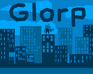


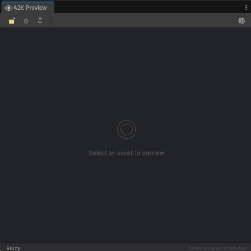
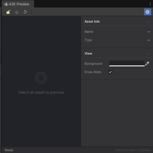
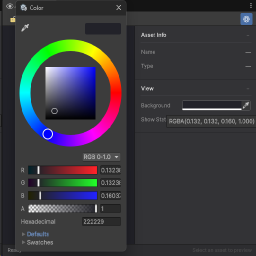
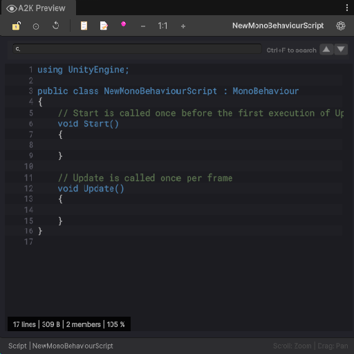
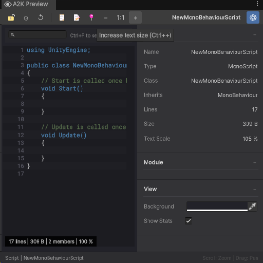
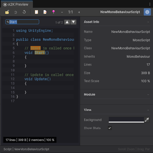
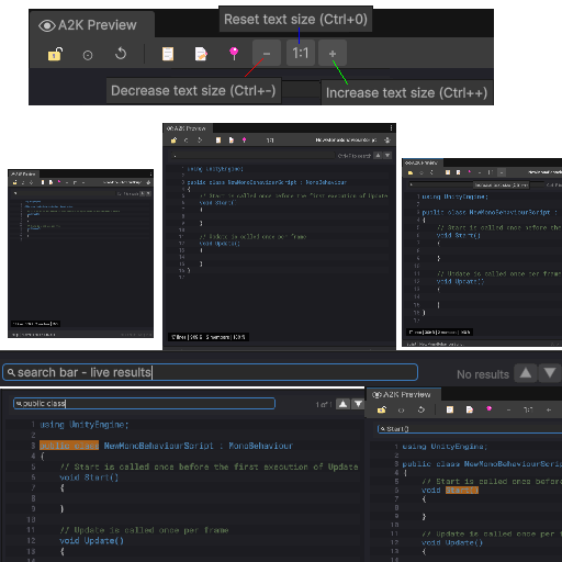
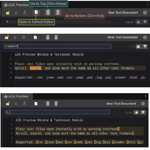
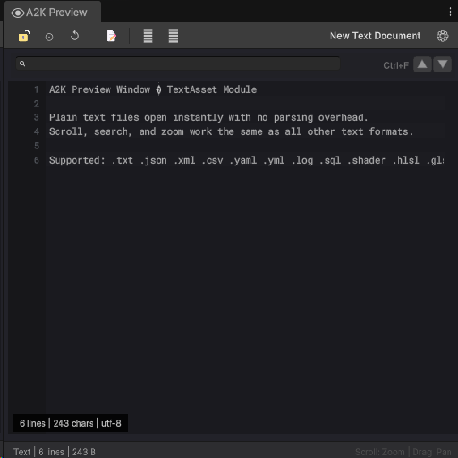
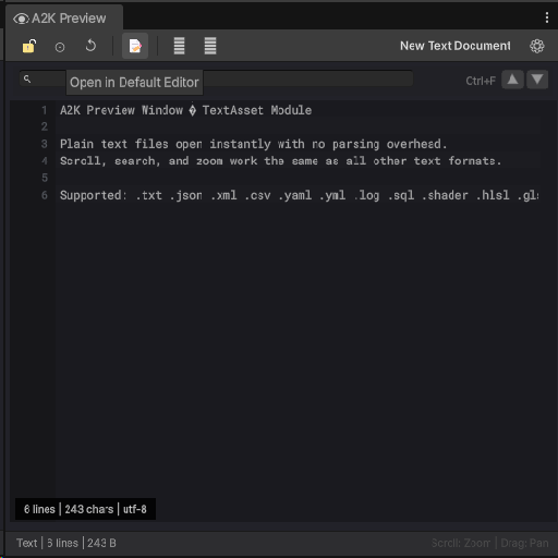
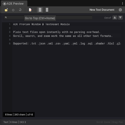
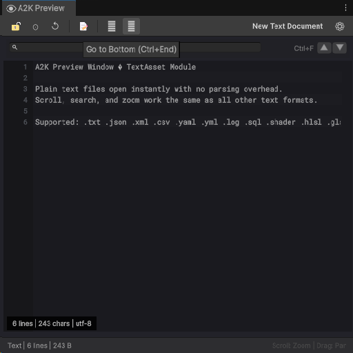
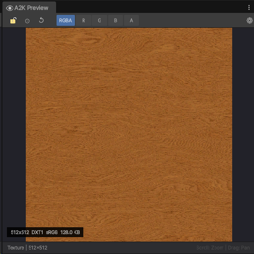
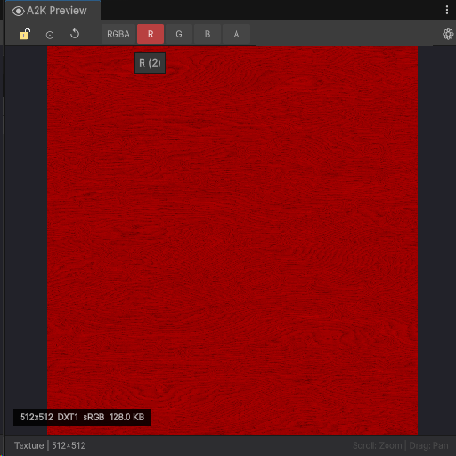
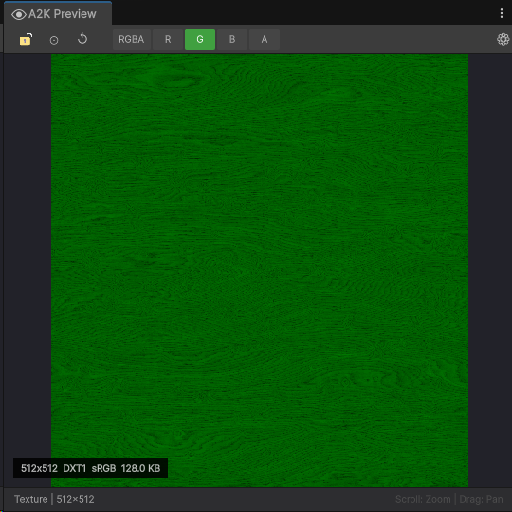
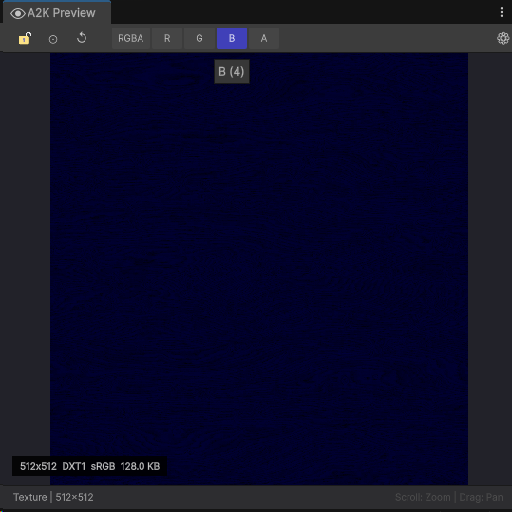
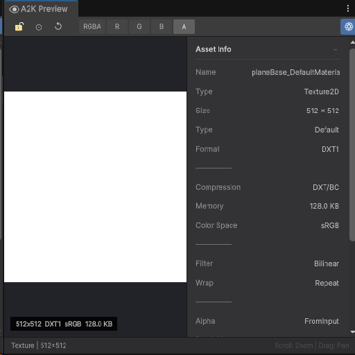
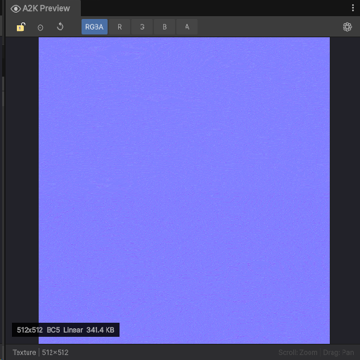
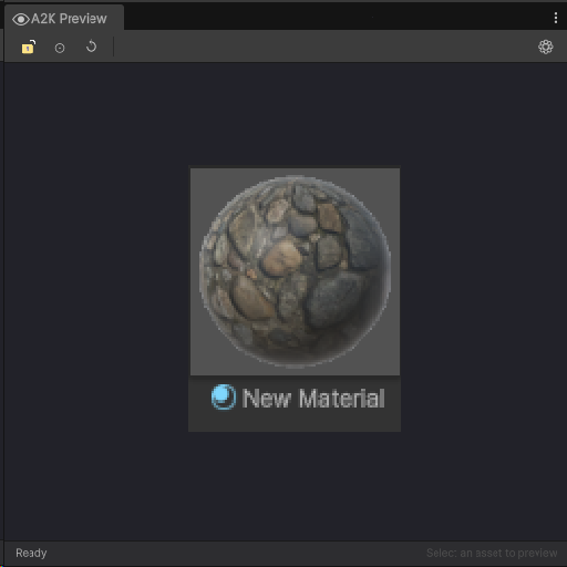
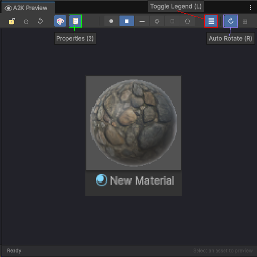
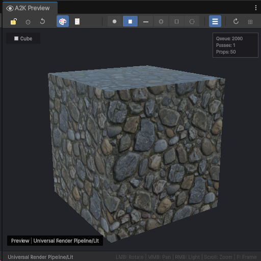
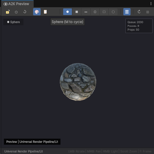
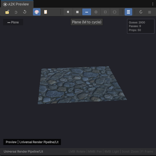
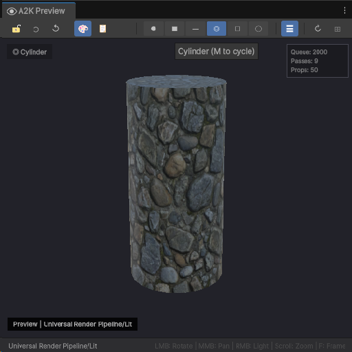
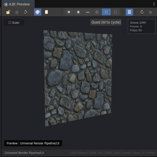
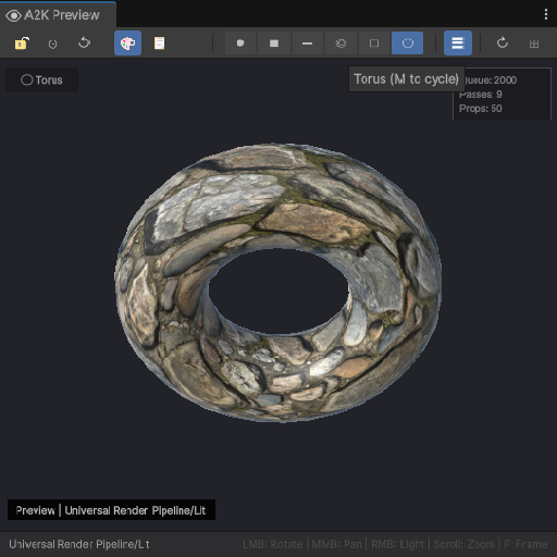
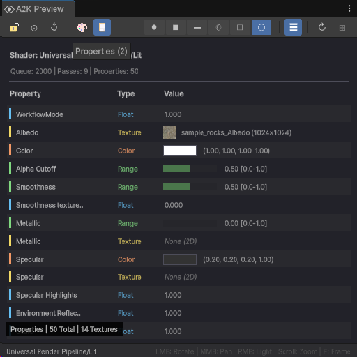
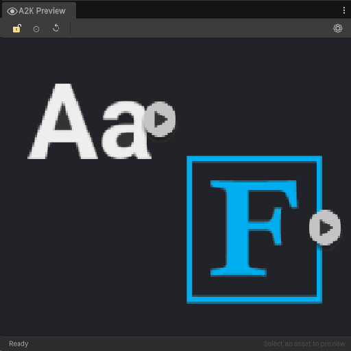
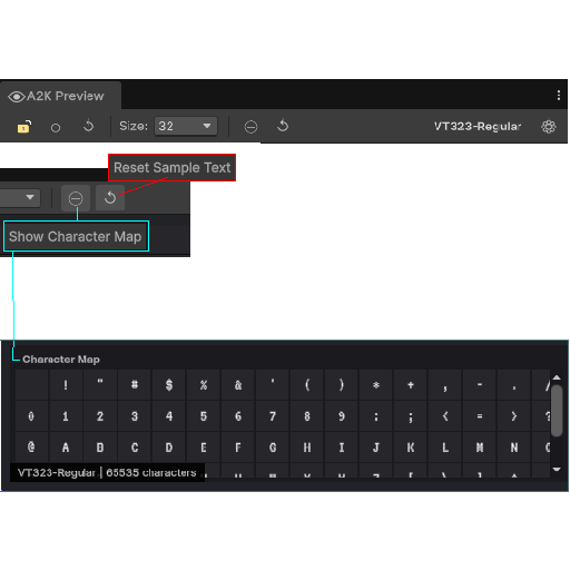
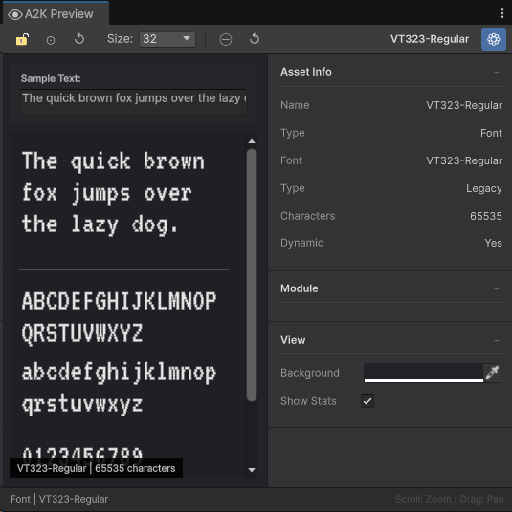
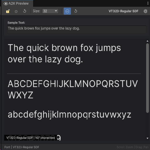
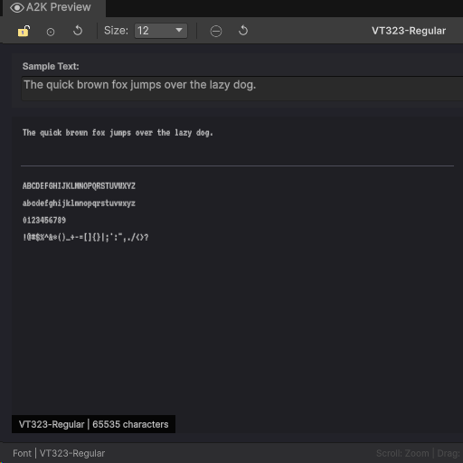
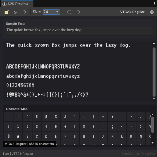
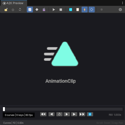
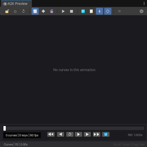
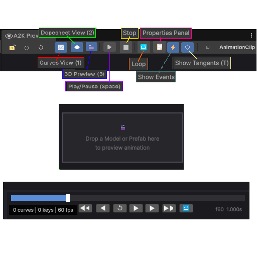
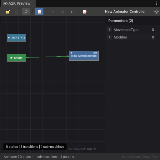
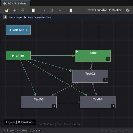
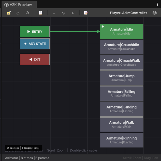
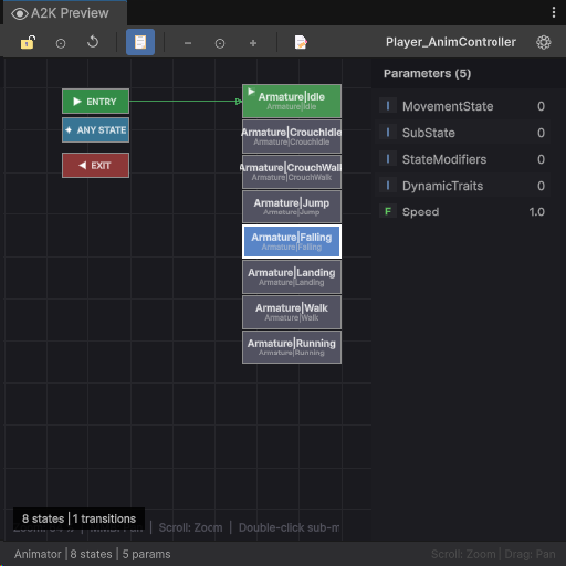
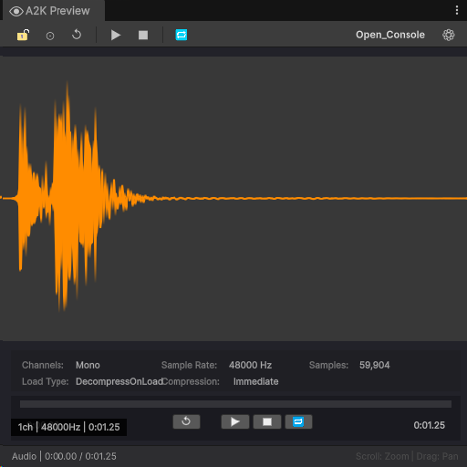
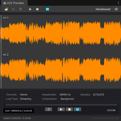
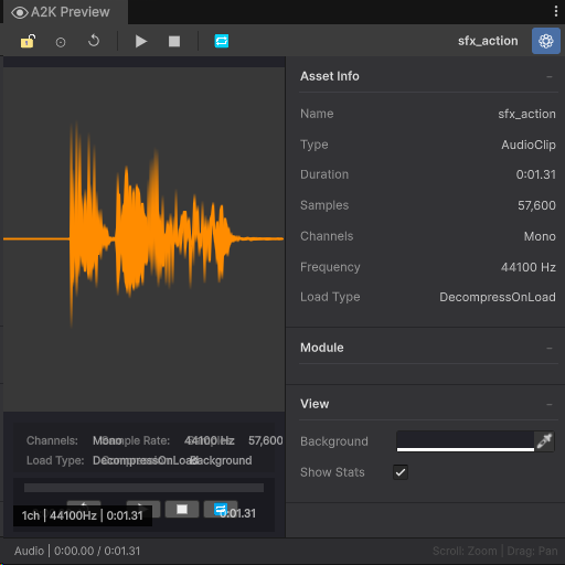
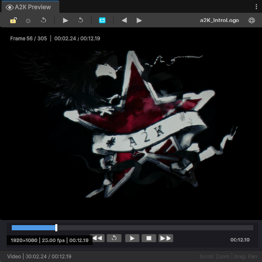
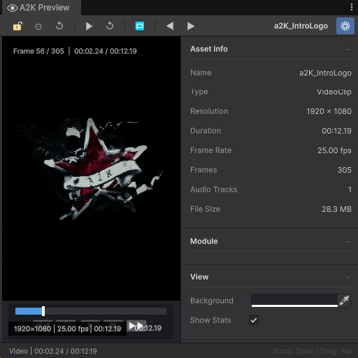
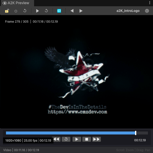
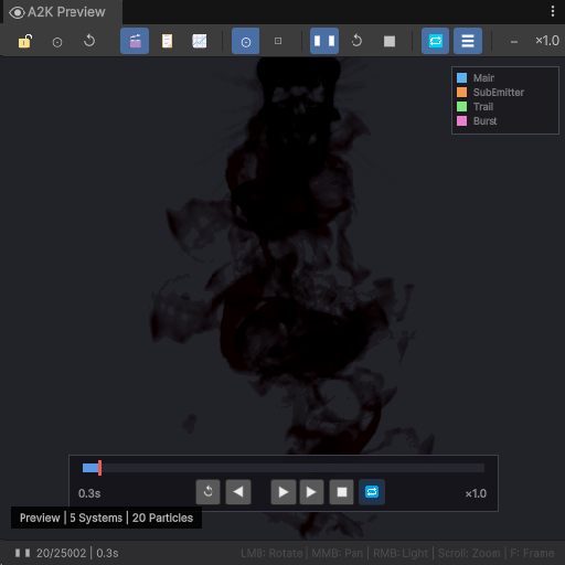
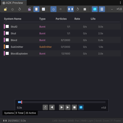
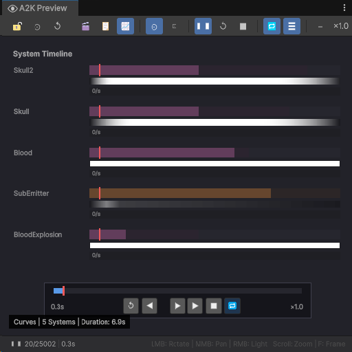
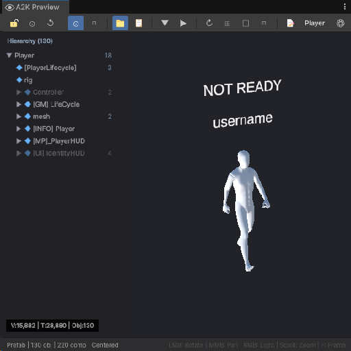
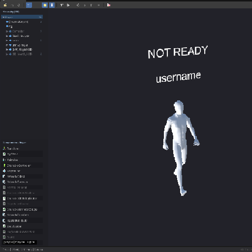
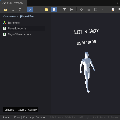
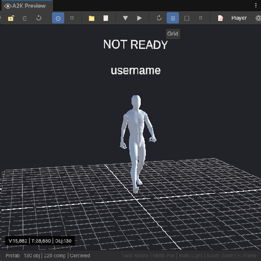
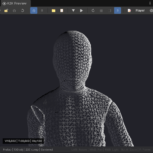
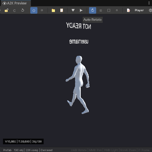
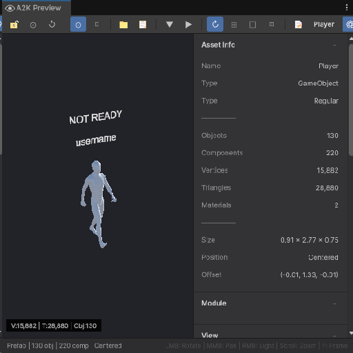
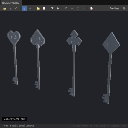
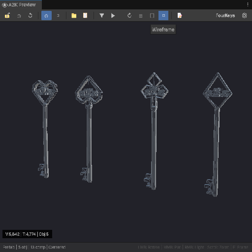
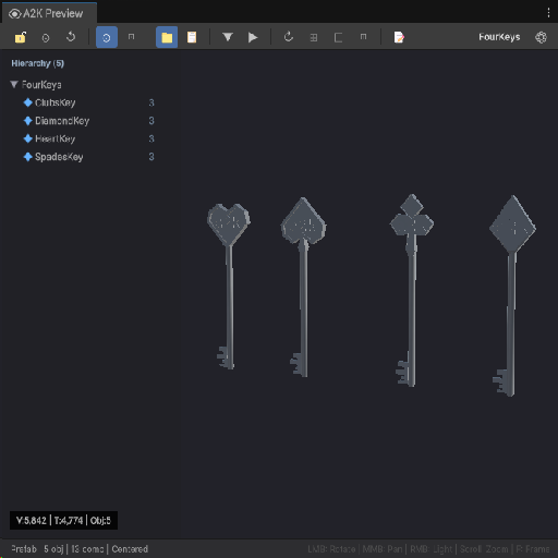
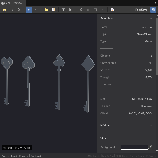
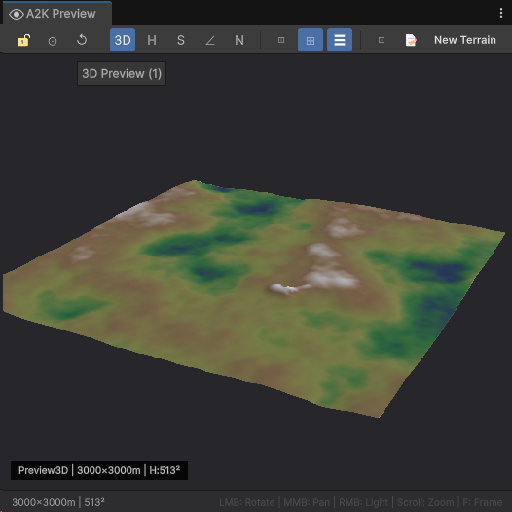
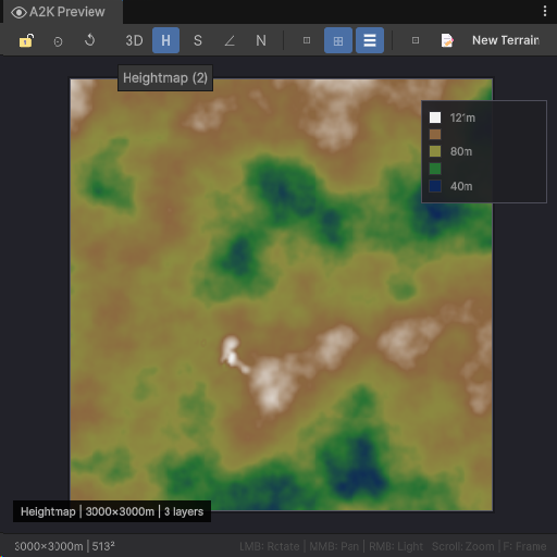
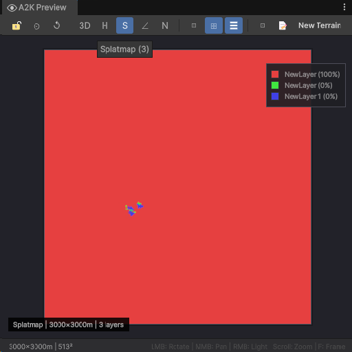
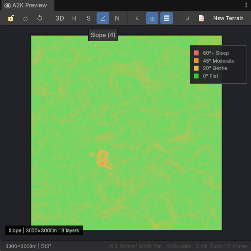
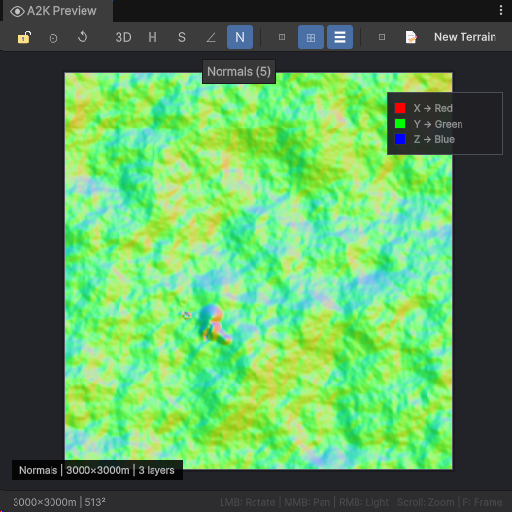
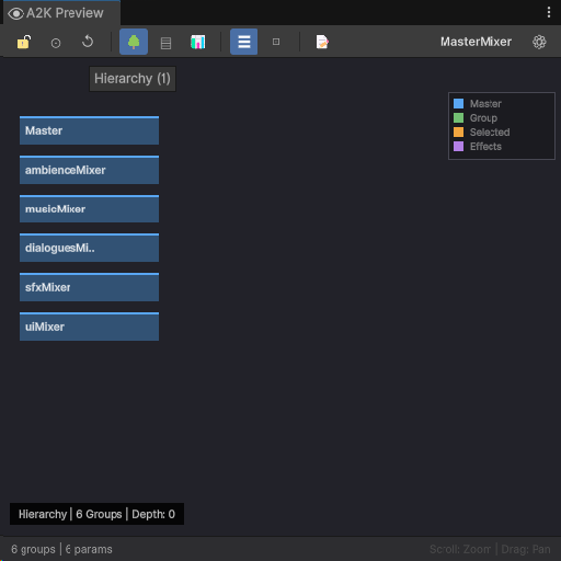
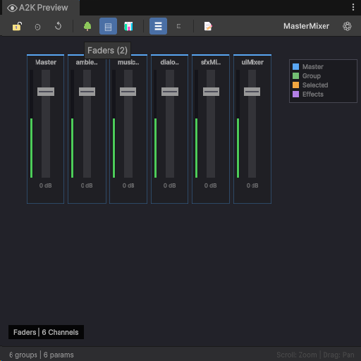
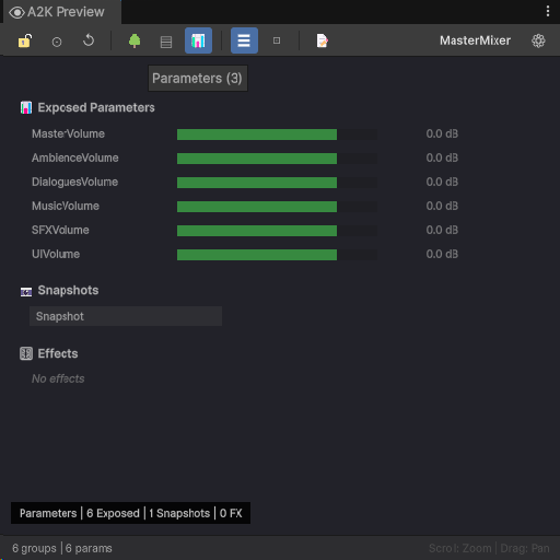
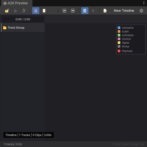
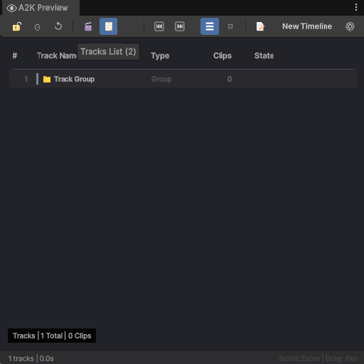
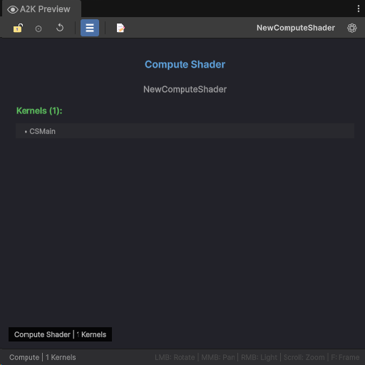
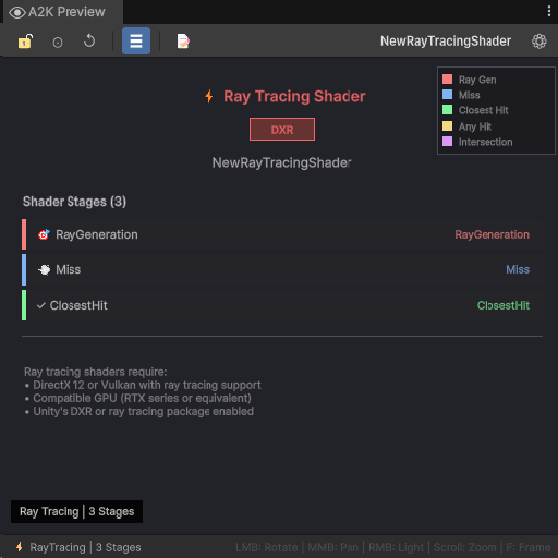
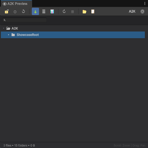
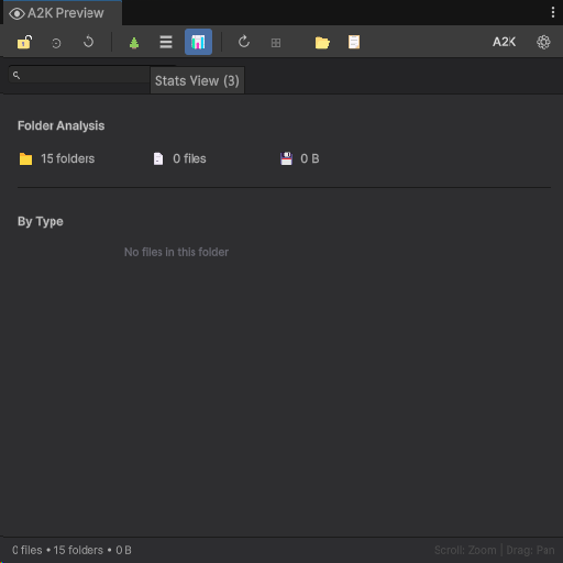
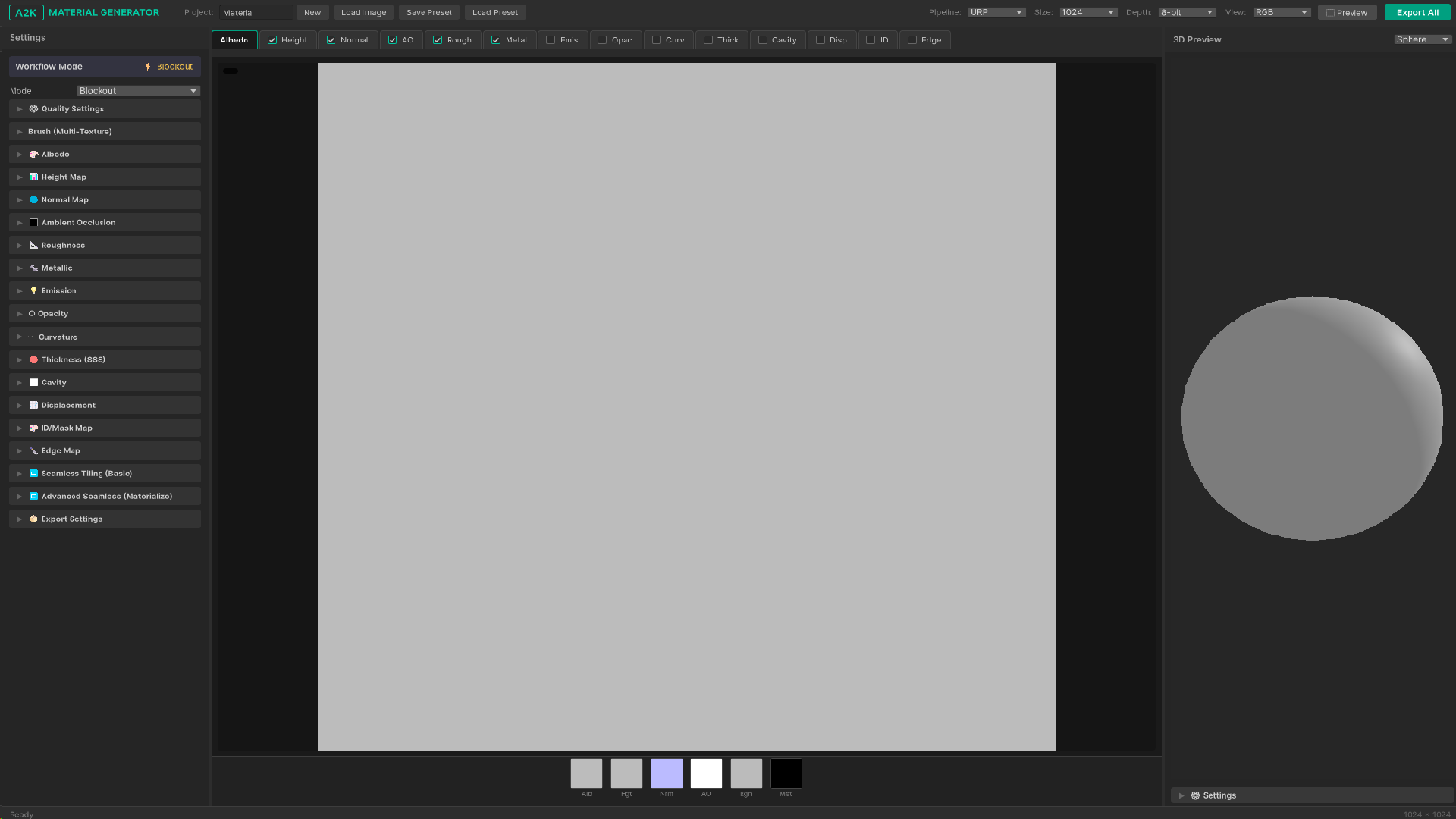
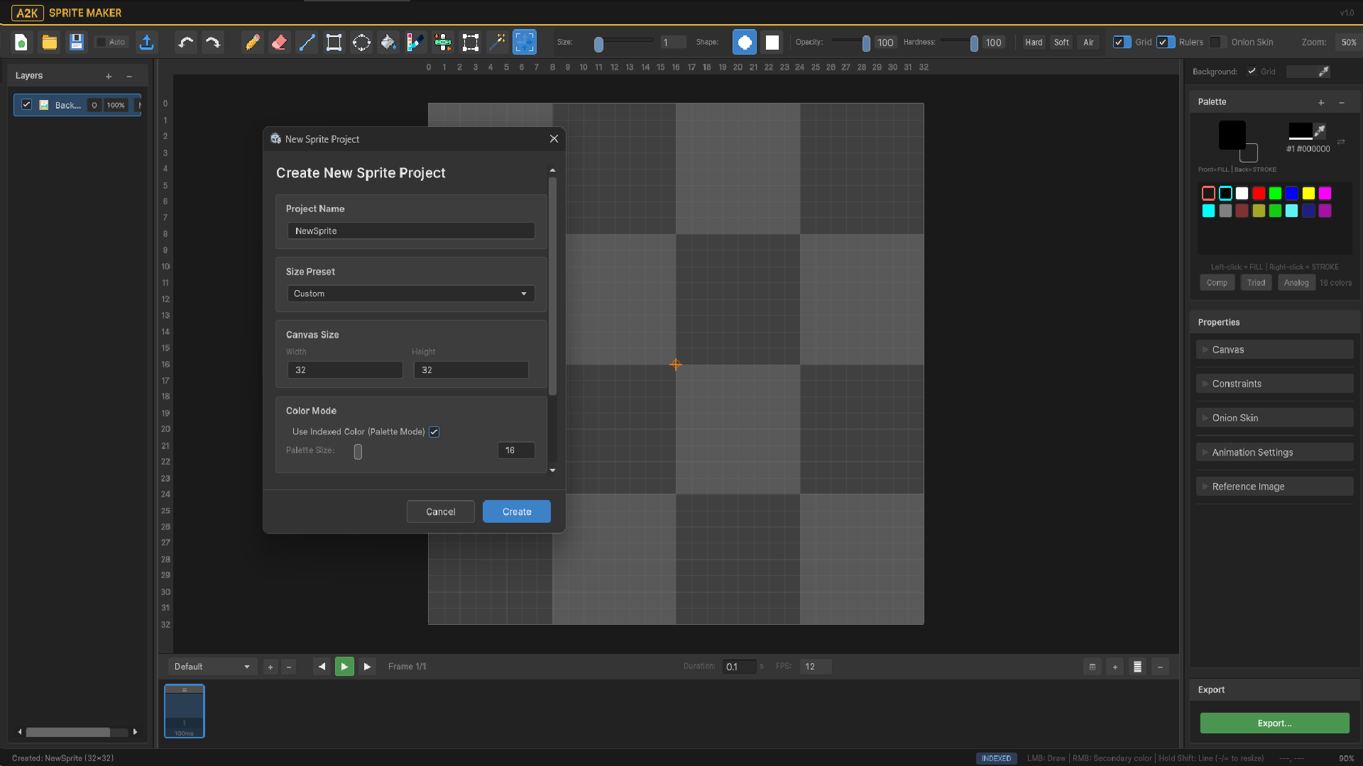
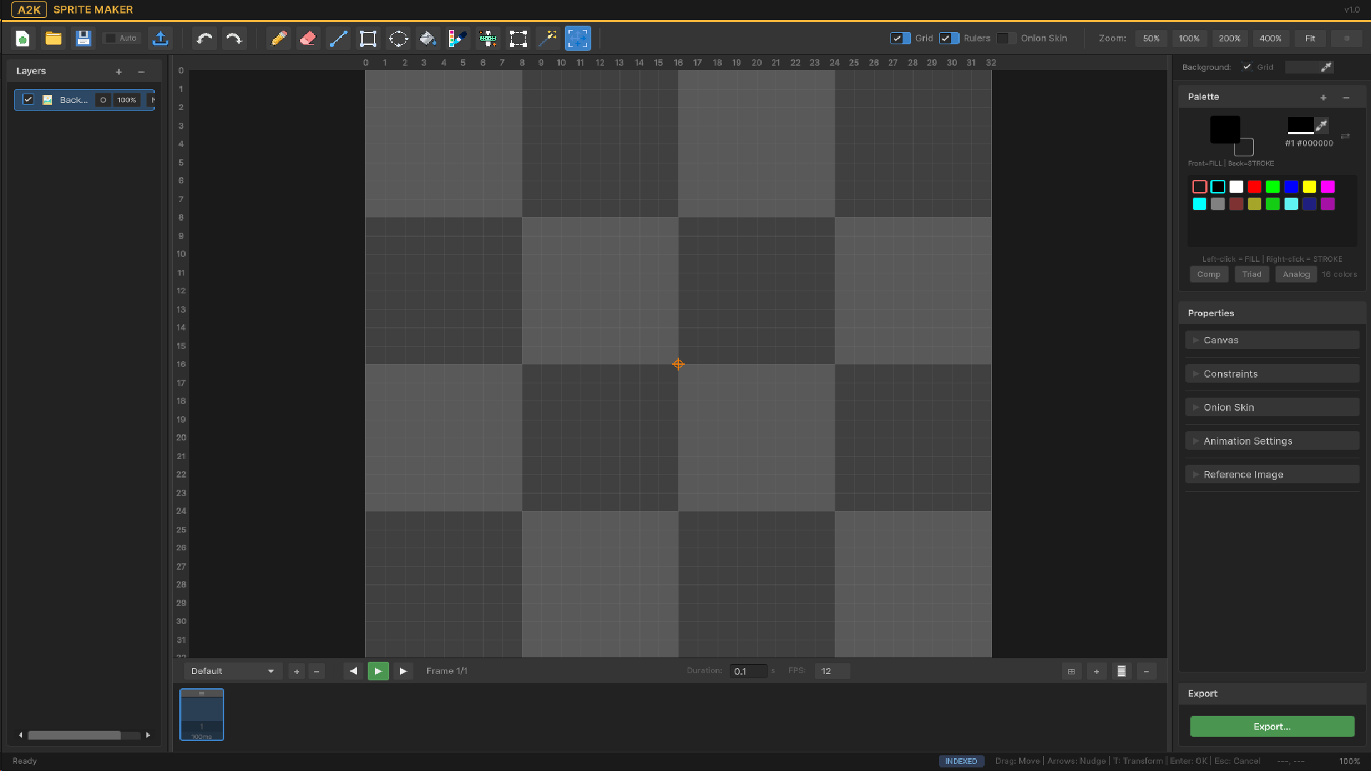
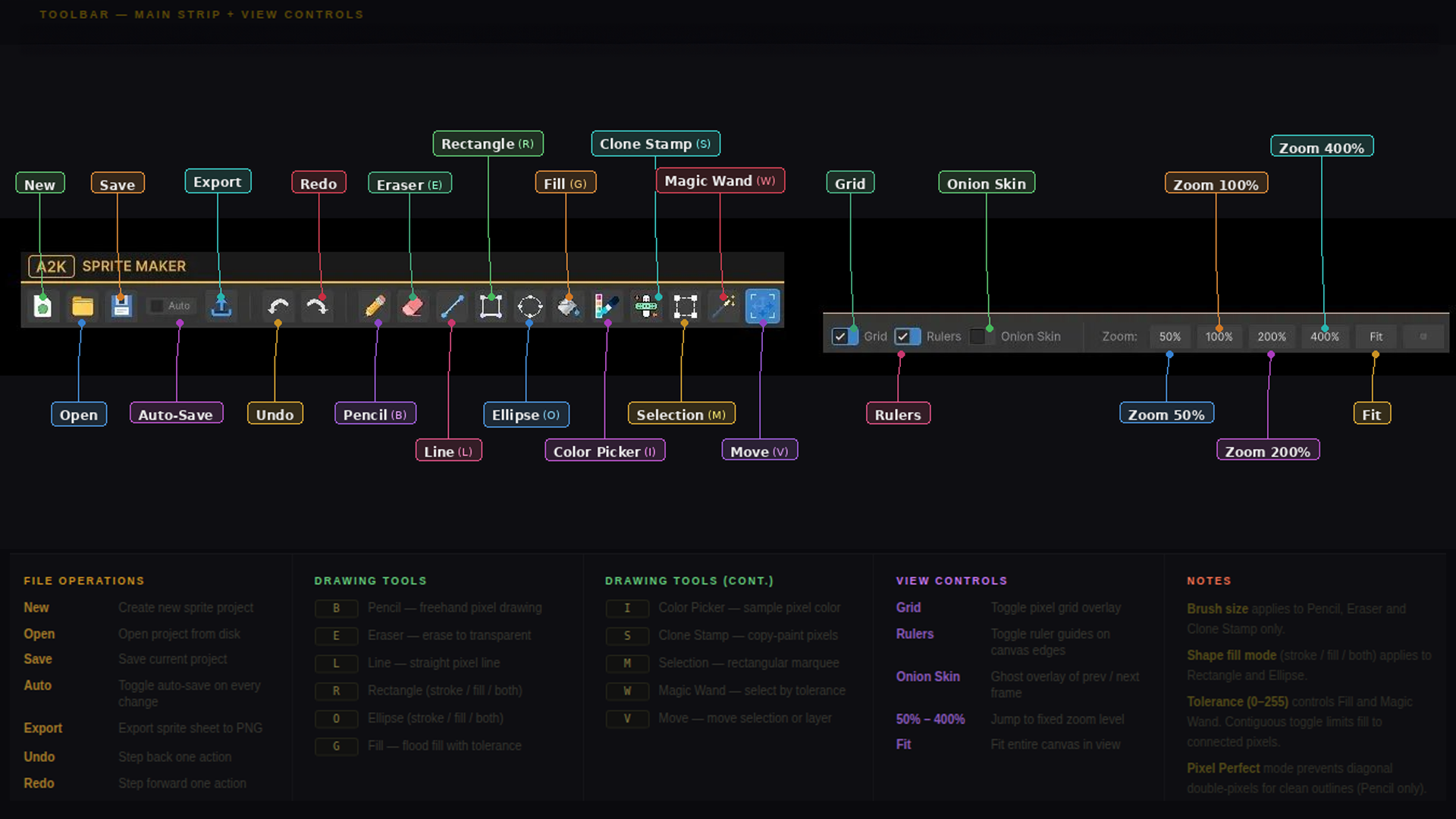
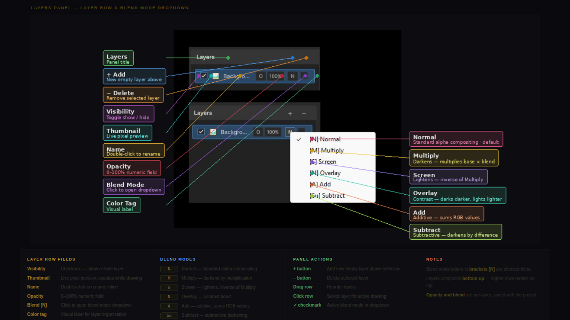
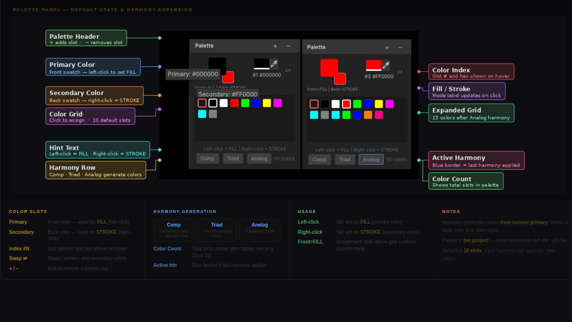
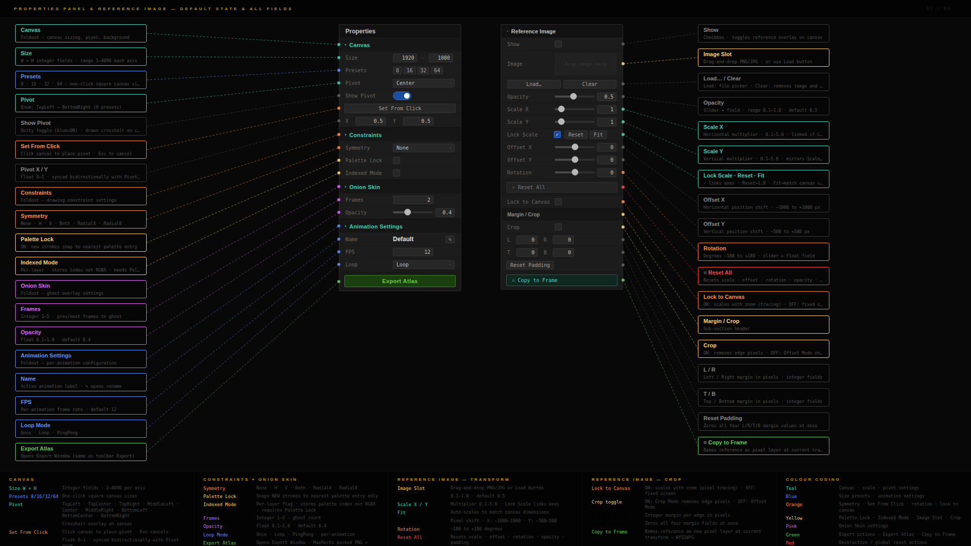
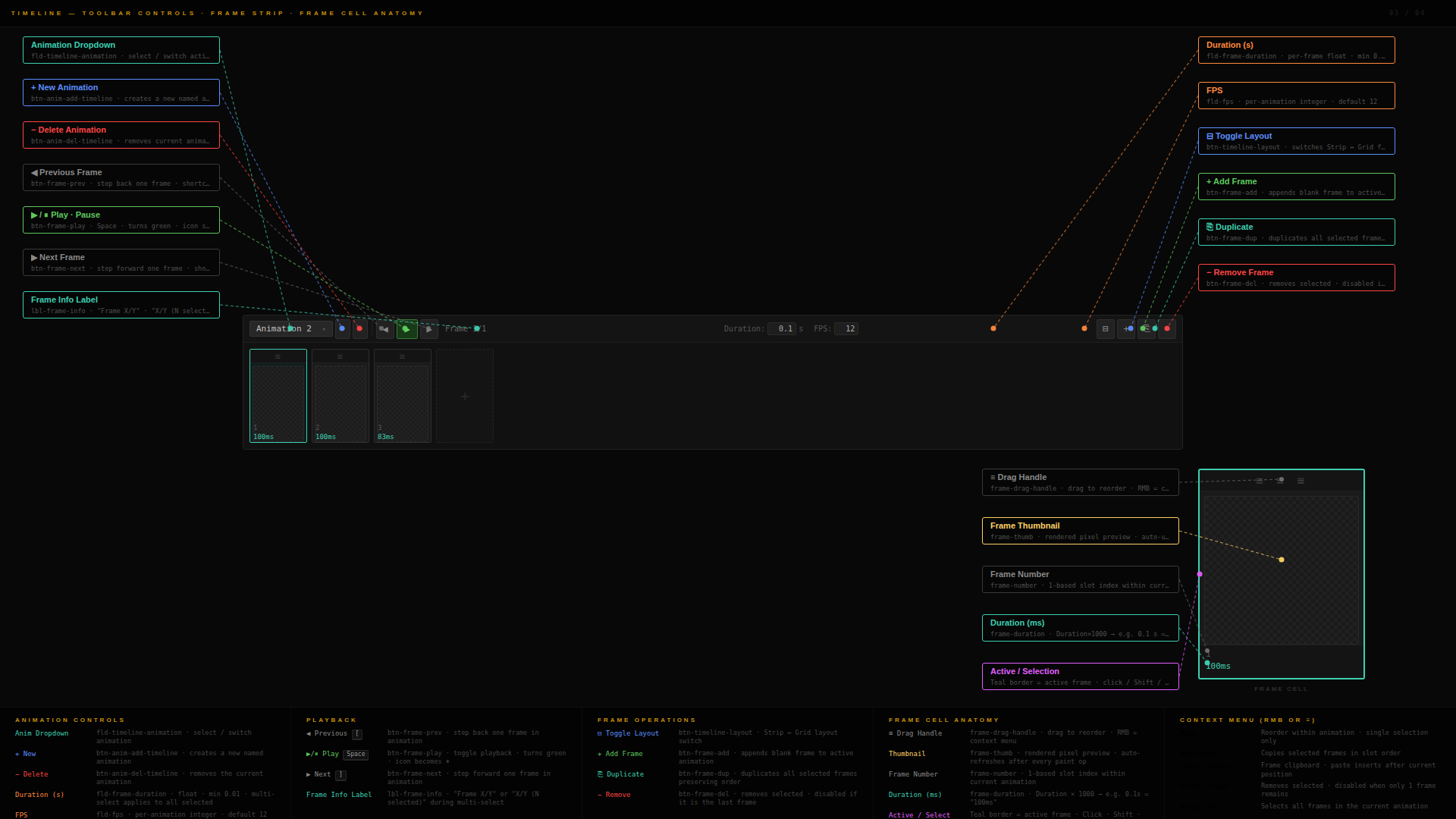
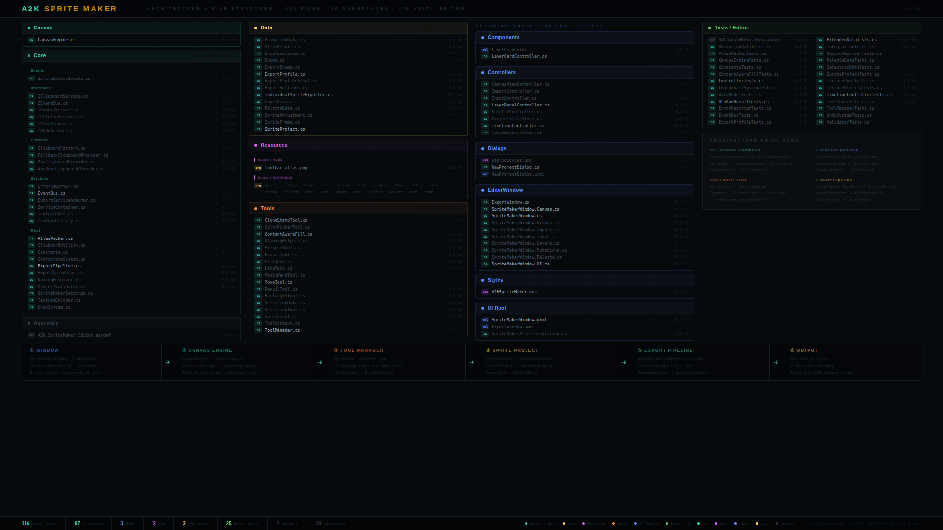
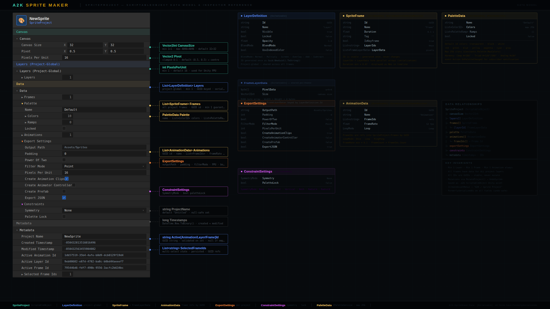
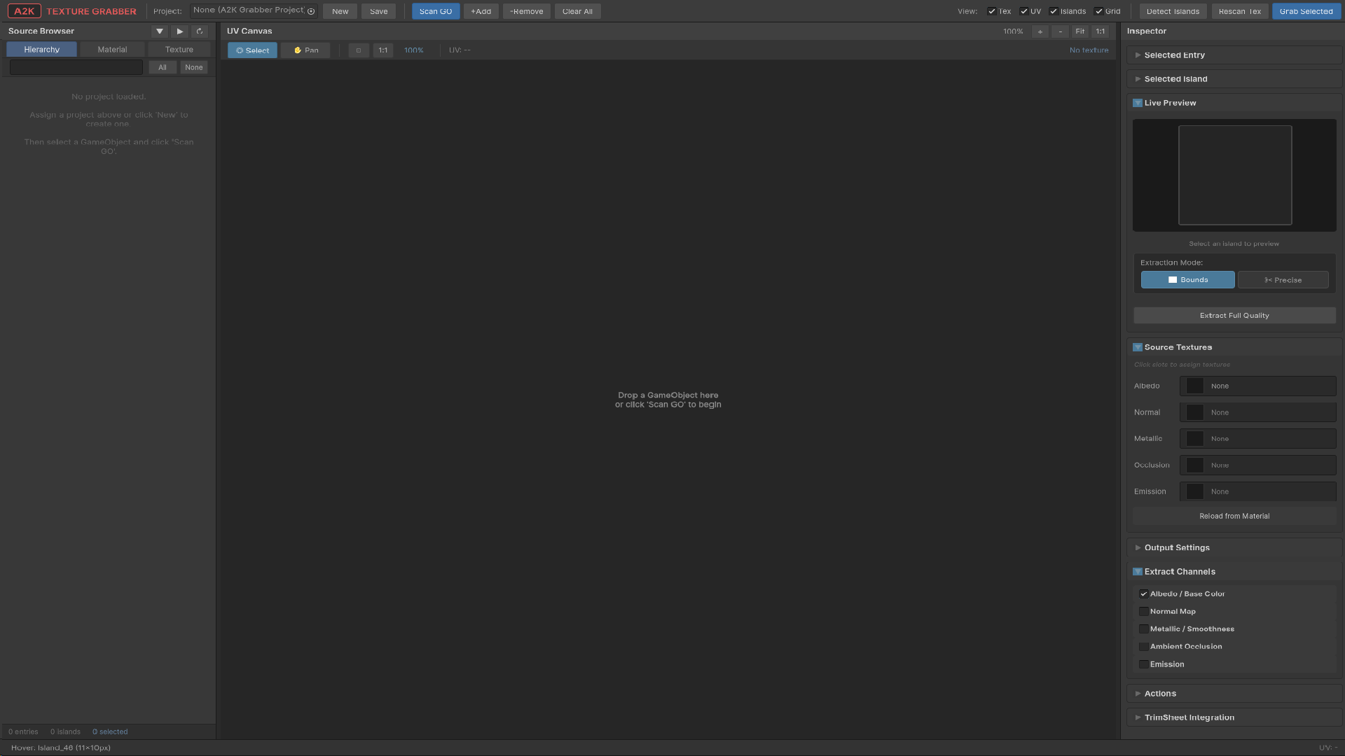
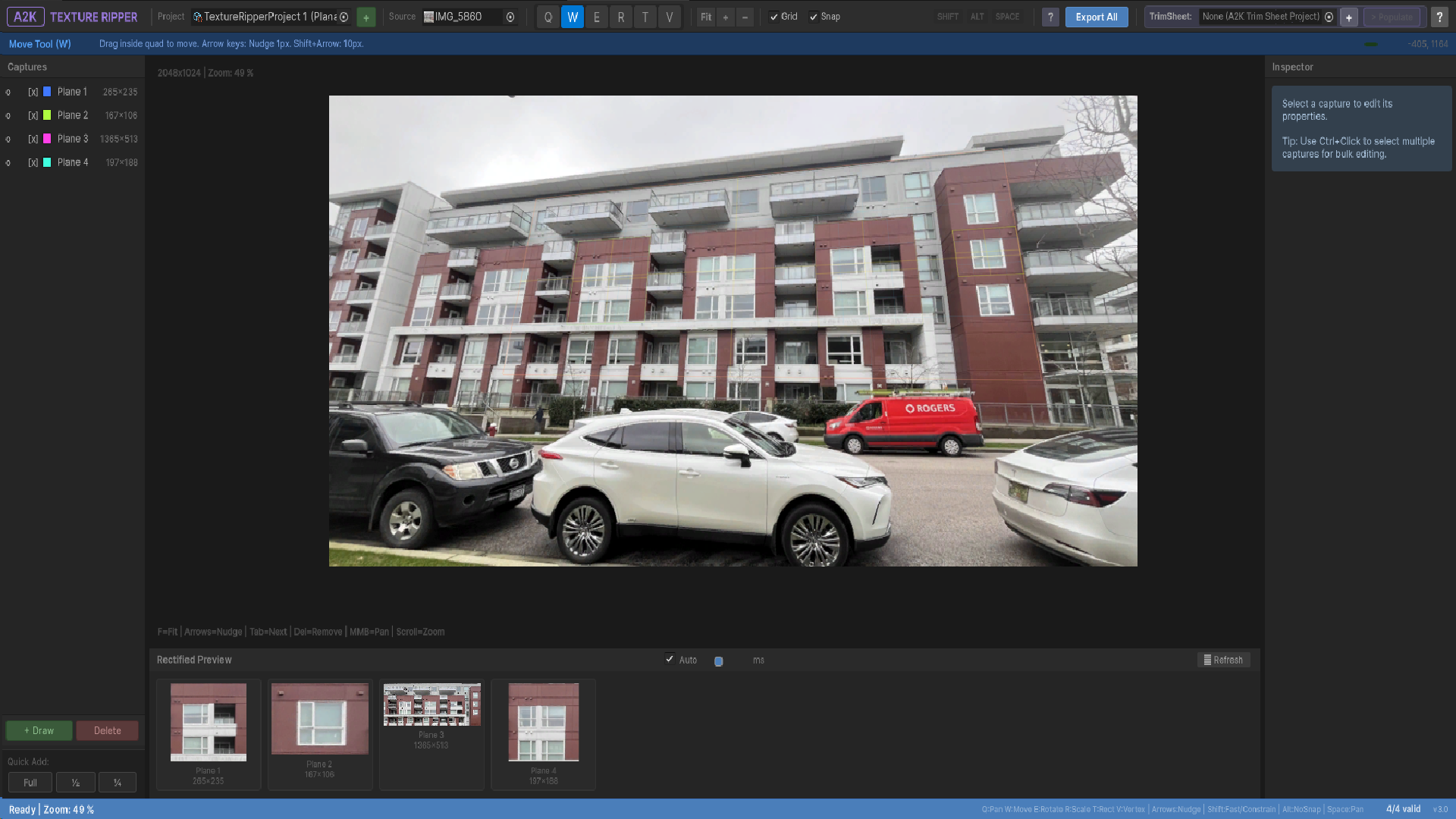
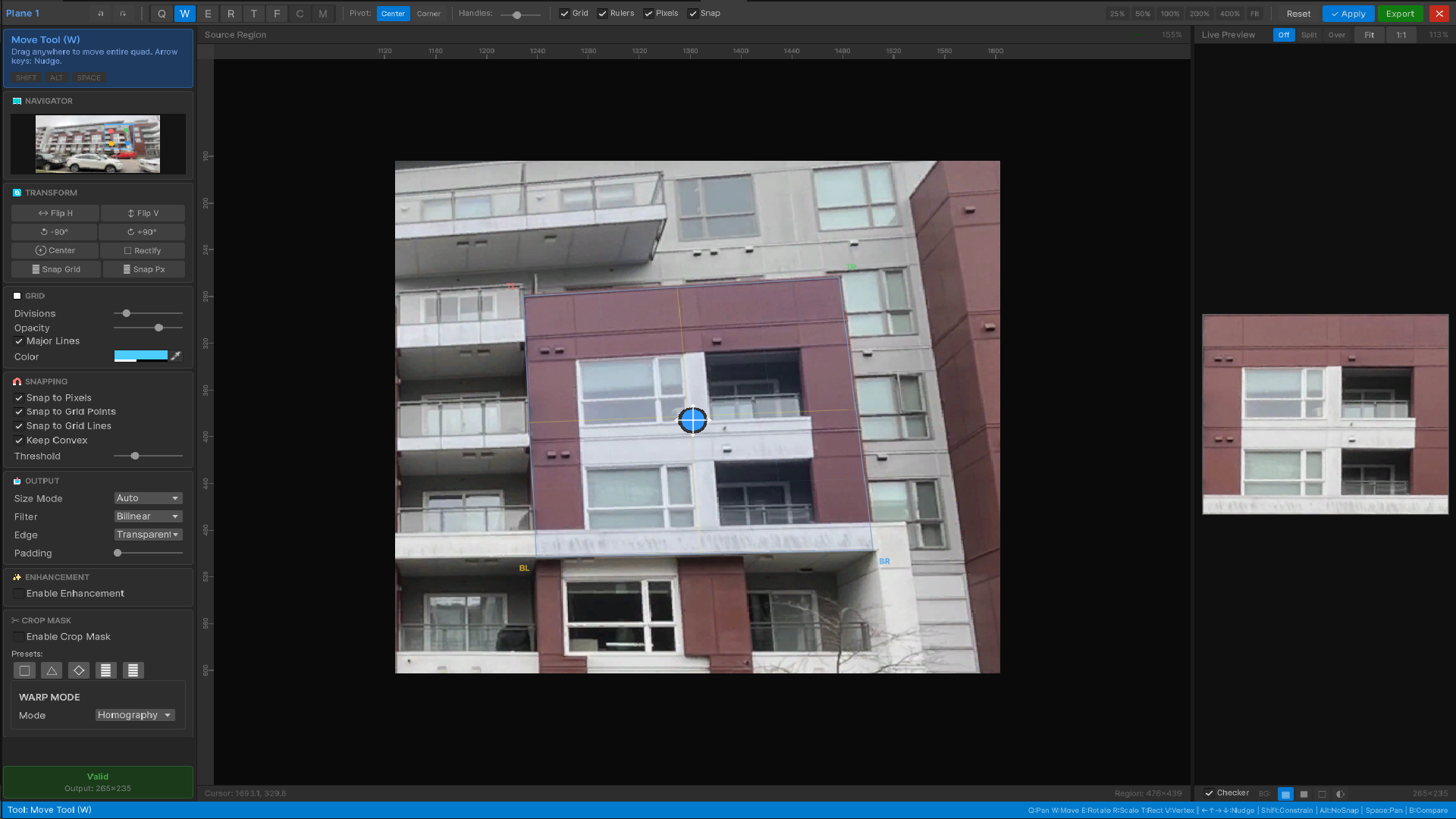
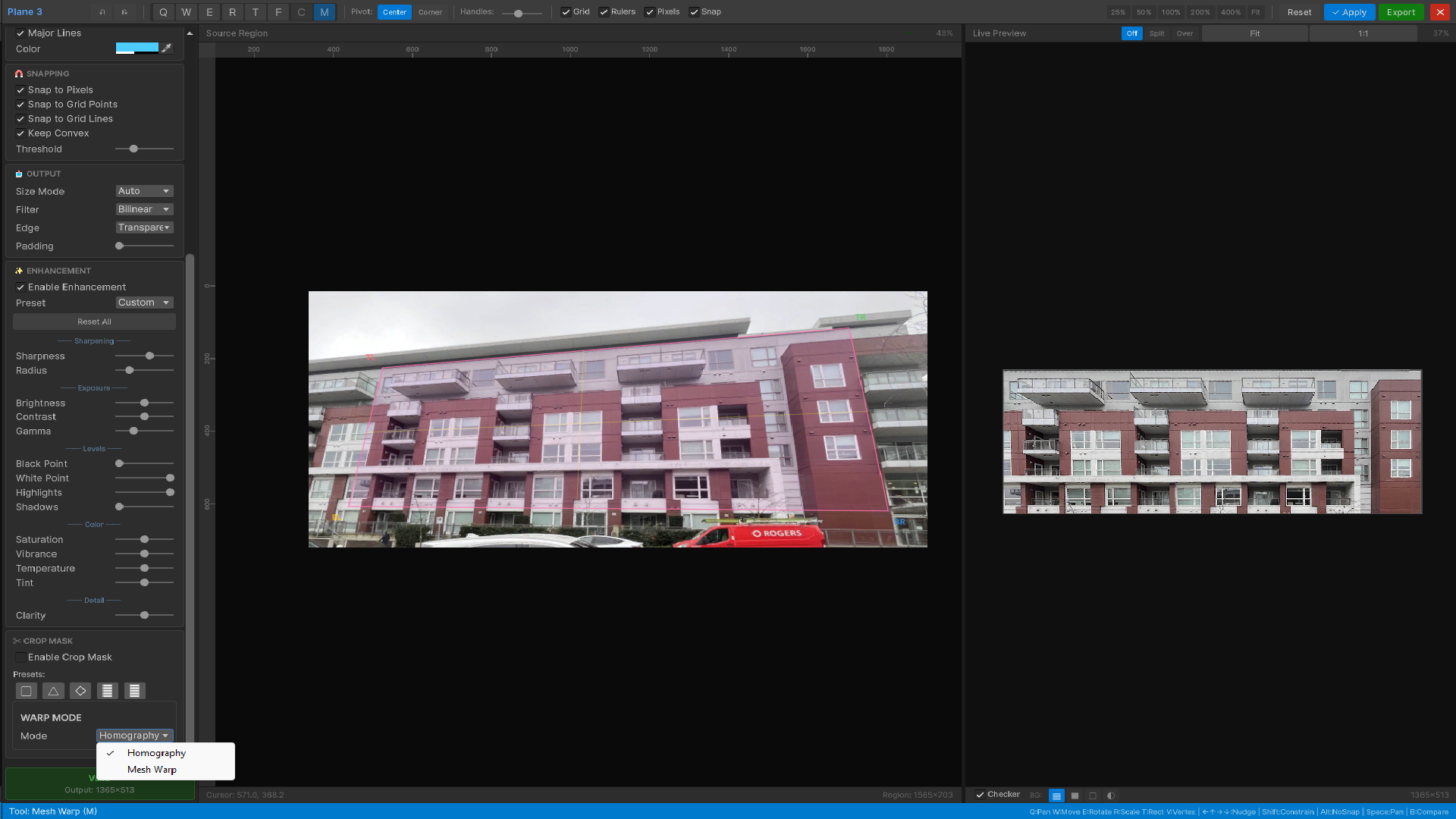
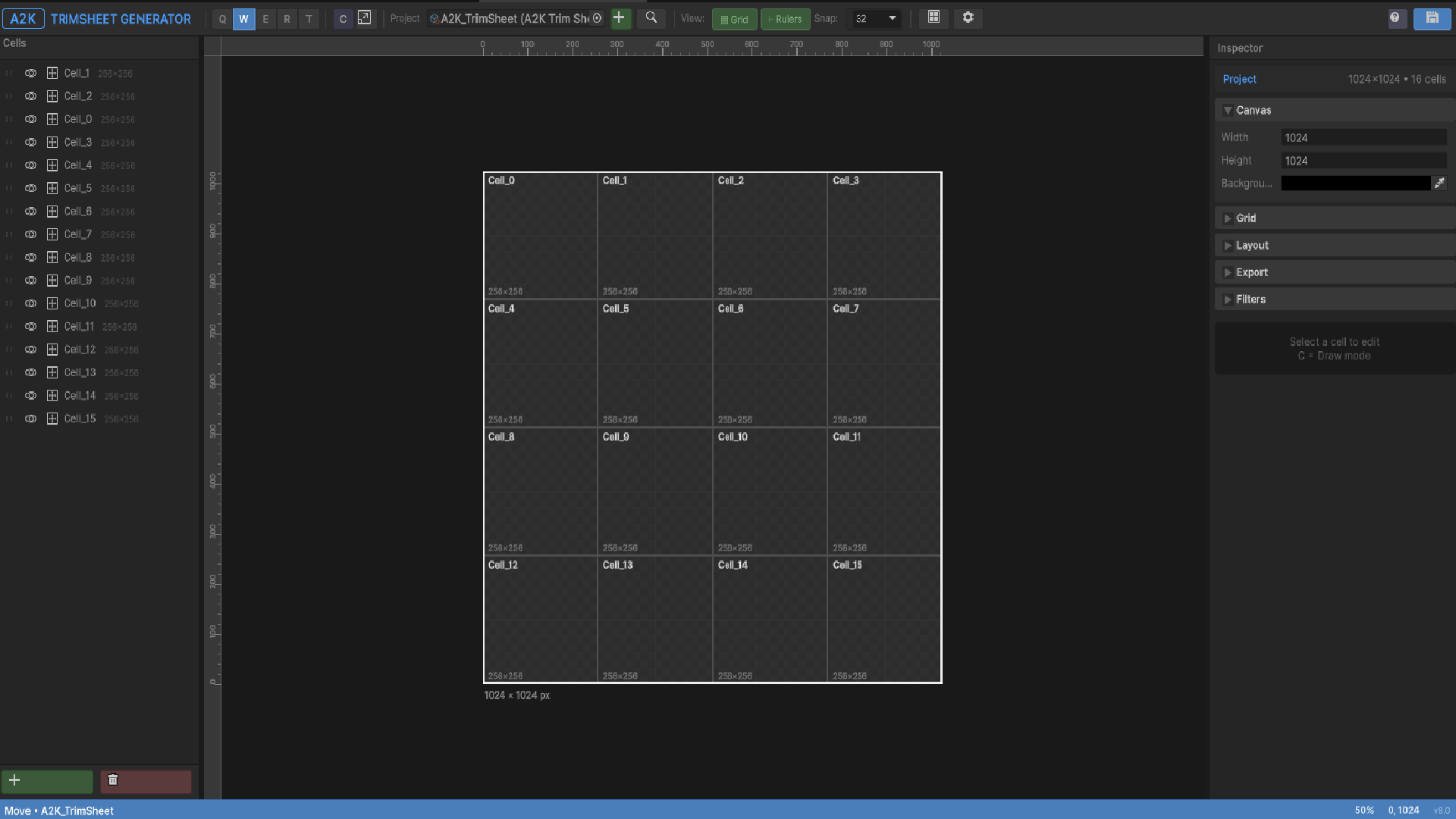
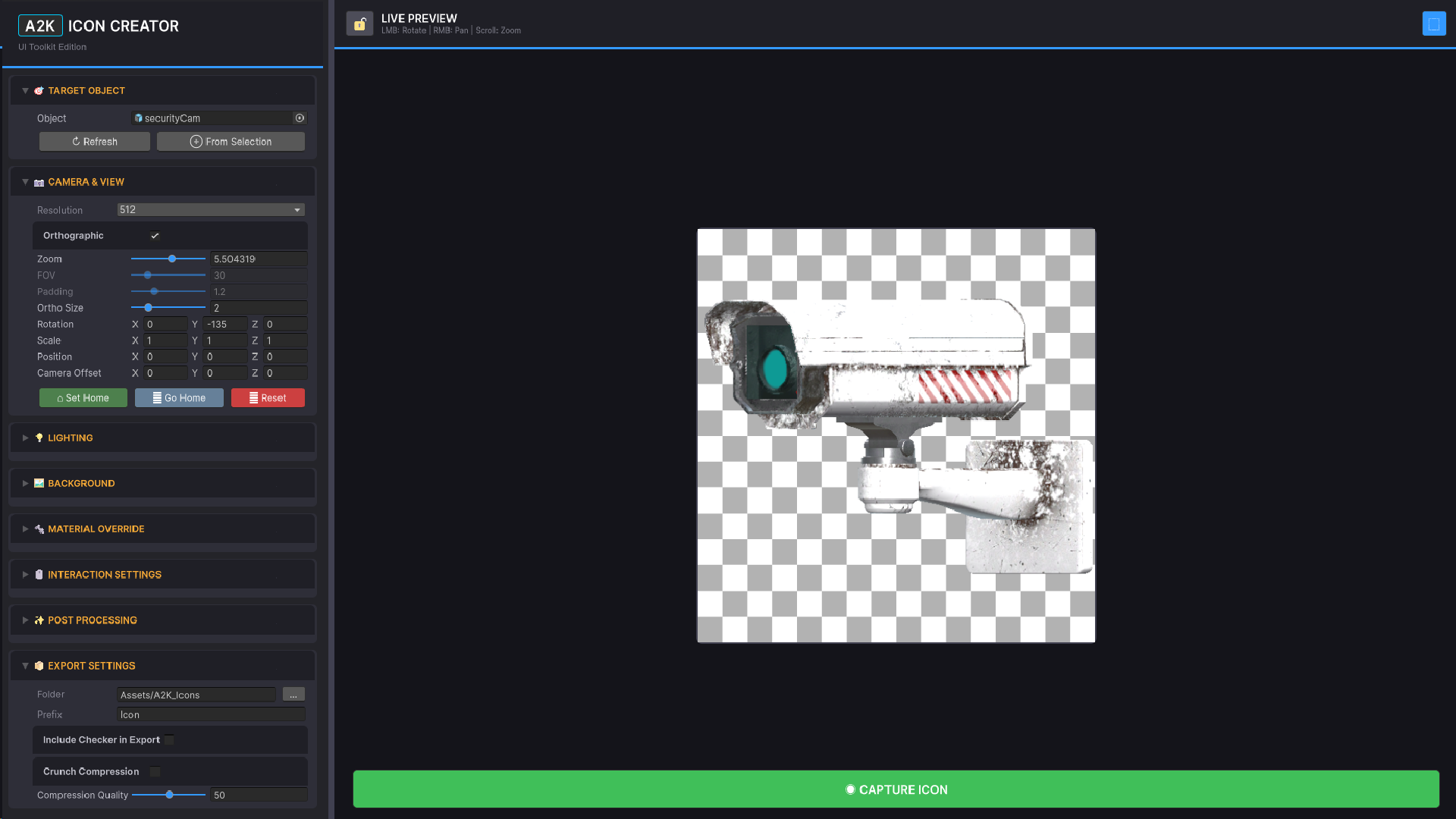